
Nielsen Hits ‘Play’ On Moving On From Shaky Past With Fun Negative-Space Logo
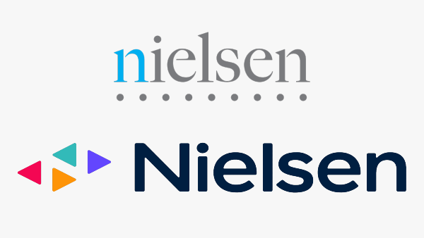
Old logo (above) VS new logo (below). Images via Wikimedia Commons (public domain) and Nielsen
By market research firm Nielsen’s estimations, its fun new logo should reflect its forward-looking role in the evolving global media landscape.
A huge jump from the near-grayscale serif branding, the cheerful wordmark sports a friendlier, rounded typeface. Four colorful triangles represent diversity, evolving trends, and the play button—but can you also spot what’s happening in the whitespace?
A new Nielsen for a new media world. https://t.co/tyWhe6tQNZ pic.twitter.com/lrIi25BEoJ
— Nielsen (@nielsen) October 18, 2021
Delving deeper, the vertically-aligned green and orange triangles signify upwards and downwards trends, while red signifies content that hasn’t been discovered.
Notably, the letter ‘N’ previously accentuated in blue has been given a more interesting update. It’s hidden in the negative space of the triangles, “signifying insights revealed by Nielsen’s data and the constant momentum in media,” says Nielsen in a press release.
The rebrand comes after a number of hiccups from Nielsen’s recent past, Ad Age reports. The Media Rating Council revealed that the company had undercounted television viewership numbers by as much as 6% back in February 2021, potentially losing advertisers hundreds of millions of dollars in advertising revenue. Nielsen’s accreditation for television ratings in the US was later suspended, an imaginably painful blow for a firm focused on performance metrics.
However, Jamie Moldafsky, the company’s chief marketing and communications officer, detailed in a statement published by Ad Age that the revamped brand identity “is not to deflect at all,” but to “reflect the accuracy of what we’re currently doing.” In fact, the overhaul had been in development since at least January, said Moldafsky.
For context, Nielsen has had a busy past year, having had let go of NielsenIQ—its retail shopping behavior measurement technology for packaged goods companies—and reverting to its specialty in creating measurement products ahead of a 2022 launch for a cross-media measurement platform called Nielsen One.
In line with its brand expansion, Nielsen has also introduced a new mission statement: “Powering a better media future for all people.” It’s worth mentioning, though, that the existing “audience is everything” tagline is here to stay.
Nielsen officially debuted the visual identity at Advertising Week New York, which will run from October 18 through 21.
[via Ad Age and Marketing Interactive, images via various sources]
Also check out these recent news


