
Mastercard Creates Differentiated Notches On Cards For Visually-Impaired Users
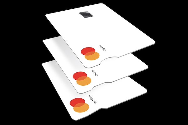
Image via Mastercard / Business Wire
For most of us, choosing the right card to use at the ATM, for contactless payment at a coffeeshop, or to gain the most rewards points at a gas station is something we hardly think about. It’s muscle memory at this point, especially with the myriad choices we have from debit cards to credit cards, and an entire slew of mobile options.
However, for the visually-impaired, selecting the right card to use at a cashier isn’t so simple. In fact, it can be a real bother, considering most bank cards feel exactly the same, and can’t be told apart unless you’re reading directly off them. And with nearly 2.2 billion individuals worldwide who face difficulties seeing, it’s about time leading organizations make their transactions a little more seamless.
Now, Mastercard has unveiled a new design change that’ll help visually-impaired people quickly differentiate between the cards in their wallet—and it all comes down to just a single notch. The ‘Touch Card’ will come with different notches on the end: round for credit cards, square for debit cards, and triangle for prepaid cards, so users can tell them apart through touch.
“The solution can be very, very simple, but it’s anything but simplistic,” Mastercard’s Chief Marketing and Communications Officer, Raja Rajamannar, told Fast Company.
“Innovation should always be driven by the impulse to include. With one in seven people experiencing some form of disability, designing these products with accessibility in mind gives them equal opportunity to benefit from the ease and security of a digital world. No one should be left behind.”
Rajamannar, who is also the company’s Healthcare Director, teamed up with the UK Royal National Institute of Blind People to work on the idea, ensuring the new designs were usable in real-life scenarios. The team had considered other differentiating tools, such as Braille, but that was quickly ruled out when they learnt only 10% of blind people know how to read it.
In addition to the physical cards, Mastercard has included “sonic acceptance sounds” at its checkout points globally, which are used to signal the completion of a transaction. Rajamannar explained: “If you are a person who is sight-impaired, when you hear the sound, you know your transaction has gone through successfully.”
The Touch Card will be available to customers in the US from early 2022.
[via Fast Company and Mastercard / Business Wire, cover image via Mastercard / Business Wire]
Also check out these recent news


