
Evolution Of Letters Through The Ages In Calligraphy Will Leave You Spellbound
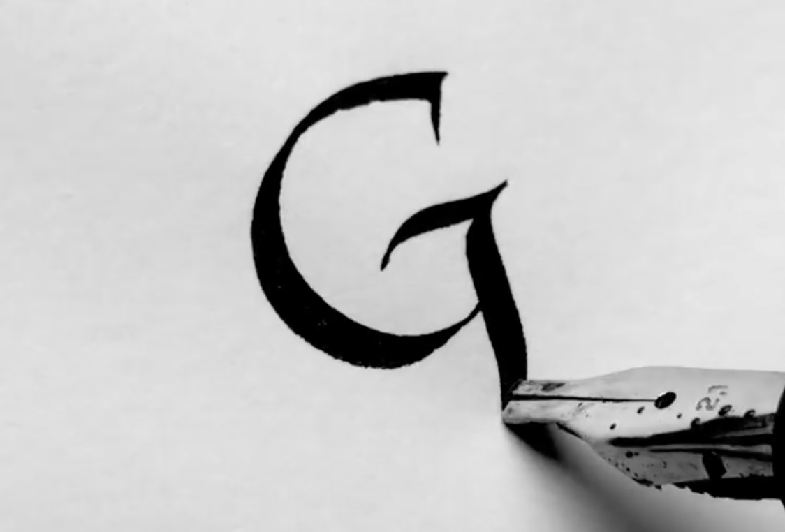
Image by Seb Lester and featured with permission
Prolific calligrapher Seb Lester is giving typophiles the history lesson of their dreams with a little demonstration of how the Latin alphabet has looked through the ages.
One compelling video showcases one of the most satisfying letterforms to draw: the capital ‘G’. Lester envisioned its Rustic Capital appearance from the first century and its evolution into its cursive roundhand look in the 18th century.
Examples of the Letter ‘G’ Through History: Rustic Capital, 1st Century — Roman Capital, 2nd Century — Roman Uncial, 4th Century — Uncial, 6th Century — Textura, 15th Century — Chancery Script, 16th Century — Bâtarde, 17th Century — English Roundhand, 18th Century. #calligraphy pic.twitter.com/Mwsrqu6Ekh
— Seb Lester (@SebLester) November 14, 2021
Video by Seb Lester and featured with permission
“Bâtarde was revered in princely courts for its pleasing simplicity and the speed at which it could be written, one of the reasons it ended up replacing Gothic styles in some parts of Europe,” he detailed.
Luckily for admirers of calligraphy, the clip is part of an ongoing series exemplifying hand-lettering in history. Lester confirmed with DesignTAXI that he’s working his way through Z.
View some hypnotic videos from the project below, and be sure to follow Seb Lester on Instagram to watch the alphabet unfold. Perhaps it’s time to readopt one of these styles into your own penmanship.
[via Creative Bloq, videos and cover image by Seb Lester and featured with permission]


