
Hermès Adopted Its Iconic Orange Packaging Only Because Of Supply Chain Problems
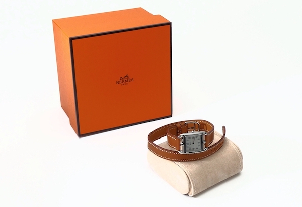
Brands have had to reconsider their business models to cope with the global supply chain crisis. Similar problems arose 80 years ago, when essentials were in shortage—although scarcity in World War II would have been more troubling than the limited access we have today. Bread, sugar, milk, meat, and some raw materials were in limited supply in 1942 Paris, still on the last legs of the war.
“There is no milk at all for ordinary people,” The Guardian reported at the time, via a 2020 profile by The Fashion Law. Given “the pitiful state” left of transportation routes like roads, train tracks, bridges, and ports, goods couldn’t arrive as punctually.
Hermès, an already established family business with a 105-year history, was one of the many affected by material and transportation issues. Its usual gold-trimmed cream or beige cardboard boxes, which had “defined Hermès’ elegance” for years, were out of reach.
The company’s supplier only presented one alternative: a vivid orange—“the color nobody wanted,” the luxury house recounted decades later.
View this post on Instagram
Faced with no other option, the leather goods brand went with the packaging that other businesses had so strongly rejected to avoid further delays. And that was that—what was by necessity had evolved into a necessity. “The orange Hermès box was born, and with it a new symbol of elegance,” reflected the company.
Today, the label defines the hue as “resourceful” and one that has made its packaging “an iconic object in its own right.”
Hermès orange, which the brand says isn’t PANTONE-listed, is now just as significant as its name and logo. The brand celebrates it everywhere. “Whether round, rectangular or square, it is used to pack ties, hats, boots, tableware, jewelry or bags. Only furniture cannot comfortably slip into one… Its radiance is a general talking point,” Hermès notes on its website.
[via The Fashion Law, cover photo 88815404 / Hermes © Steeve Baillon | Dreamstime.com]


