
AB InBev Debuts Bright New Branding That Raises A Toast To An Optimistic Future

Anheuser-Busch InBev (AB InBev) is buzzing with excitement thanks to a new visual identity that reflects positive change. The world’s largest brewer—which encompasses beer brands like Beck’s, Budweiser, Corona, Hoegaarden, and Stella Artois—has unveiled a logomark befitting of its new global vision: “We dream big to create a future with more cheers.”
The overhaul, created by brand consultancy Prophet, features a negative-space globe that not only exemplifies the brand’s international reach but also the clinking of three glasses (the act of “cheers”). And, as an ice-cold, refreshing change, its logo is now gold like beer and barley.
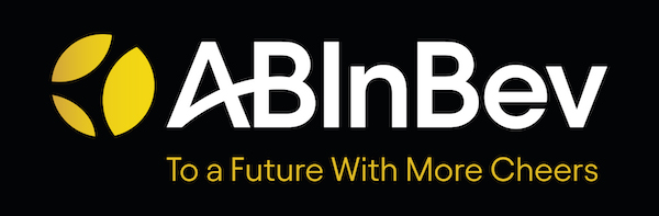
AB InBev also reworked the logo’s typography in a way that “modernizes our expression and connotes our forward momentum as a company and a business,” it described.
As reported by Campaign, the conglomerate studied the brand evolutions of household names like Coca-Cola, FedEx, P&G, Nike, and Amazon to create the logomark.
Peter Dixon, the agency’s Chief Creative Officer, details in a press release that the new corporate branding encapsulates AB InBev’s hope to transition “beyond beer and beyond mainstream.”
“We believe this new visual and verbal expression perfectly captures AB InBev’s revitalized corporate brand and inspiring new global purpose,” adds Dixon.
AB InBev’s global vice president Richard Oppy notes that the “simple and modern design” makes the company’s “spirit of optimism, ambition and celebration that comes with our new purpose of dreaming big to create a future with more cheers” much more apparent.
He also posits that—although a logo redesign can be perceived as superficial to some—it can also drive down the company’s new purpose, now that it’s presented “with a clear direction,” he tells Campaign.


