
From Pop Art To Bauhaus: Iconic Logos Get Reimagined In 6 Graphic Design Styles
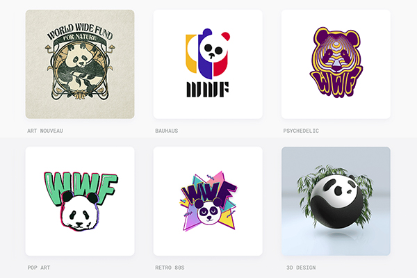
Image via Kapwing
As a key part of a brand’s identity, a logo must withstand the trials of time and competition to ensure that it keeps standing out. Some of today’s most iconic logos can be recognized at a glance, no names required.
To see if this success can be replicated even through different eras, the Kapwing team has recreated six of the most ubiquitous logos of today’s commercial landscape in six graphic design styles, arguably as iconic as these logos themselves are.
The chosen styles include Art Nouveau: an “elegant, sinuous, romantic style” prominent at the turn of the 20th century; Bauhaus: a style favoring “functionalism, geometrics, and space” popular in the 1920s; and 3D design: futuristic, colorful “playful renders,” to name a few.
And the logos themselves need no introduction: the chosen brands are Apple, Google, NASA, the WWF, Instagram, and McDonald’s.
Apple
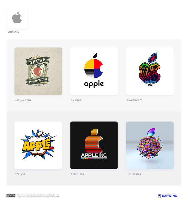
“Our art nouveau take on the Apple logo is not far from the brand's original 1976 artwork—a woodblock print of an apple gravitating towards Isaac Newton’s head with the words ‘Apple Computer Co.’ wrapped around it,” the design team states.
“But the Bauhaus version most clearly articulates Steve Jobs’ vision: clear, artistic—a tool to amplify your abilities.”
Google
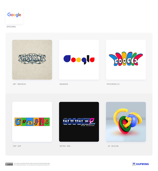
Google’s existing logo is simple enough that it “has allowed for infinite variations via the regularly-changing Google Doodle,” Kapwing points out.
“So, while none of our redesigns look implausible, the two that are most evocative are those that imagine Google in a realistic alternative timeline: either the vaporwave look of our dial-up era 1980s logo or the augmented-reality bubbles of the 3D version.”
NASA
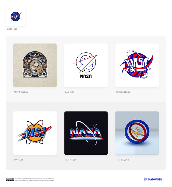
This logo is affectionately known both in and out of NASA as “the meatball,” the design team notes. However, it doesn’t mean that the old text-based “worm” logo, which served the brand between 1975 and 1992, goes forgotten.
“Our 1980s version imagines the best of both worlds: a meatball in the decade that gave us the bubblegum heroics of Explorers and Flight of the Navigator.”
WWF (World Wildlife Fund)
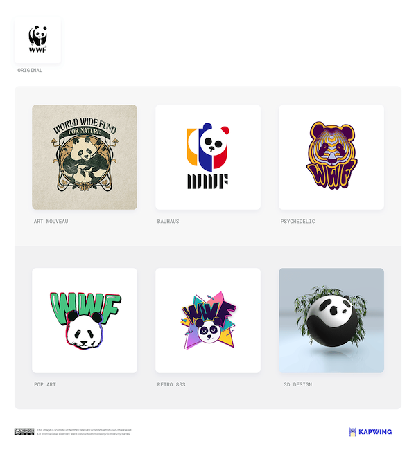
The simple black and white of the panda in the WWF’s logo is a “masterstroke of clear thinking,” the designers declare. While serving the “aww” factor that is bound to attract lingering eyes, the simplicity of the silhouette makes the logo flexible and, of course, recognizable.
“Our Bauhaus-style redesign of the WWF logo adds a splash of color while simplifying the form. And it maintains the cuteness without resorting to the child appeal of our 1980s version.”
But that 3D design version just looks so deliciously squeezable.
Instagram
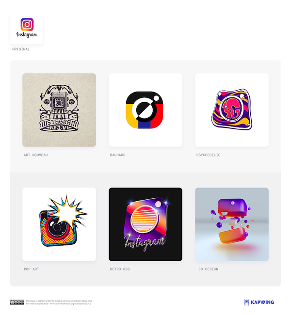
When Instagram began to redesign its iconic logo, taking the cream-colored camera to the gradient color palette that we know today, every staff member at the time was asked to draw the logo from memory.
“That gave us a sense of what was burned in,” said Ian Spalter, head of design, in a past interview with Fast Company. “The most difficult part was once you decide to move on from a beloved icon, how far do you go?”
What was “burned in,” as it turns out, was the simple but effective square-and-circle configuration that still stands front and center of the logo today.
McDonald’s
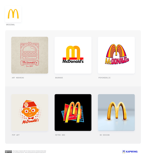
When we think of the mascot for fast food giant McDonald’s, perhaps the red-and-white painted face of Ronald McDonald will come to mind alongside the golden arches. But there’s another mascot that goes often unknown, and that is Speedee.
Placing emphasis on the “fast” in “fast food,” Speedee is a chef that’s made of a hamburger. Who is, presumably, cooking… hamburgers. “The ghost of Speedee haunts the rock ‘n roll quiffed burger boy of our 1950s pop art style McD’s logo,” Kapwing notes.
“But the versions that retain prominent arches demonstrate the power of a simple motif to conjure a brand's aftertaste in your mouth,” the team details.
The grand takeaway for logo designers, as the Kapwing team writes, is to “draw inspiration from style movements but remain boldly true to the brand.”
“It takes integrity and flair to create an icon that sears itself into the world's retinas.”
[via Kapwing]


