
M&M’s Brand Overhaul Unites All Colors & Quirks, In Candy & Humanity
We won’t go into the “progressive” shoe change of the green M&M. Instead, here’s a broader but overlooked part of the massive makeover that the brand has recently adopted.
Mars engaged creative agency Jones Knowles Ritchie (JKR) to help the “most colorful chocolate brand” represent the spectrum of lives everywhere, reflecting its wish for a world “where everyone feels they belong.” There was no way that could be done simply, so the studio worked on a flexible visual system that could be mixed and matched.
View this post on Instagram
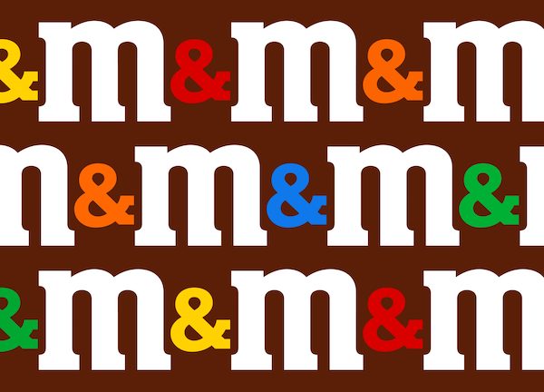
Branding agencies have long expressed the importance of going back to the company’s roots when planning an overhaul. This couldn’t be truer for M&M’s redesign—JKR fixated on the lettermark’s quintessential ampersand, now a symbol of unity larger than the friendship of founders Mars and Murrie.
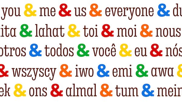
Another aspect that springs to mind when you think of M&M’s? Colors. Akin to the appearance of an assortment of M&M’s being poured out of a bag, the brand can, at any time, mix up the combination of hues.
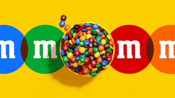
Each candy color is now part of M&M’s palette.
View this post on Instagram
Unifying these shapes and colors is an all-new bespoke typeface called ‘All Together’, containing a fun bag of weights and widths. The creative agency says the typography’s ink traps resemble smiles, while its ball terminals nod at the perfectly round shape of classic M&M’s.
View this post on Instagram
The lightweight candy pieces dance around in moments of shared fun. A new system of motion sees them “fall, spin, bounce, and roll.”
“At Mars we believe that in the world we want tomorrow, society is inclusive. And, as one of our most iconic brands, M&M’S is announcing a new global commitment to create a world where everyone feels they belong,” Mars shares in a press release. “M&M’S has been around for more than 80 years and this year the brand continues to evolve to reflect the more dynamic, progressive world that we live in.”
View this post on Instagram
[via Jones Knowles Ritchie and Mars, images via Jones Knowles Ritchie]


