
Nintendo’s Countless Rejected Wii Logo Designs Are A Rollercoaster
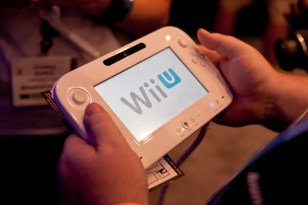 The final Wii logo. Photo 19890623 © Antonio Jodice | Dreamstime.com
You would think, with a simple three-letter name, the Nintendo Wii’s logo was a no-brainer. However, the truth is far from it—a newly-emerged copy of a Nintendo company handbook from 2007 shows there were at least 100 other (completely different!) versions.
A tweet by the Nintendo Memories account brings these rejected iterations to light. To distinguish the radical Wii console apart from the GameCube, Nintendo came up with numerous branding styles ranging from serifs to more abstract shapes.
Nintendo #Wii tentative logos from the NCL 2007 Company Book.
— Nintendo Memories (@NintendoMemo) January 27, 2021
"Wii beginning new era" 🙃
Nintendo Weiird 🤔 pic.twitter.com/uKGqC31DAM
The company appeared to experiment with the idea of the two letter i’s as characters quite seriously—a couple adorably envisioned the stick figures holding hands—though this was scrapped altogether.
It eventually settled for a pared-back sans serif with a power button—which might seem underwhelming now that you’ve looked at the brand’s design process—but the important thing is that it worked. Nintendo went on to sell 100 million Wii systems, which was almost five times the number of GameCube units sold.
Yeah... hands...
— revSPRTN (@revsprtn) February 8, 2021
some personal highlights for me include:
— mylesOS (@mylesdotapp) January 28, 2021
1) "who hired the guy who designed the sony vaio logo"
2) "hey apple can i copy your homework?"
3) wrr. ~wrr.~
4) "let's lean into the whole 'channel' thing" pic.twitter.com/9v4G4SXqPo
WHAT the hell is this pic.twitter.com/aUHPfydIO1
— The Weeniest YO HO HOI ðŸ³ï¸ðŸŒˆ (@SSJ3Goku90) January 28, 2021
This one's cute. They're holding hands â¤ï¸ pic.twitter.com/dGRu9G7lRH
— ♡ Wyvern ♡ (@wyvern_tail) January 28, 2021
I think it's solid but the main issue I see here is that someone might look at it and mistake it for wiii or wiiii or smth like that haha. Even if it sounds kinda out there, clarity and immediate recognizability are huge
— Ravioli (@Ravioli_510) January 28, 2021
[via Game Rant and ComicBook.com, images via various sources]


