
Barilla Hatches From The ‘Egg’ In New Visual Identity Marking 145 Years

Image via Robilant
Barilla says pasta la vista to the past with an all-new visual identity cementing its presence as Italy’s longest-standing global food company, as part of its 145th anniversary.
The vivid rebrand breaks out of the white egg-shaped bubble, a reference to egg pasta, to represent Barilla’s expanding position as a provider for foodstuffs beyond pasta. But Barilla hasn’t forgotten its roots—for the first time, its logo comes stamped with the reminder “Since 1877.”
The wordmark, designed by Italian brand strategy firm Robilant, is now encased in a deeper, sophisticated red. It also sports a more straight-edged typeface that the agency says not only enhances legibility but also reflects “a clearer, more assertive, and, above all, ‘timeless’ look.”
The metamorphosis also affects within. For sustainability, Barilla has ditched the plastic window on packaging for global markets—more specifically, the blue boxes stocked in countries other than the US, Canada, and Russia—which it says could eliminate 126 tons of plastic. As for why the other three markets aren’t adopting this change, a spokesperson tells Dieline that customers in these countries still rely on the see-through panel to help them decide on pasta types.
“This new visual identity and sustainable commitment brings the Barilla brand one step closer to the vision we have for the future: pasta as a sign of love not only for the people but also for the planet that can be achieved through small everyday changes,” details Gianluca Di Tondo, global chief marketing officer at Barilla, in a statement via Food Business News. “Today we celebrate our 145 years heritage, while adapting to the challenges of our time and evolving with people.”
Part of the celebration is the introduction of a new pasta range called Al Bronzo, which follows the traditional bronze-die pasta-making technique that ensures rougher textures and therefore greater ability to soak up sauces and flavors. To distinguish the selection from Barilla’s original products, Al Bronzo boxes will be decked in red instead of the famous blue.
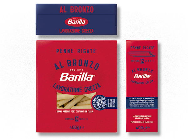
Image via Robilant

Image via Robilant
[via Dieline and Food Business News, images via Robilant]


