
NYC Pride Unveils New, Ever-Evolving Brand Identity That’s Always Inclusive
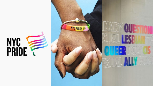
For over half a century, NYC Pride has marched in unity with the pride community, but the inconsistency in its branding hasn’t quite delivered its message of harmony. To project its story of inclusivity far into the future, its organizer Heritage of Pride tapped brand strategy firm Lippincott to design a visual identity that endures and adapts as the meaning of diversity continually evolves.
The face glitter that NYC Pride’s communication materials put on would vary according to the theme of the year. However, Heritage of Pride acknowledges that to raise awareness and encourage equality, it has to stay true to something more solid. Even though its voice is most reverberant at events, the nonprofit’s commitment to uplift the LGBTQIA+ community stays strong 365 days a year.
To reflect NYC Pride’s new brand purpose, “To inspire and empower every LGBTQIA+ person to proudly love and live their truth,” the branding studio developed a bold and direct design system with a flexible logo that supports “storytelling flexibility and inclusivity for different subgroups within the LGBTQIA+ community.”
View this post on Instagram
The base emblem is of the original rainbow Pride flag—deliciously constructed using the letters “NYC”—to honor the parade’s colorful heritage and roots. “The iconic Pride flag, which has become known as a universal symbol of safety, community, and allyship, is at the center of the identity, capturing the brand’s spirit of celebration and activism,” says Lippincott.
But the recent years have shown that there’s far more of the spectrum than the human eyes can see. As such, the logo has an adaptive gradient designed to be truly “progressive” and can take on colors of other pride flags, including intersex, trans, pansexual, bisexual, lesbian, nonbinary, gay, asexual, and polyamorous symbols. In time, it could embody more.
View this post on Instagram
“The idea is that this kind of diversity is additive,” Dan Dimant, Media Director at NYC Pride, explains in a statement published by Fast Company.
The brand identity is headlined with the ‘Knockout’ and ‘Gotham’ typefaces from foundry Monotype, both designed by NYC type design studio Hoefler & Co., as a nod to the brand’s home city.
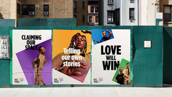
Image via Monotype
“The enduring fighting spirit of ‘Knockout’, with its roots in the eclectic typography of 19th-century broadsides, perfectly counterbalances the friendly openness of ‘Gotham’, a contemporary take on a style of sign lettering that is quintessentially New York and whose elemental forms were made to express as broad and inclusive a range of voices as possible,” Monotype tells DesignTAXI in an email.
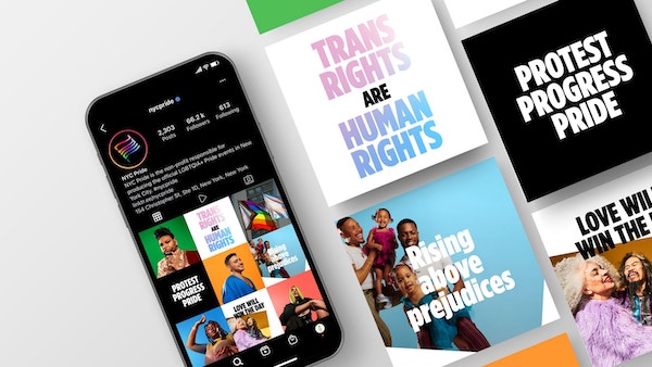
Image via Monotype
“The refresh reinforces NYC Pride’s commitment to inclusivity and its heritage of uplifting the LGBTQIA+ community, while setting a foundation for growth as it works towards a future without discrimination… It lends the brand flexibility to consider tone and context, dialing up exuberance when needed in celebratory events throughout the year, but also leading with a strong, clear voice in moments of reflection and protest,” says Lippincott.
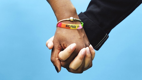
Image via Monotype
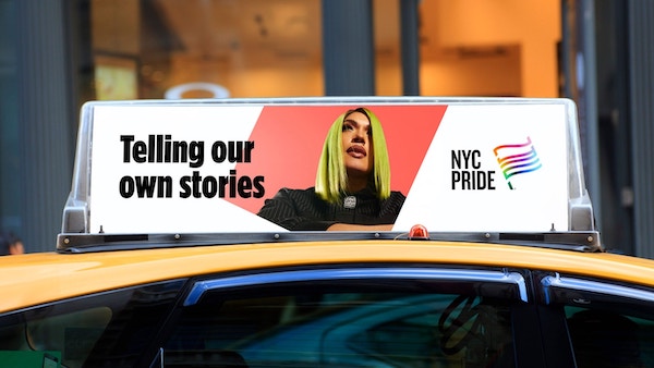
Image via Monotype
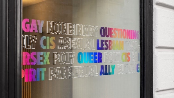
Image via Monotype
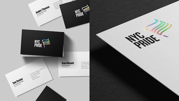
Image via Lippincott
[via Monotype, Lippincott, Fast Company, images via various sources]


