
Google Releases Free Serif Font Designed For Reading Over Long Periods Of Time
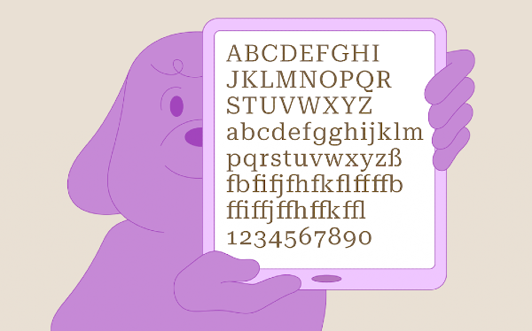
Image via Material.io
Serifs are sorely misunderstood and often have a bad rep for being “hard to read,” so when designers zero in on legibility, they’ll typically pick out sans-serifs like Arial and Helvetica. That means they’re missing out on all the elegant typefaces that have been making a comeback of late.
Google has debunked that myth with the introduction of ‘Roboto Serif’, the latest member of its beloved Roboto superfamily and just one of the thousands of free web-friendly resources it is offering on the Google Fonts treasure trove. The versatile serif is optimized “to make reading more comfortable at any size, in any format.”
Image via Material.io
With Roboto being Android’s system font, Roboto Serif will now join the operating system too. The tech giant notes that since people around the world spend an average of seven hours per day staring at their phones, they’ll need to be looking at a comfortable font to sustain this routine.
According to 9to5Google, the company appears to have completed the font last year but is only announcing it now. The project was commissioned to type designer Greg Gazdowicz of Commercial Type.
The designers found that it wasn’t essential to cling onto all the usual traits of serifs, so they hand-drew every letterform from scratch and kept things simple.
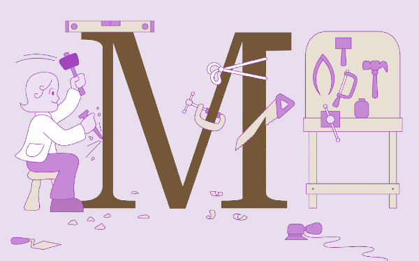
Image via Material.io
“We wanted it to feel comfortable next to a sans-serif, and not to feel cluttered. It doesn’t need to have serifs everywhere to drive home the point that, ‘I am a serif and have serifs in all the places serifs go,’” says Google UX designer Rob Giampietro, who was one of the people involved in the creation process.
Roboto Serif is a variable font with a full spectrum of weights (100–900), widths (condensed, regular, and extended), optical sizes (eight–14), and grades (-50–100), making it adaptable not just for digital screens of all sizes but also for print formats.
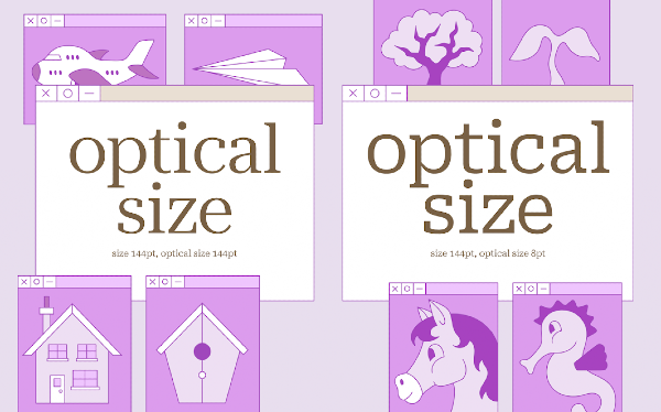
Image via Material.io
“Our aim has been to make a typeface that you could use for long-form journalism or a novel—something very long and involved; an immersive piece of text that you read on your phone—without wanting to complain about it,” explains Gazdowicz.
The font is free for personal and commercial use under the Open Font License, and you can check it out here. There’s also a neat handbook demonstrating Roboto Serif’s full range of reading applications, which you can find here.
[via TechRadar and 9to5Google, images via Material.io]


