
Did You Know: The Domino’s Pizza Logo Is A Rollback To Its Small Beginnings
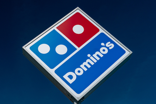
Photo 186287568 © Ken Wolter | Dreamstime.com
It’s no secret that the boxy Domino’s logo is resemblant to a pizza box, or that those little squares are, well, dominoes.
But did you know that somewhere in there is a slice of humble pie that calls back to the 1960s?
When brothers Tom and James Monaghan acquired a small pizzeria in the 1960s, they were hoping to retain its original name, DomiNick’s, after its former owner Dominick DiVarti. However, this was against DiVarti’s wishes, so the brothers had to come up with a new moniker.
It was one of their pizza delivery guys who had coined the Domino’s name. It resonated with the founders as Domino’s sounded close enough to DomiNick’s, which meant the brand would still establish some familiarity among the old restaurant’s regulars.
The first Domino’s Pizza logo, designed in 1965, wasn’t too different from the domino-inspired symbol today. It also had two dots in one square and one dot in another.
Those three specks, as it seems, are central to Domino’s roots. As shared in a recent piece by The Sun, citing Inkbot Design, Tom Monaghan used the dots to symbolize every Domino’s restaurant. At the time, there were three outlets, and the founder’s intention was to keep adding a new dot for every branch he opened.
The company grew exponentially from there, and all plans to add to the dominoes were scrapped.
About 40 years on, Tom Monaghan revealed to CNN in an interview: “I decided we’d put three dots on the Domino because we had three stores, and every time we added one, we’d add a dot.”
“You can see I wasn’t thinking of a national chain back then.”
In hindsight, stopping at three was the only way to go. Not only would it be excruciatingly time-consuming and expensive to match a dot to every restaurant (there are now more than 18,300 of them in the world!), but sticking to a simple design ensures the logo is distinguishable and scalable for all sorts of formats.
[via Inkbot Design, The Sun, Logaster, cover photo 186287568 © Ken Wolter | Dreamstime.com]


