
Grubhub’s New Logo Is Too Alike Kroger’s Food Branding, Judge Warns
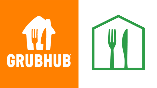
Images via Grubhub and Home Chef
A US Magistrate Judge has cautioned Grubhub that its logomark looks too close to the trademark of meal kit and food delivery service Home Chef, a subsidiary of Kroger, and recommends that Grubhub tweak it. Although Grubhub isn’t currently being forced to do something about the design, it’s certainly not savoring this suggestion.
The new Grubhub logo, unveiled last August, features a fork and knife in a pentagon shaped like a house, against an orange background. It’s a significant departure from its red wordmark, but Crain’s Chicago Business reports that the company made the switch to unify with the visual identity of its new owner, Just Eat Takeaway.
Grubhub’s previous logo. Image via Wikipedia (public domain)
Unfortunately, a logo like that already exists in the food delivery space. Home Chef’s emblem also sports a fork and knife, laid out in the same orientation, in a pentagon house.
Home Chef sent a cease and desist letter to Grubhub in September, but the two Chicago brands couldn’t find a common ground, so they took it up to court.
According to Home Chef, it had heard from several consumers and suppliers who were confused by Grubhub’s redesigned logo.
Grubhub tried to convince a Chicago federal court that its new logo did not violate Home Chef’s trademark rights. In the latest of the dispute, though, US Magistrate Judge Jeffrey Cummings sided with Home Chef and said the Grubhub motif was uncanny enough to confuse consumers.
The judge proposed that Grubhub amend its logo to avoid further conflict.
Grubhub thinks the decision is in bad taste, and it is considering an appeal. The company says it will present its objections in court for another review.
[via Crain’s Chicago Business, images via various sources]


