
Warner Bros. Discovery Replaces ‘Initial Logo’ Ridiculed For Resembling WordArt
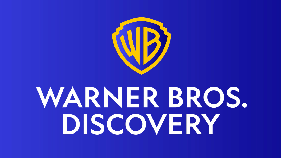
The new Warner Bros. Discovery logo. Image via Chermayeff & Geismar & Haviv
Earlier this month, WarnerMedia and Discovery finalized their merger to become Warner Bros. Discovery. People already saw this coming, having had the memory of the brand’s “initial word mark” imprinted on their minds.
The networks announced the business decision back in June 2021, sharing a logo (shown below) that combined both their names. With its 3D appearance and metallic sheen, viewers couldn’t help but compare the look with something made from Microsoft Office’s WordArt tool.
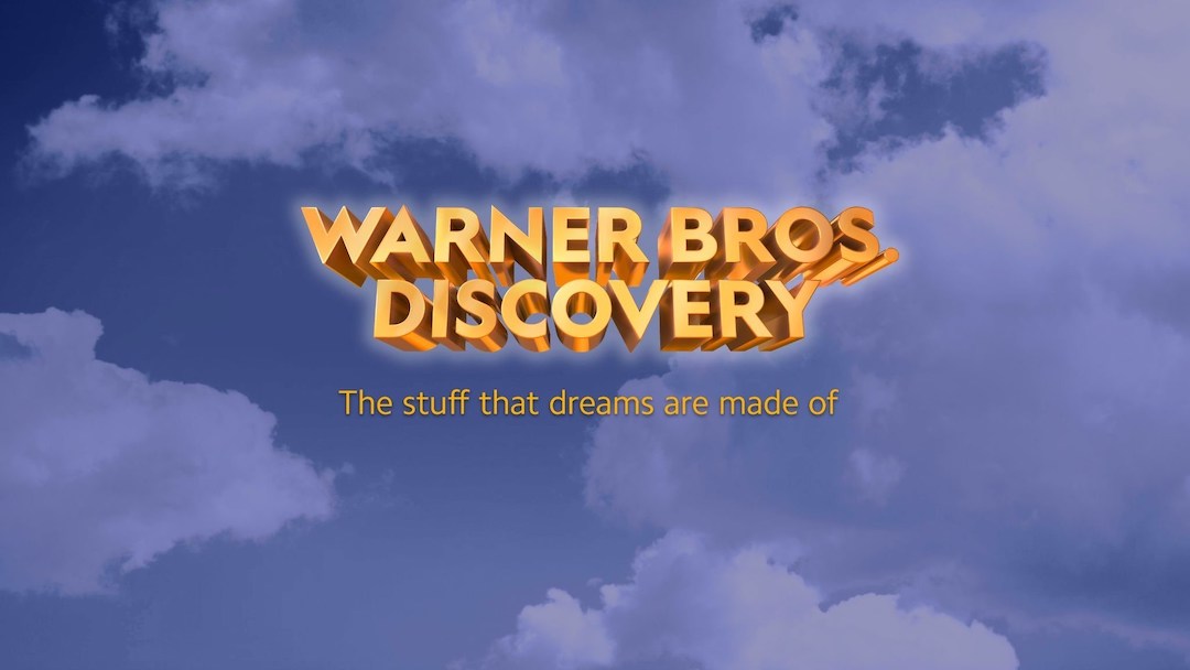
The “initial wordmark.” Image via Warner Bros. Discovery / PR Newswire
Warner Bros. Discovery explained that the branding was just an “initial wordmark” and more of a visual representation of the newly-formed network’s values than anything.
With the official launch of Warner Bros. Discovery, the company revealed a simplified visual identity that did away with all the elements that the public so expressively detested. The new branding—based on the 1948 shield—was produced by famed graphic design firm Chermayeff & Geismar & Haviv, which had no part in the initial wordmark.
The branding studio wanted to honor Warner Bros. Studio’s cinematic roots, and retrieved the archival blue and gold color scheme to be renewed for the modern era. The palette was blue-washed by former owner AT&T when it acquired Time Warner in 2018.
The Warner Bros. Discovery family has a shared heritage of storytelling, and this aspect is intended to shine through in the new emblem. That’s what makes it stand out from other streaming giants, who have instead adopted more abstract logos, Sagi Haviv, a partner of Chermayeff & Geismar & Haviv, tells Fast Company.
Video via Chermayeff & Geismar & Haviv
With that being said, it was important that the branding wasn’t too stuck on its nostalgia. The design studio describes the revamp as “a distillation of the classic 1948 Warner Bros. shield,” bringing to mind the company’s cinematic creativity, all while leaving its baggage in the past.
For a look that carries across contemporary screens, Chermayeff & Geismar & Haviv redrew the shield, and lightened the weights of the W and B initials so they’d unify with the lines of the shield.
This badge represents a whole enclave of entertainment businesses including the Discovery Channel, Warner Bros. Entertainment, CNN, DC, HBO, Cartoon Network, Animal Planet, and Food Network.
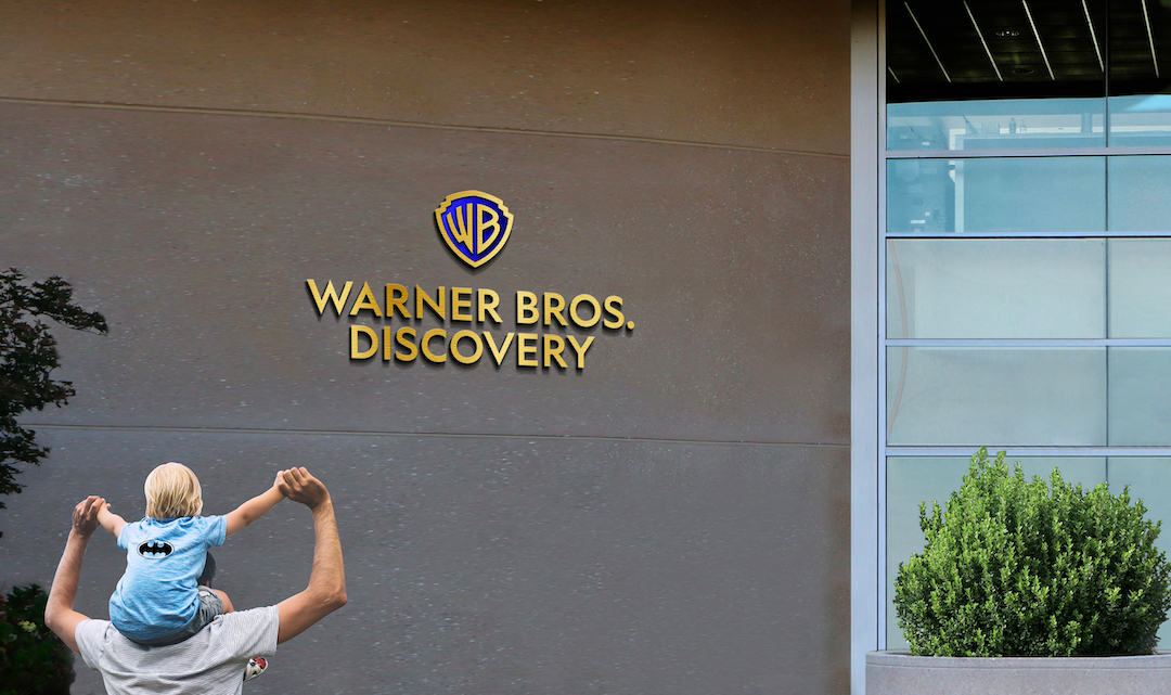
Image via Chermayeff & Geismar & Haviv
Video via Chermayeff & Geismar & Haviv
Video via Chermayeff & Geismar & Haviv
[via Fast Company, Variety, Chermayeff & Geismar & Haviv, images via various sources]


