
Magnolia Bakery Bakes Up Sweet Makeover, Finishes It With Trademark Swirl
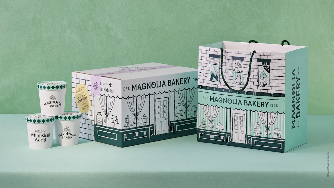
Image courtesy of Jones Knowles Ritchie
Magnolia Bakery has a new flavor of visual identity, and it’s not vanilla. In a bid to future-proof its business, the beloved American cupcake shop has adopted charming branding reminiscent of its interiors and ingredients.
The bakery enlisted creative agency Jones Knowles Ritchie (JKR) to give it a makeover, or bakeover, in a way that its sweets could rise from just a “New York treat to an anywhere eat.”
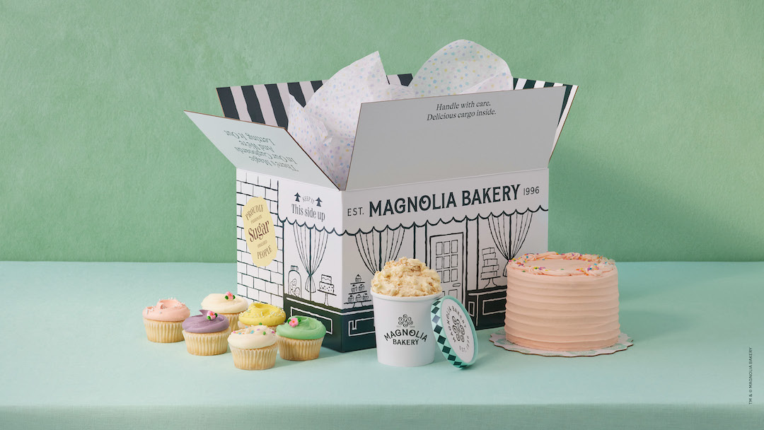
Image courtesy of Jones Knowles Ritchie
A whimsical shipping box is envisioned as a miniature, illustrated bakeshop reminiscent of the one on Bleecker Street, bringing the location “right to your door,” a spokesperson says.
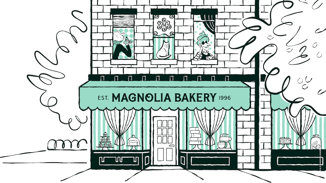
Image courtesy of Jones Knowles Ritchie
Save room for dessert, because the logo’s got some sweet touches. It’s accented with what looks like the brand’s cupcake swirl, a feature that takes up to 40 hours to master. The branding additionally re-enacts “the live theater of the bakery—mixers spinning vanilla cake batter, cupcakes being iced and banana pudding being scooped,” JKR tells DesignTAXI.
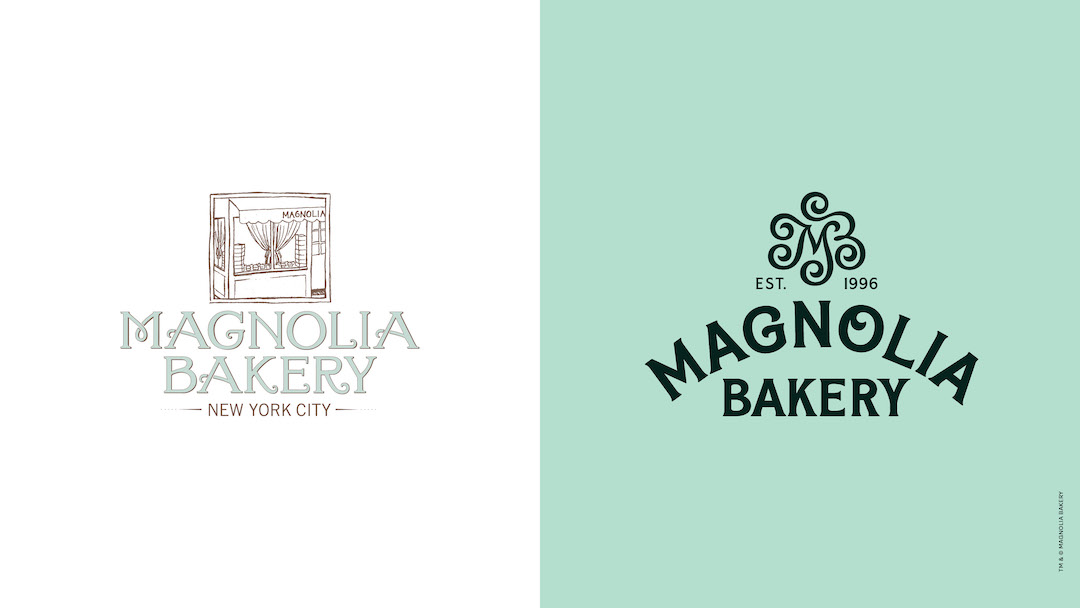
Old logo (left) VS redesigned logo with new color palette (right). Image courtesy of Jones Knowles Ritchie
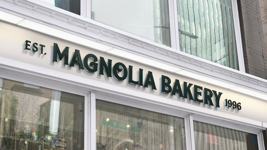
Image courtesy of Jones Knowles Ritchie
Elsewhere, Magnolia Bakery’s palette is iced in a similar shade to the green on its walls, while colorful sprinkles and other well-loved desserts inspire the other hues.
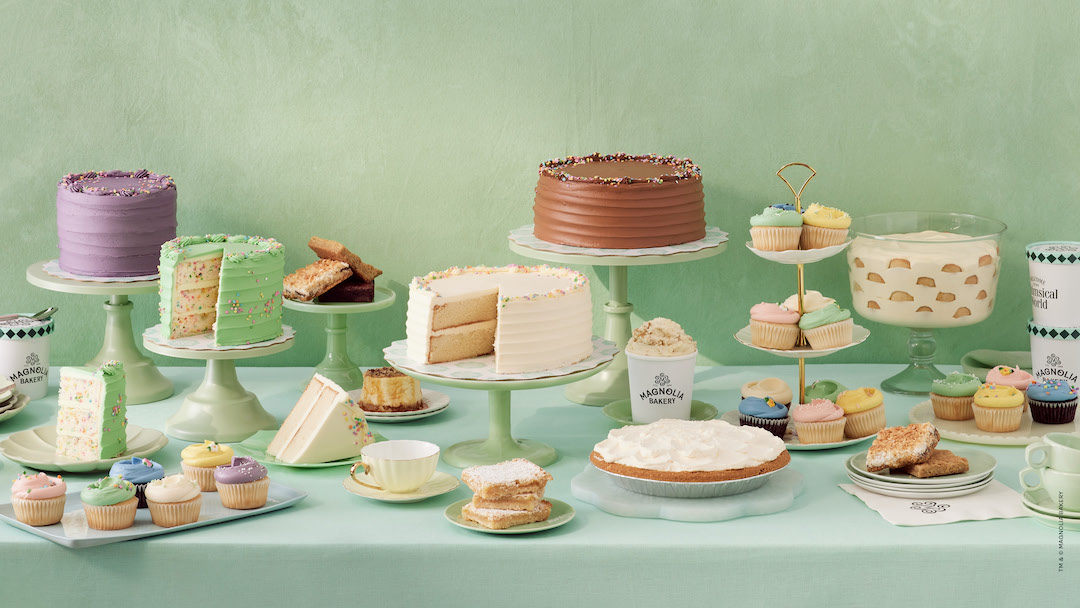
Image courtesy of Jones Knowles Ritchie
The new visual identity will be rolled out across packaging, store refreshes, and digital channels over the next few months.
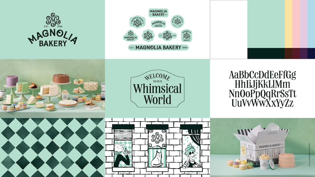
Image courtesy of Jones Knowles Ritchie
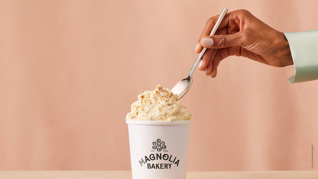
Image courtesy of Jones Knowles Ritchie
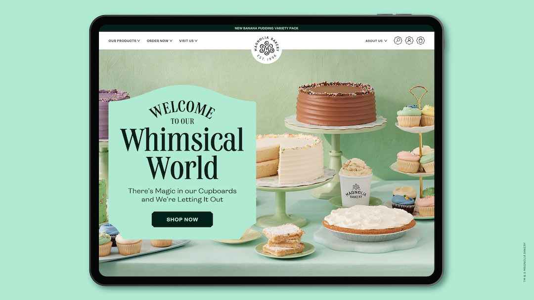
Image courtesy of Jones Knowles Ritchie
[via Jones Knowles Ritchie]


