
‘Avatar’ Kills ‘Papyrus’ In Sequel’s Logo But It’s Still An Eyesore To Designers
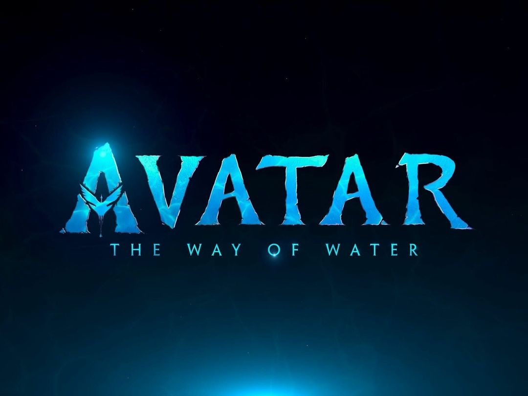
Image via Avatar
James Cameron’s 2009 Avatar was a blockbuster hit, and matching that acclaim in notoriety was its logo, which used the polarizing Papyrus.
The display was so jarring to some, in 2017—close to a decade after the film premiered—Saturday Night Live ripped it apart in a sketch starring Ryan Gosling, a man haunted by the production’s typographic choice.
“He just got away with it,” Gosling’s character grieved. “This man, this professional graphic designer. Was it laziness? Was it cruelty?”
A year later, 20th Century Studios quietly replaced the typeface on its social media channels. The revamp has since been carried forward with the official announcement of the second movie, Avatar: The Way of Water.
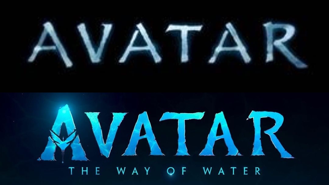
Old logo (above) VS new logo (below). Images via IMDb and Avatar
While audiences might be relieved that the old Papyrus look is gone, some creative professionals are immediately unsettled by another detail.
It’s not the typeface they’re worried about, but the font. For context, typefaces are identities like Helvetica, Arial, and Times New Roman. Fonts are the styles of those typefaces—like the styles, widths, and, weights.
In particular, designers are irked by the kerning—what a layperson calls spacing—between the last two letters, which makes the ‘A’ and ‘R’ look disproportionate to the rest of the title.
Well, they didn't use Papyrus, but they DID still forget to kern. Come on, y'all - these are billion dollar movies! https://t.co/MaemvHc8ye
— Kyle T Webster (@kyletwebster) April 28, 2022
As a result, the logo reads as “AVATA R” to some.
Hey, AVATA R logo designers! Did you know that in Adobe Design programs that if you put your cursor in between two letters, hold the option key, and tap the left or right arrows it’ll adjust the KERNING? You can do the same trick by highlighting the whole word. Give it a shot! https://t.co/sUy5w8TL9F
— Dane (@monkeyminion) April 28, 2022
I can’t wait to see Avata R!
— mark englert (@markenglert) April 28, 2022
We need @RyanGosling to reprise his brilliant, type-obsessed SNL role. This time…on kerning. #avata #r https://t.co/QIaiWZhMdY
— Dan Cederholm (@simplebits) April 28, 2022
But Avata r, Schmavat r, because there’s at least one person who would rejoice over this redesign.
Ryan Gosling, seeing the lack of papyrus in the AVATAR 2 logo. pic.twitter.com/hHYQ3nh6zy
— 🇺🇦 Harris Dang aka Critic Name 🇺🇦 (@FilmMomatic) April 28, 2022
[via UNILAD and The Independent, images via various sources]


