
Kellogg Isn’t Famed For Snacks. Will This Redesign Pack The Flavor It Needs?
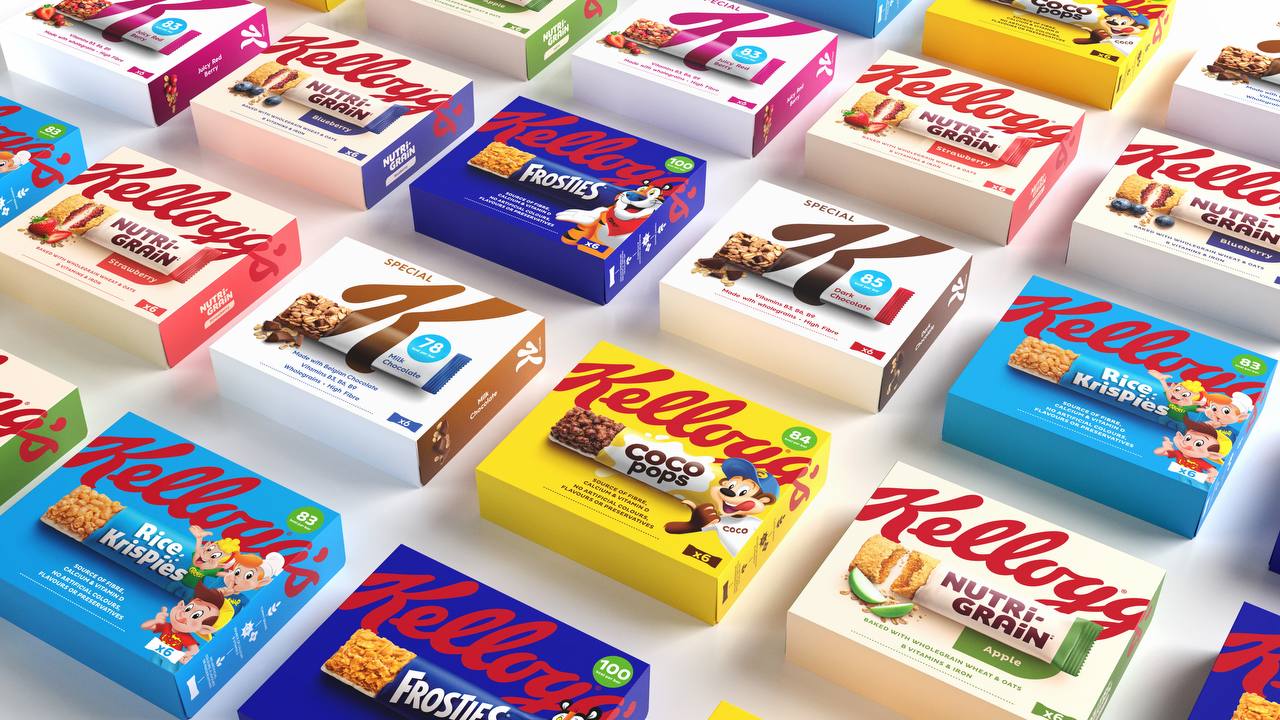
Image courtesy of Landor & Fitch
Kellogg is leading in the cornflakes department, and while that’s something to write home about, it also means there are other areas it’s *puts on Tony the Tiger voice*… not so grrreat! in.
Part of this is due to the lack of uniformity in design across Kellogg’s snack range. Without dominant branding, the packaging just doesn’t pack the punch it needs to stand out on shelves.
For added crisp, Kellogg turned to brand consultancy Landor & Fitch, the same studio that redesigned its cereal boxes back in 2019.
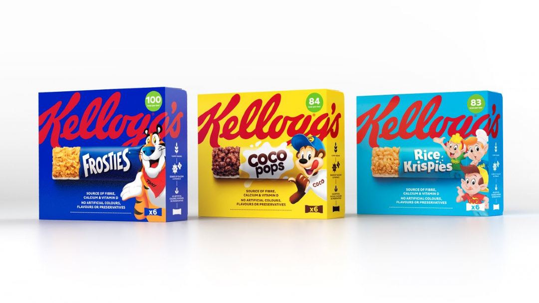
Image courtesy of Landor & Fitch
The Kellogg wordmark has been enlarged and now takes up the better half of the snack packaging for greater prominence and recognition.
Each product box takes on the color of its powerbrand—such as Coco Pops or Rice Krispies—or variant, but the vibrant Kellogg or Special K logos are consistently stamped at the top for easy navigation.
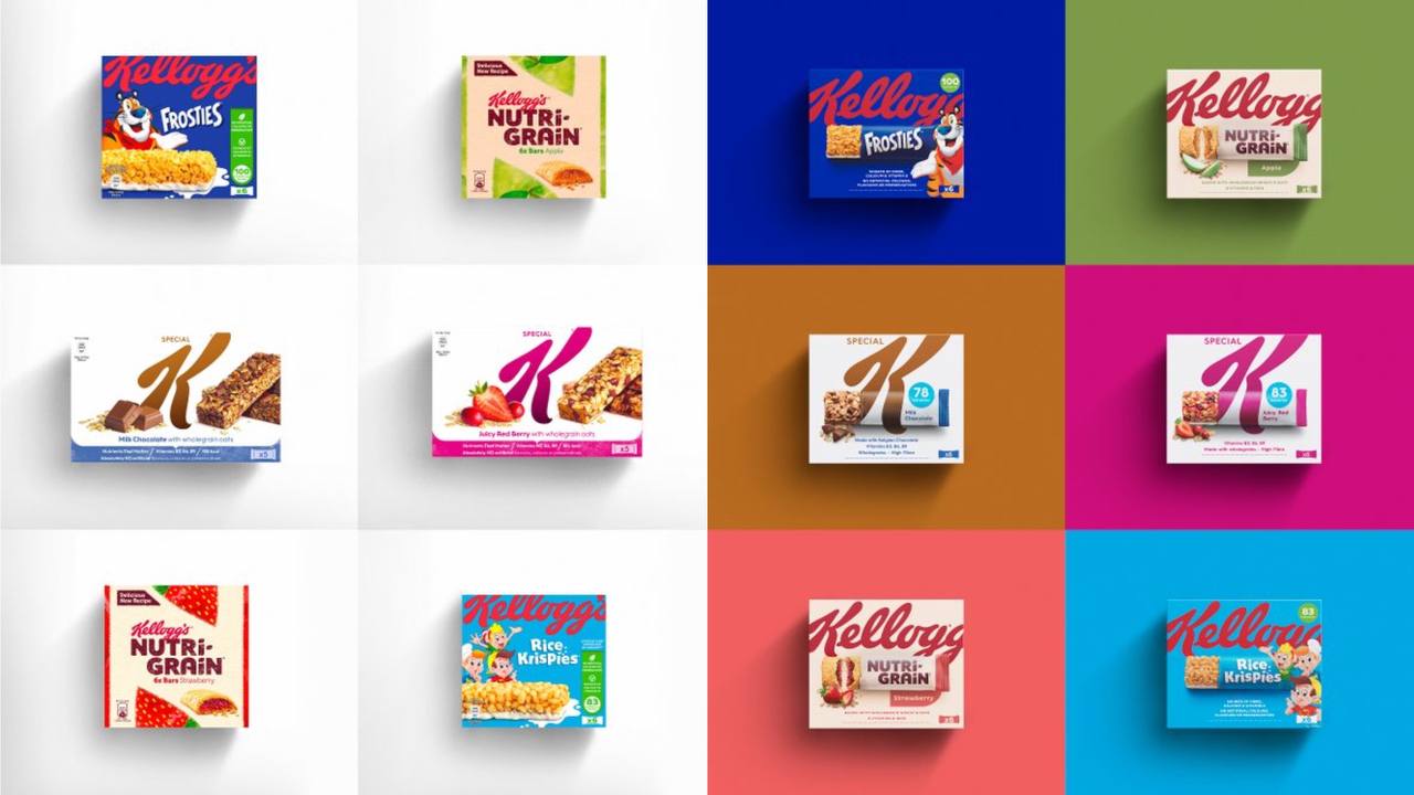
Previous designs (left) VS the new designs (right). Image courtesy of Landor & Fitch
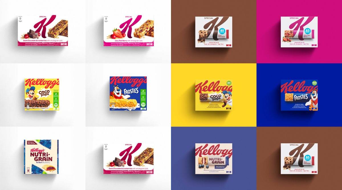
Previous designs (left) VS the new designs (right). Image courtesy of Landor & Fitch
Each snack bar pack is fronted by a “ripped-open” bar, allowing consumers to recognize its contents immediately while also maximizing what little space the box provides.
Image courtesy of Landor & Fitch
“Working within Kellogg’s design process, we developed a new and balanced design system for a very complex brand hierarchy across its snacks portfolio,” says Tristan Macherel, Global Executive Creative Director at Landor & Fitch, in a press release. “The refresh positions Kellogg as the bold leader in snacking, reclaiming and reinforcing its iconic status while also celebrating each product.”
The new packaging system has made its way across markets including the UK and Ireland, Benelux, France, Italy, Portugal, Spain, and the Mediterranean region.
[via Landor & Fitch, images provided]


