
CNET Unveils Sci-Fi-Esque Rebrand That Channels Tech In Everyday Life
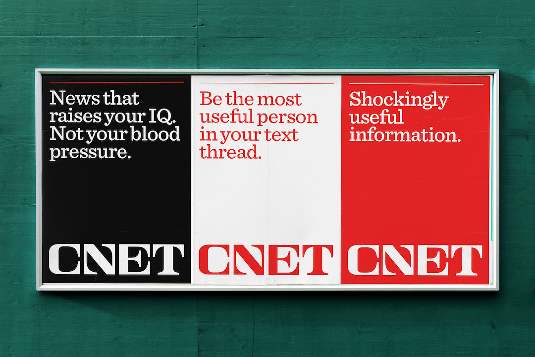
Image via CNET / PR Newswire
While the technological world kept blossoming, the CNET logo remained consistent. It was the same branding that greeted early adopters of the internet back in 1994, and it was the same when Mark Zuckerberg introduced the metaverse into the mainstream.
In the last 28 years, the tech publication witnessed the rapid metamorphosis of the digital world and how easily it has permeated people’s daily lives. Everything we breathe and do these days is tinged with technology. It was about time CNET shed off its reviews-for-geeks image to one that embraces the omnipresence of technology.

Old logo (above) VS new logo (below). Images via CNET / PR Newswire
The website enlisted branding agency Collins to shift its visual identity to one that embodies being editorial-first. The revamped logo is a huge jump from the lowercase sans-serif wordmark that’s been around for nearly three decades—each letter in the new serif branding curves to fit into a square, a visual metaphor for trust and reliability.
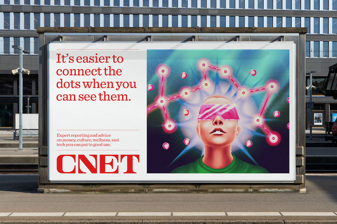
Image via CNET / PR Newswire
The retrofuturistic logo, straight out of science-fiction films, also calls back to the days of nonpartisan broadcast journalism in the 1950s through 1970s. It’s CNET’s way of telling audiences how it is separating itself from today’s “clickbait factories.” For this to be apparent, the emblem couldn’t be like any of those reblands.

Image via CNET / PR Newswire
A new bespoke slab serif, called ‘Sentinel’, is perhaps the only link to the previous slab-serif logo. It’s both “authoritative and friendly”—two components essential to trust. Importantly, the typeface remains legible in spite of display size.
View this post on Instagram
Cementing CNET’s reformed identity are surreal illustrations by artist Robert Beatty. The imagery is deliberately out of touch with reality, being open to interpretation instead of mirroring consumers’ lives.

Image via CNET / PR Newswire

Image via CNET / PR Newswire
[via It’s Nice That, Creative Review, Collins, images via CNET / PR Newswire]


