
Citroën Introduces Fresh Brand Identity That Harks Back To 100-Year-Old Logo
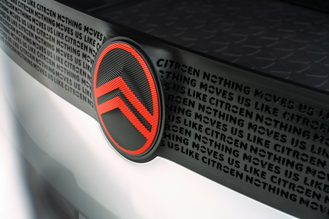
Image via Stellantis
To speed into the future, Citroën went back to its roots to remember where it all started. The result is a new logo that’s a near-carbon copy of the very first branding the company adopted when it launched in 1919.
The French automaker has made 10 major overhauls to its brand identity in its 103 years. Although distinct from one another, each version brings Citroën’s first-of-a-kind ‘herringbone’ gear systems to center stage with iconic double chevrons (officially known as “deux chevrons”).
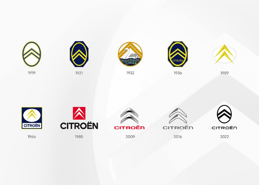
As you can see, the latest iteration goes full circle, reviving the vertical oval frame of the original. To accommodate modern displays, however, the chevrons are now more pronounced, with the loop softened. Citroën has additionally polished its typography to match the lightweight wordmark.
The “new but familiar” look denotes the soul-searching Citroën undertook to get in touch with, and renew, its earlier objectives. “As we look to clarify our future focus, it was logical for us to close the loop by coming back graphically to André Citroën’s first logo which represented the genuine promise of affordable and innovative mobility for all,” explains the company’s Global Brand Designer Alexandre Revert in a press release.
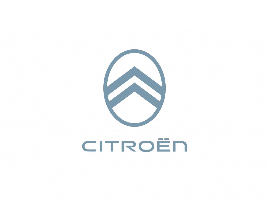
Notably, the old-but-new emblem also borrows from non-automotive industries that have friendlier images. Elements from beauty and apparel branding, among others, lend warmth and intimacy for an aesthetic that’s “easy on the eyes when experienced in different settings.”
The new color palette retains the classic white and cold gray to serve as “a basis of serenity and easiness” but introduces two additional hues. There’s ‘Monte Carlo Blue’, a legacy tone seen on signature cars like the 2CV and DS; and an energetic ‘Infra-Red’ to bring dynamic contrast in print, physical, and digital applications.
“Our new identity is an elegant symbol of progress as we move our customers physically in daring, forward-looking vehicles that challenge traditional industry rules, and emotionally by ensuring their entire experience—particularly going electric—is more affordable, comfortable and enjoyable whatever their wants and needs,” describes CEO Vincent Cobée.

The revamped Citroën logo will make its first appearance on a concept family vehicle set to debut in end-September, and official cars with the new symbol will begin rolling out from mid-2023. Accompanying the makeover is the new tagline, “Nothing Moves Us Like Citroën.”
[via Carscoops and Top Gear, images via Stellantis]


