
Audi Flattens Its Logo To The Bone To Make It More Distinct On The Road

Image via Audi
Audi likes its classic branding so much, it continues to put four rings on it for the new one (thanks for the timeless metaphor, Queen Bey!). In other words, the all-new logo will look pretty much the same to the uninitiated.
In truth, the already simplified interlocking rings from 2016 have become even flatter, with the company sanding the chrome off the insignia on cars in favor of monochrome. The all-new Audi emblem features four white rings in a black rim, with the aim of making it stand out across all screens and applications from a distance—“whether in a magazine, on your smartphone, or a billboard—and on or inside the car,” describes designer André Georgi in a press statement.
“We believe that we have found the ‘new chrome,’” notes Georgi, adding that the black and white will offer an “unmistakable” quality to Audi’s corporate identity. “The thin black border around the rings makes for a consistent, premium-quality appearance, regardless of the car’s paint or radiator grille color.”
In the words of Audi’s head of design Marc Lichte, “good design is less design.” That explains why the carmaker hasn’t made too many changes to its visual identity throughout its lifetime, retaining the rings that signified the union of four German automotive companies—Audi, DKW, Horch, and Wanderer—into one Audi in 1932. The reduced badge also harmonizes with the 2D mark that has fronted the brand’s social channels for years.
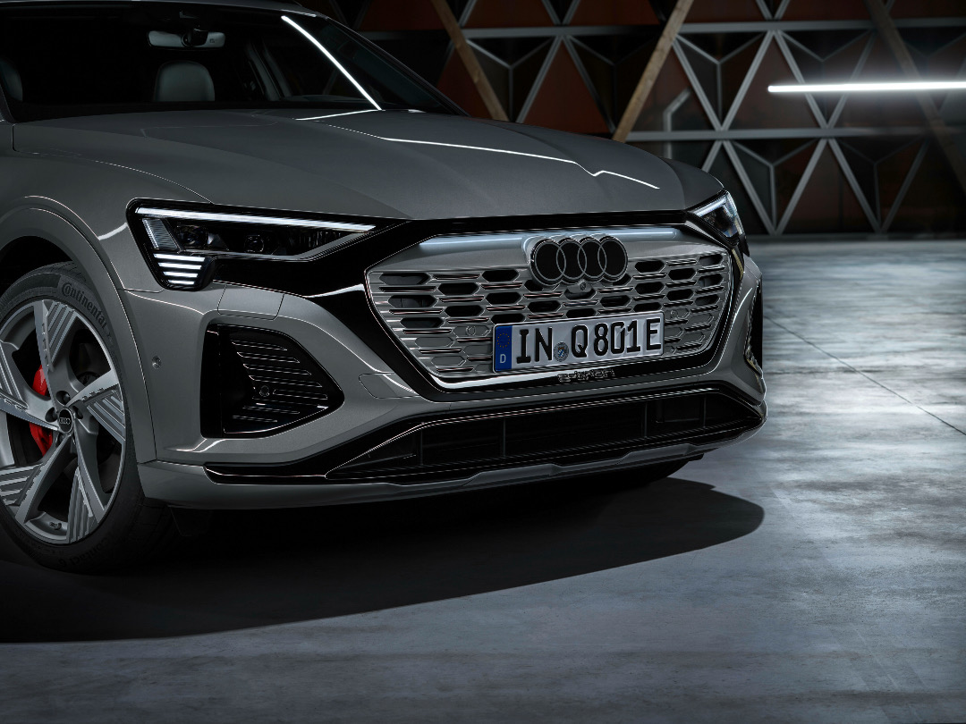
Black and white may be a classic, but not every driver will want to stand out on the road. As such, those who prefer a more understated look can still ask to swap out the white rings with dark gray ones on their cars, says Audi.
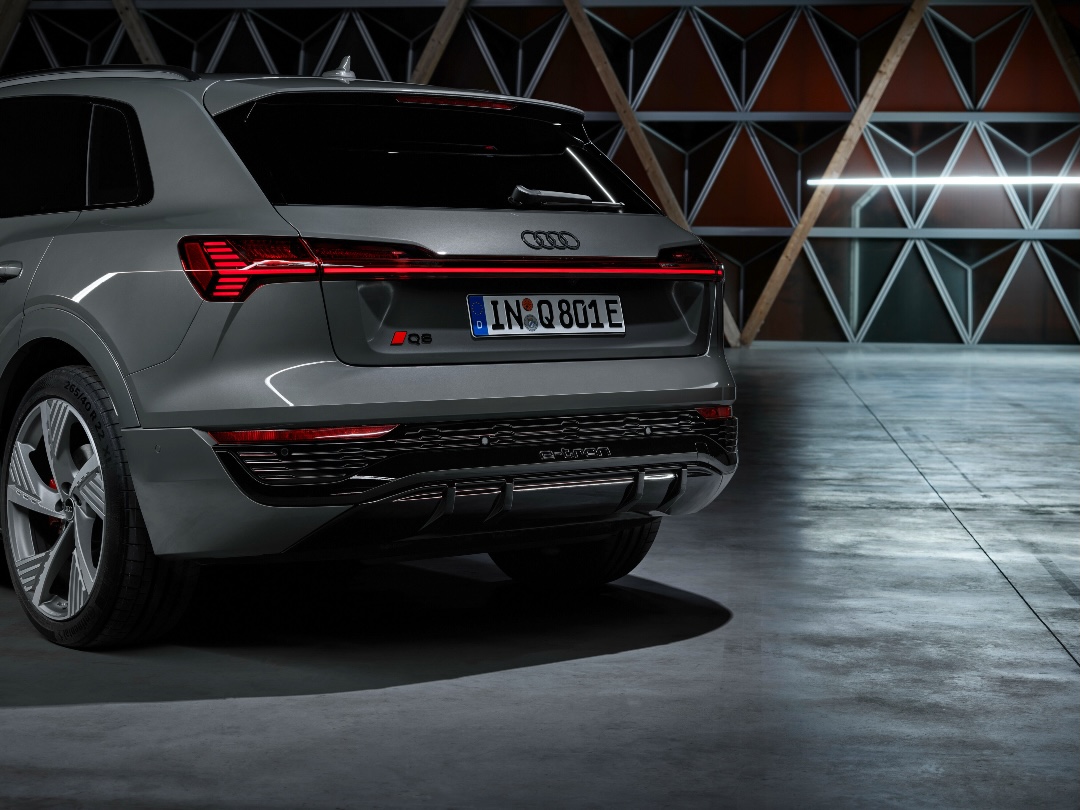
To pair with the barebones makeover, Audi has introduced a new bespoke typeface, called ‘Audi Type’, to standardize the text found outside and inside its vehicles.
The symbol will first debut on the 2024 Audi Q8 e-tron family.
[via Car and Driver and Jalopnik, images via AUDI AG]


