
Shake Shack Celebrates Reunions Across The World With 2022 Holiday Packaging
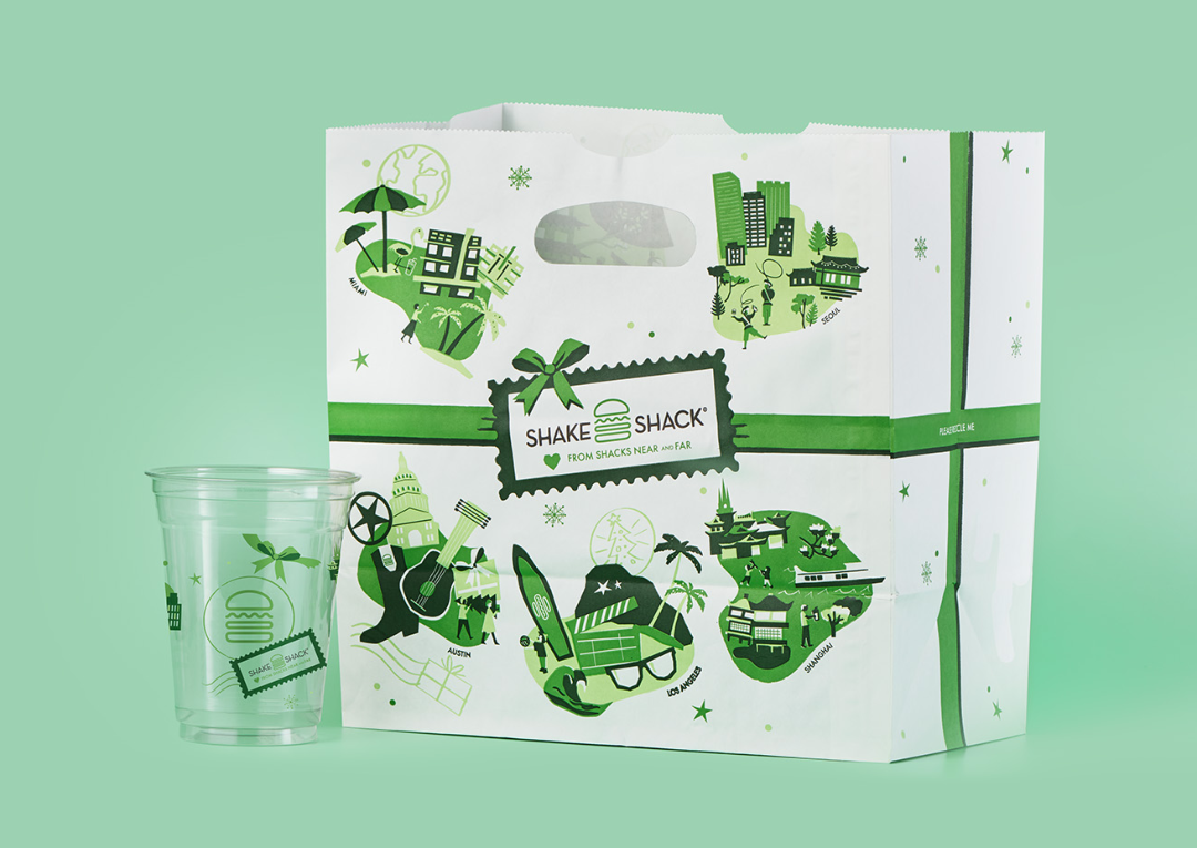
Image courtesy of Shake Shack, featured with permission
Snowmen, festive sweaters, and gingerbread characters have had their chance to shine. This year, Shake Shack is going straight to the heart of the holiday spirit: reconnecting with loved ones near and far. The past couple of years have proven that distance does make the heart grow fonder, making get-togethers in 2022 all the more special.
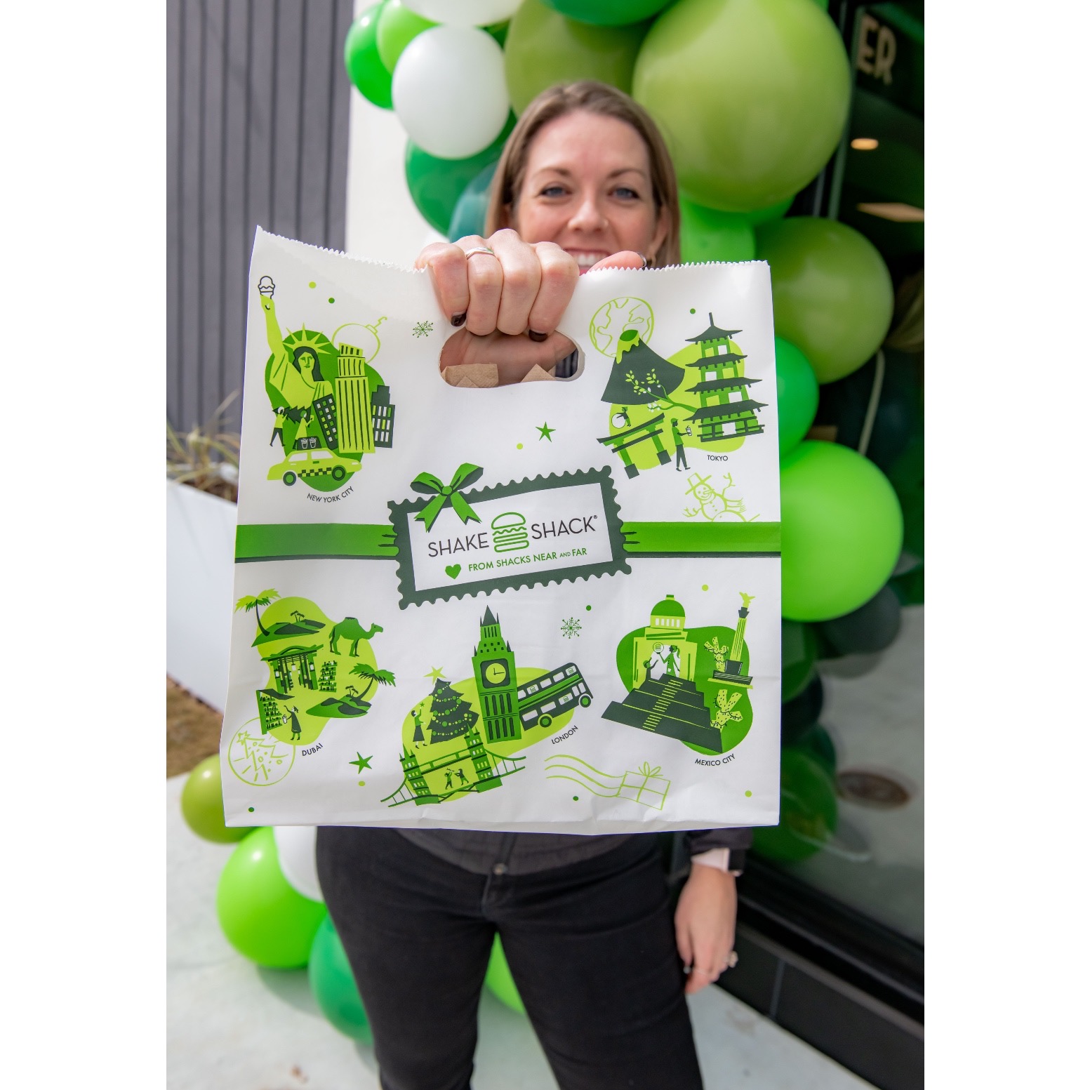
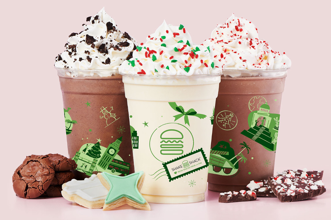
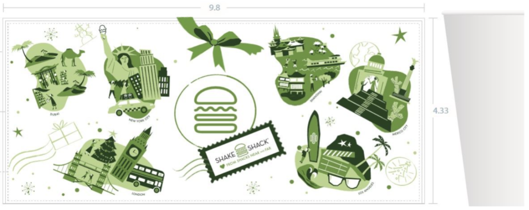
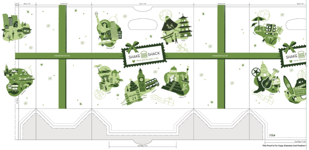
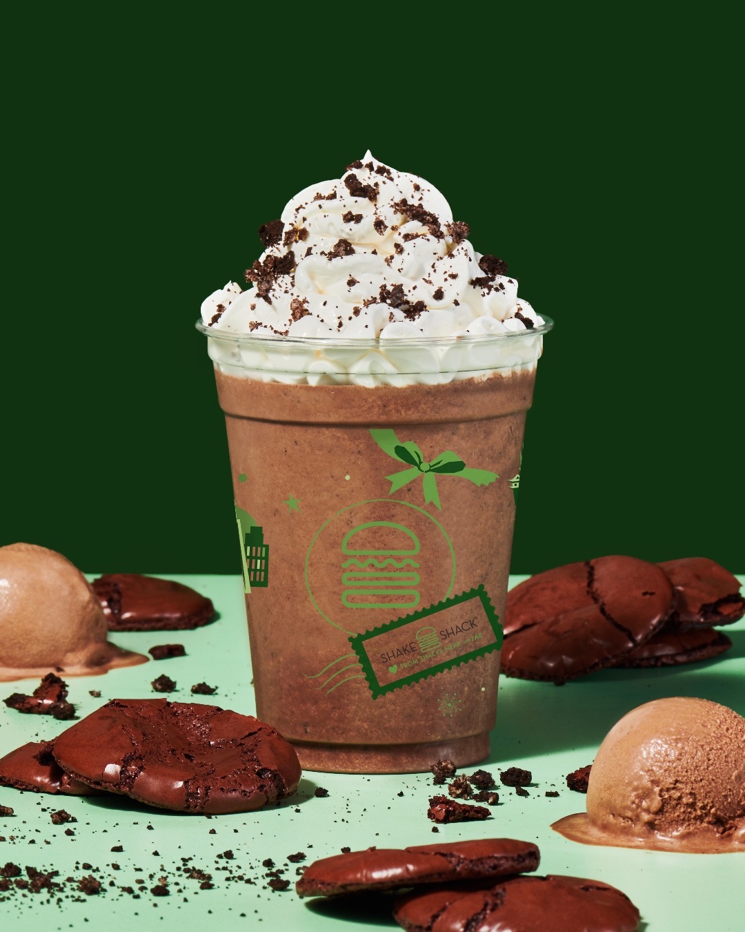
The burger joint reunites friends and family across borders on its new holiday takeout bags and cups with cityscapes of some of its locations around the globe, from Shanghai to Miami.
The striking seasonal work is also a testament to the brand’s expansion through the years: What began as a hot dog cart in New York has since, for the lack of a better word, snowballed into a fast-casual restaurant chain adored by fans worldwide.
DesignTAXI spoke briefly with Cathie Urushibata, Shake Shack’s Art Director and its very first in-house designer, for some insight into the chain’s holiday packaging this year and its overall creative process. Urushibata has been overseeing the company’s creative and visual identity for over a decade, and she now heads its design and production teams.
What stories are told in the new holiday packaging?
“The notion of travel and visiting loved ones near and far during the holidays was top of mind for us as we brainstormed what we wanted to celebrate and showcase on this year’s holiday packaging,” Urushibata told DesignTAXI.
“We created vignettes of various cities in which we operate to show the culture and spirit of those locations—from the Statue of Liberty and the iconic taxis of New York, our hometown, to Mount Fuji and the Meiji Shrine of Tokyo. The design features retro but modern illustrations to give a nostalgic vibe.”
How has the design approach grown with Shake Shack’s global evolution?

“My main job is to make sure our brand’s design aesthetic remains intact and to continue to evolve it. Our food raises the bar—we offer elevated, modern and fun versions of the classics. That’s the same mentality my team and I have towards design. We want to push the envelope and be design-forward,” Urushibata divulges.
“We also continue to grow our iconography. Icons are universal and can be understood in any language. That has been a design benefit of Shake Shack and part of our design system from the very beginning.”
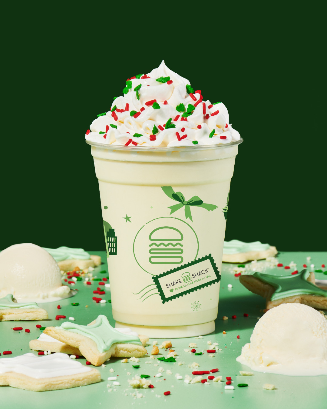
Shake Shack also adopted new shades of green over time, Urushibata told DesignTAXI.
The brand initially had its reservations about using photography. “It felt very QSR to us,” Shake Shack’s lead creative added. Instead, the company leaned in on graphically-striking signs and illustrated ingredients, which seemed more authentic and welcoming at the time. That was a decade ago.
Then came the era of smartphones, when cameras were placed in everyone’s pockets. So spawned apps like Instagram and a resurgence in photography.
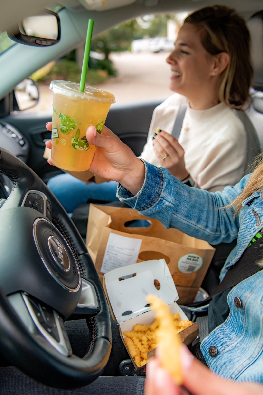
“As social media grew, and with it, the need to produce visuals and content, we found our way of shooting photography,” said Urushibata.
[via Shake Shack, images courtesy]


