
Warsaw Unveils Official Logo Immortalizing Its Mermaid For Digital Times
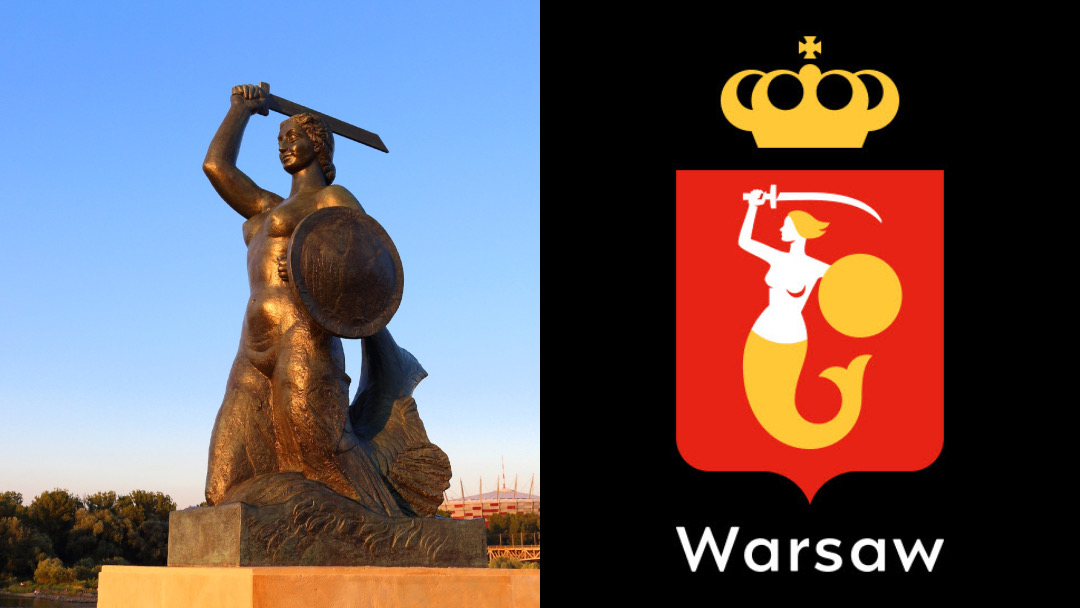
Images 86309883 © Tupungato | Dreamstime.com and City of Warsaw / Podpunkt
Legend has it that a mysterious “animal” had stopped by a riverbank near the Old Town in Warsaw and was releasing the fish trapped in nets. Irritated that their work was being disrupted, fishermen had planned to capture this creature—only to fall in love with her singing. The strange visitor was eventually caught by a rich merchant, but she was soon rescued by fishermen who heard her cries. Since then, the mermaid has sworn her loyalties to the city and vows to keep it and its people safe.
The aquatic creature now stands vigilant in the form of statues in Warsaw and as the city’s symbol and coat of arms. And although she’s been protecting residents for centuries, little has been done to defend her image from becoming obsolete in the digital era.
Until now. The Polish capital has commissioned an official brand identity set to wade the high seas of all of Warsaw’s 18 districts, each previously represented by their own visual systems. With a consistent logo and design system for the entire city, residents will no longer have to second-guess if the local government was behind a project or announcement.

For years, Warsaw has relied on two logos—the first being a historical crest and the other a promotional version that has been interpreted in multiple styles. The City of Warsaw has now roped in branding studio Podpunkt to give the mermaid a more formidable presence, overseeing all federal activities in the capital and offering protection into the future.
From now, the mermaid on Warsaw branding will solely bear the likeness of Polish-French physicist Marie Curie, and the logo will spotlight the city’s traditional palette of red and yellow.

Warsaw’s mythical mascot shouldn’t just be a pretty face but also a role model, says the brand studio. “We like that the mermaid has the features of a woman known throughout the world for her passion and interests.”
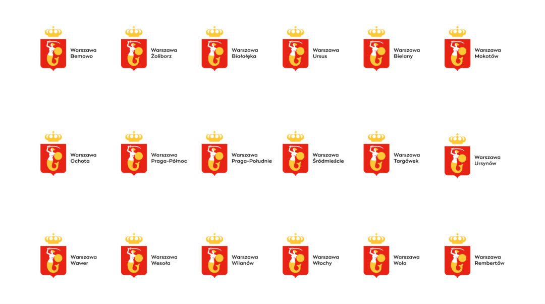
The former, old-timey emblems weren’t built for digital mediums, and therefore couldn’t be scaled effectively for all sorts of displays. The new logo overcomes this with a more proportionate design made up of circles and other geometric shapes, with just “a touch of human imperfection.”

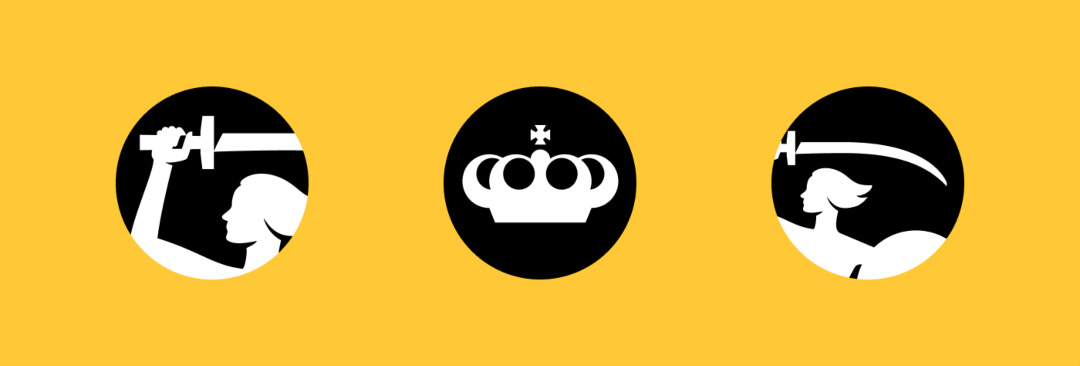
Curie’s mermaid is also seen wielding a historically-accurate sword, while a geometrically-perfect crown floats above.
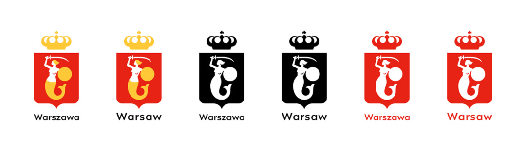
The logo, envisioned in Polish and English, arrives in four colorways as well as horizontal and vertical styles.
To move with the mobile age, the branding has been imagined by Podpunkt to also include round icons.

Warsaw tapped graphic designer Mateusz Machalski to adapt his ‘Engram’ typeface for the city. ‘Engram’ is a versatile, geometric gothic sans-serif with a friendly image, and the bespoke Warsaw version embraces these qualities while also tweaking it for legibility across smaller formats.

To ensure the renewed visual identity paints an accurate picture of Warsaw and its 18 districts, the city consulted the expertise of Dr Krzysztof Zwierz, a historian at the Museum of Warsaw.
The revamp also conveys Warsaw’s evolving interest from the self to the world. Gone is the catchphrase, “Fall in love with Warsaw,” as the Polish capital growingly finds itself as both a subject and observer of global topics. “The outbreak of war in Ukraine made Warsaw an important place on the map of aid for the Ukrainian community,” the city details in a press release obtained by It’s Nice That. “It made Warsaw more visible in the world media.”
It’s believed that the brand transition will take a number of years, given the multiple touch points involved in the process.
[via It’s Nice That and Podpunkt, images via various sources]


