
Twitter’s New Way To Hopefully Suss Out Impersonators? A Font Change
As Twitter 2.0 works out some growing pains, the blue bird app has been a stomping ground for some prowling copycats, who have interpreted Elon Musk’s “free-speech” stance as a green light to impersonate famous personalities and brands, including the new Twitter boss himself.
To distinguish real accounts from fakers, the company introduced color-coded verification checkmarks and square-shaped profile pictures, breaking the social network’s uniform design of circles and blue ticks. Perhaps noting complaints about the site’s UI getting too cluttered, Twitter has now made a barely noticeable typography tweak.
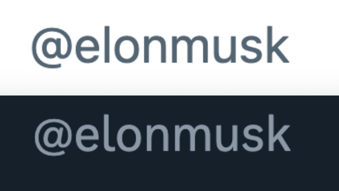
Eagle-eyed users like software engineer Molly White have pointed out that the zero in Twitter handles now has a strike, while the lowercase ‘L’ has been given a tail.
looks like twitter is making some attempts to cut down on impersonation accounts by using a new font for twitter handles. note the slashed 0 and the tail on the l. pic.twitter.com/NZRQxjS3XJ
— Molly White (@molly0xFFF) January 26, 2023
It’s been speculated that Twitter adopted this slight change to catch copycat accounts in their Iies, a theory supported by the fact that the new font is only visible on handles and not within tweets. Oftentimes, impersonators attempt to pass off as others by masquerading zeroes as an ‘O’ and a capital ‘I’ as a lowercase ‘L’ in their usernames.
The TeslaReal is my favorite so far. pic.twitter.com/X1XXsdZKZT
— Pxl  🇺🇦 ðŸ³ï¸ðŸŒˆ 💉😷 (@PxlJedi) November 11, 2022
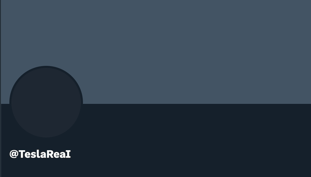
Joshua Benton, founder of Harvard’s Nieman Journalism Lab, chimes in that Twitter is still using its bespoke typeface, ‘Chirp’, but it has now incorporated OpenType stylistic sets to dot its i’s.
The new implementation of the Twitter font (TwitterChirp) uses OpenType stylistic sets (font-feature-settings) to differentiate a few characters — capital I, lowercase L, zero — but only in account names pic.twitter.com/2tlcsgXryK
— Joshua Benton (@jbenton) January 26, 2023

For now, the subtle update seems to affect just the desktop version of Twitter, though it could only be a matter of time before the iOS and Android apps follow suit.
[via XDA Developers and Mashable, images via various sources]


