
KitchenAid Unveils 2023 Color Of The Year For Brighter Days With Experimentation
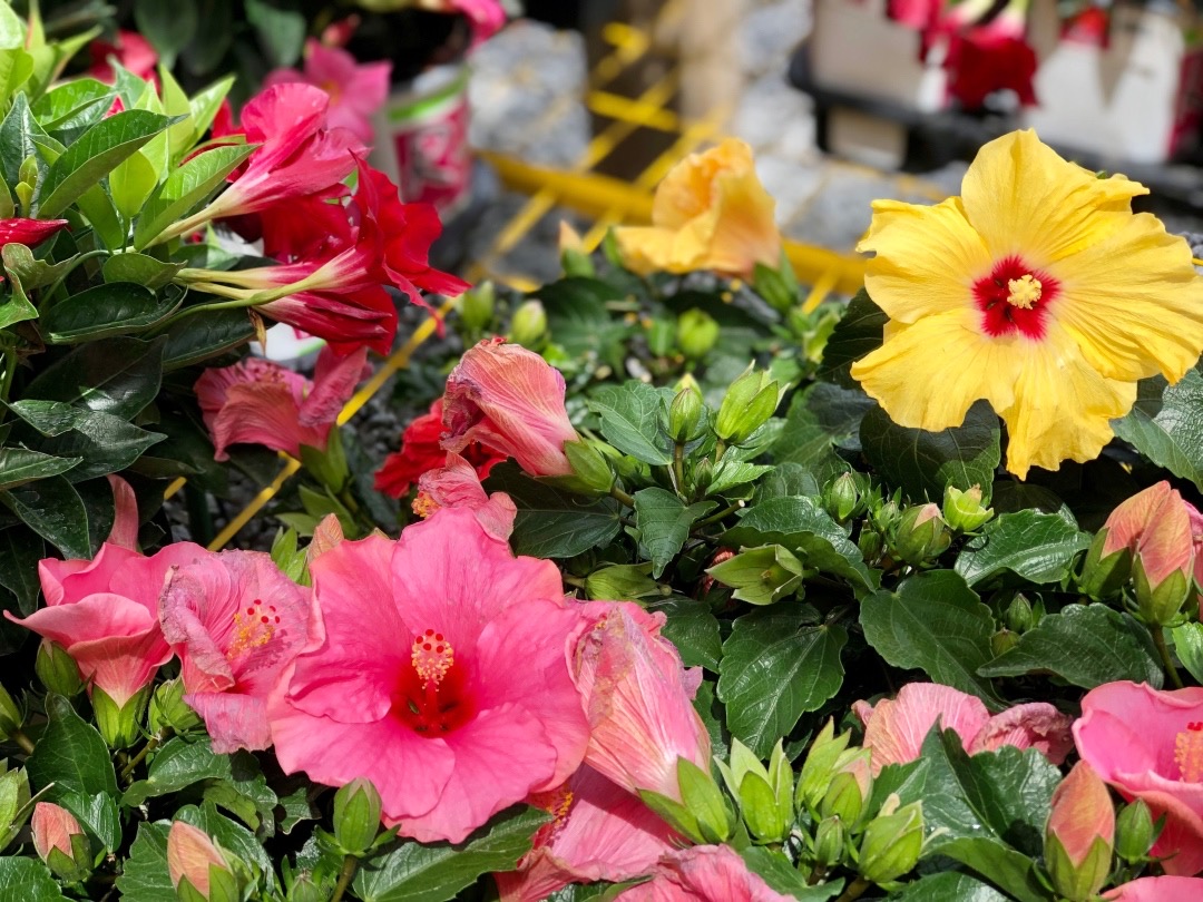
Photo 259001256 © Wirestock | Dreamstime.com
When in nature, stop and smell the roses. Indoors, strike the pan while it’s hot… and whip out the Hibiscus.
The vibrant, nearly-neon fuchsia with a matte finish is KitchenAid’s Color of the Year. It looks to the allure of its namesake flower from verdant gardens, inviting homebodies—like bees to nectar—to new experiences in and out of the kitchen.
“When a Hibiscus flower blooms, it attracts hummingbirds, butterflies, and dragonflies thanks to its nectar. A shared interest can truly bring together all walks of life,” explains Doug Searles, general manager for the kitchen appliance giant. “This phenomenon inspired the energetic 2023 Color of the Year, Hibiscus. Hibiscus exemplifies the creative exchanges that we see between Makers across the world, everyday, around their passion for experimentation in the kitchen.”
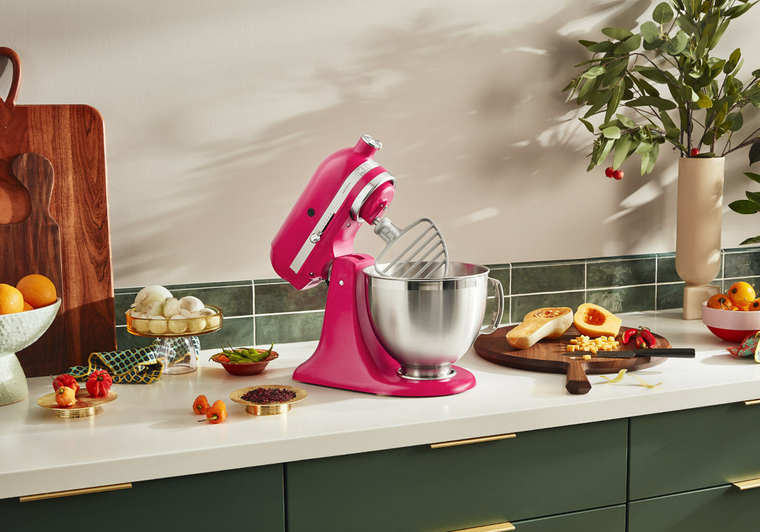
Image via KitchenAid / PR Newswire
The hue is decidedly more intense than last year’s ‘Beetroot’, with its vividity aimed to inspire home cooks to get experimental. Yet, it’ll sit pretty with today’s Barbiecore trend.
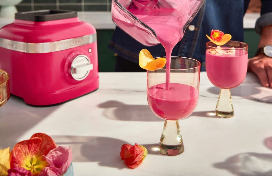
Image via KitchenAid
KitchenAid’s lead color, material, and finish designer Brittni Pertijs says the brand has been following the evolution of the color pink since 2017. “Beginning with Millennial Pink and advancing to deeper hues as of late, pink is bringing boldness to life in its color and energy,” describes the designer. “We took that as the spark to create Hibiscus. Hibiscus is a color that draws us to something exciting.”
This year, Hibiscus blossoms on the Artisan Stand Mixer and K400 Blender, bringing a thing of beauty to countertops.
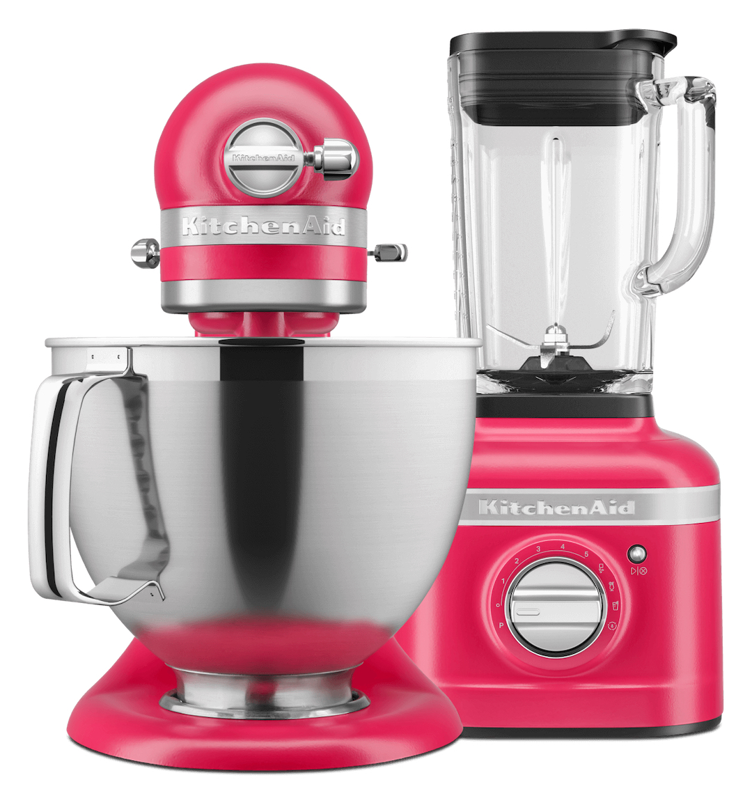
Image via KitchenAid
With Hibiscus as a new statement in design, KitchenAid is blending it all together by branching out of the kitchen and teaming up with global creative director and designer Marta Del Rio to interpret the boldly-hued appliances as one-off, avant-garde outfits. The styles were whipped up in time for New York Fashion Week.

Image via KitchenAid
View this post on Instagram
[via The Kitchn, Better Homes & Gardens, PR Newswire, images via various sources]


