
Brazil Ejects The ‘Z’ In Brand Relaunch To Reconnect With Culture

Numerous big names seem to be readopting their old design codes this year, among which is the country of Brazil. The South American nation has wholly returned to its visual identity from 2005 to better illustrate its vibrancy and natural environment.
The colorful branding symbolizes Brazil’s position as multicultural—a blend of layers and ecosystems—with contours that denote its larger-than-life personality. The emblem also doubles down on the nation’s continued commitment to sustainability.
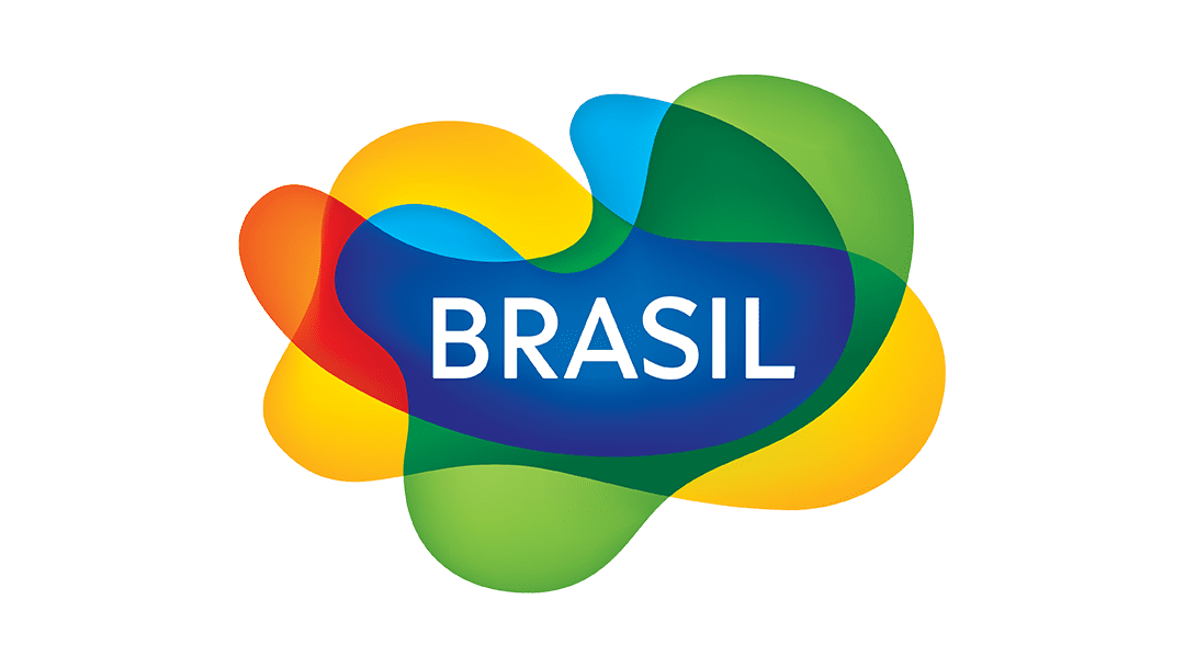
Green captures Brazil’s rich nature, while yellow represents its land’s sunshine and the joy of its people, and red is the embodiment of the warmth and vibrance of the community. Meanwhile, blue reminds of Brazilian waters and the bright sky, and the hue harmonizes with white, encapsulating Brazil’s spirituality.
View this post on Instagram
Worth noting is how the ‘z’ has been swapped out for an ‘s’ on the tourist-facing branding. “We are Brasil, spelled with an ‘S,’” the nation emphasizes, firmly embracing its Portuguese tongue. For context, the previous logo pandered to international readers, rather than the country’s own people.
View this post on Instagram
Inspiration for the abstract wordmark came from the cover of a book by famed Brazilian landscape architect Roberto Burle Marx. The Brazilian Graphic Design Association (ADG) incorporated it into its brief for a contest to develop an international presence. Designer Kiko Farkas of Máquina Stúdio channeled those colors and shapes into his concept, and won.
View this post on Instagram
View this post on Instagram
[via Brandemia and TravelPulse, images via various sources]


