
Amazon’s ‘Dimple’ Steals The Attention In Prime Video Brand Refresh By Pentagram
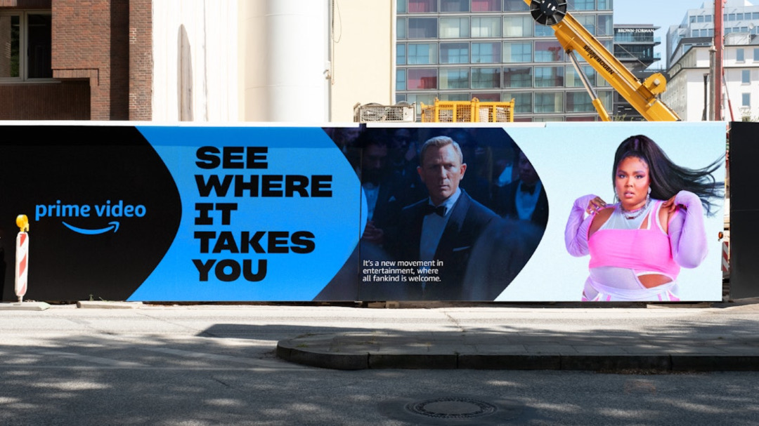
Image via Pentagram
Amazon’s dimple leaves a deep impression, in more ways than one, on the new, refreshed Prime Video visual identity created by Pentagram partner Emily Oberman and her team at the renowned design studio.
It’s a wide-open secret that the arrow in the Amazon logo is also a smile. This time, its sealing feature—the dimple—is the star of the show and, dare we say, the beauty standard across the tech giant’s entertainment ecosystem. Pentagram fixated on this recognizable detail and made it more dynamic, repositioning the dimple as an animated frame for visual assets to “break the fourth wall in a way that interacts with the audience.”
View this post on Instagram

With the streaming sphere growing more saturated, Prime Video is keeping true to its identity to capture the gaze. Its new graphic system endeavors to highlight the brand’s original content and flexibly adapt to point all kinds of fandoms to “a rabbit hole” of entertainment, all while remaining consistent with the wider Prime family.
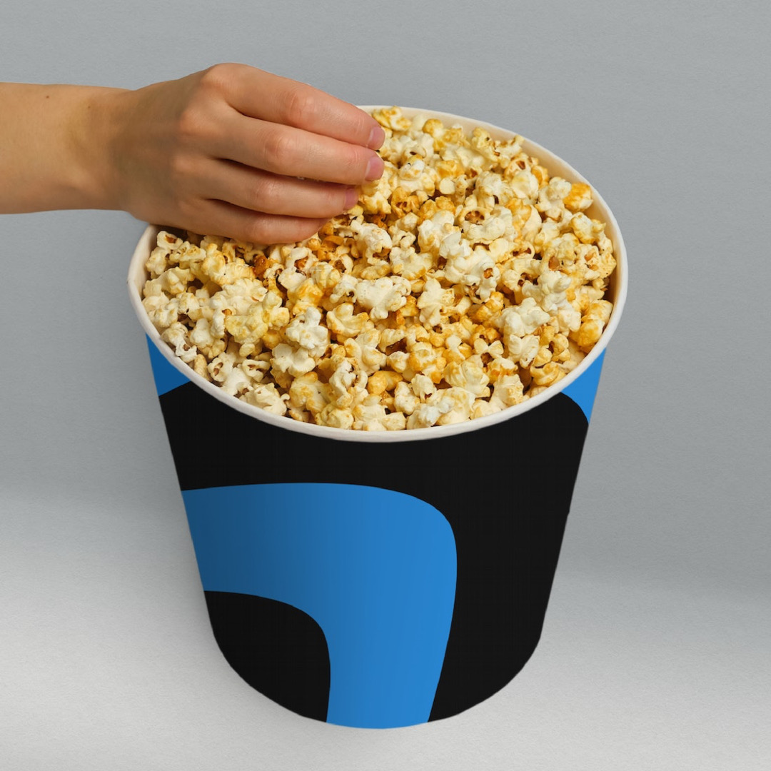
The signature blue keeps its place as a mainstay.
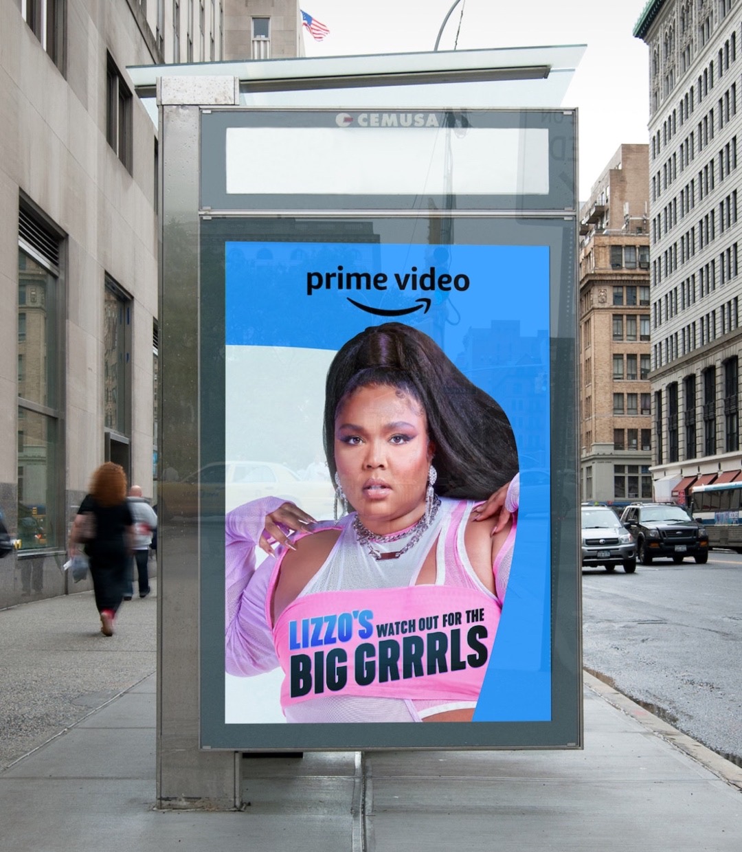
It can be argued that a smile is just face value, which is why Pentagram has paired the dimple with ‘Prime Video Sharp’, a new bespoke typeface designed by Lucas Sharp of New York type foundry Sharp Type. Prime Video Sharp, a derivation of an existing Sharp Grotesk, is “strong and friendly,” emitting Prime Video’s exuberant energy as well as accommodating it with multiple weights.
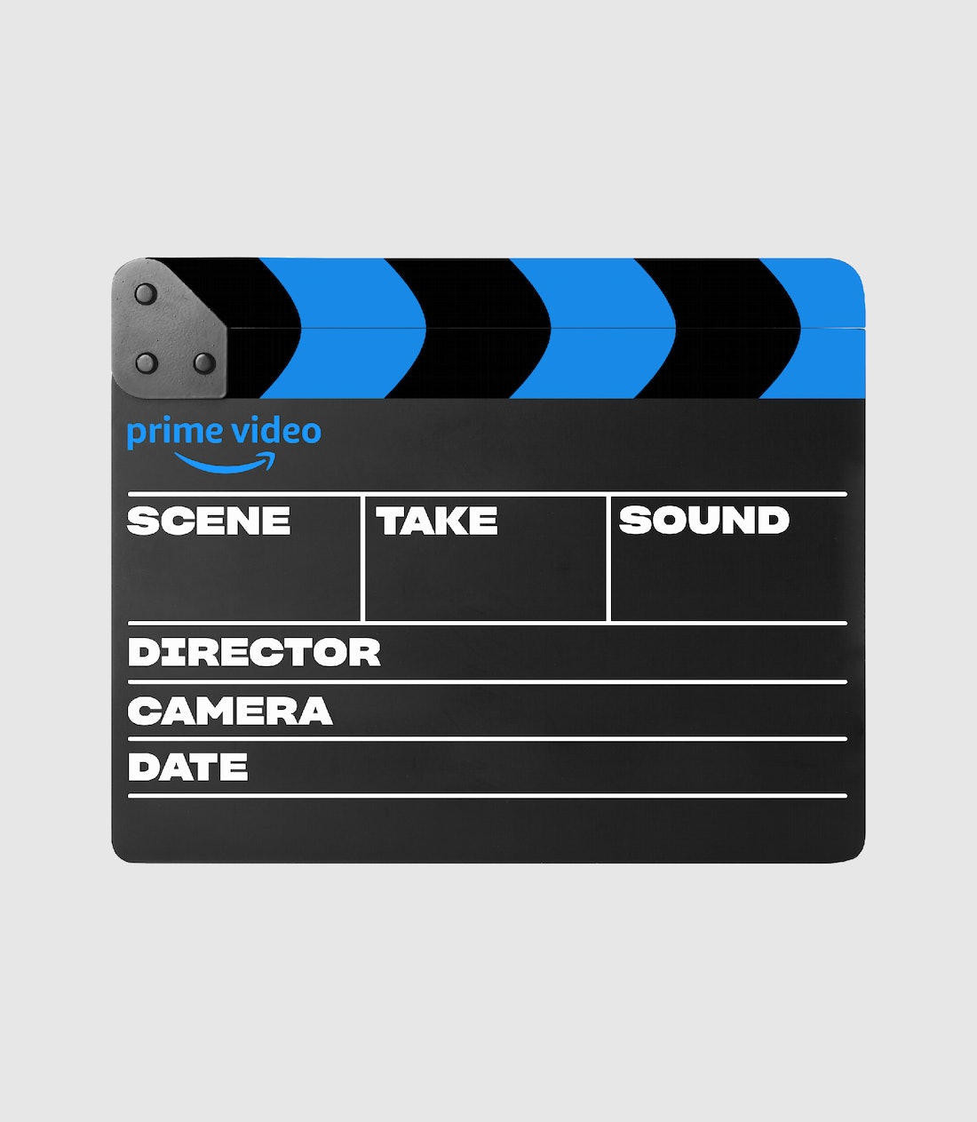
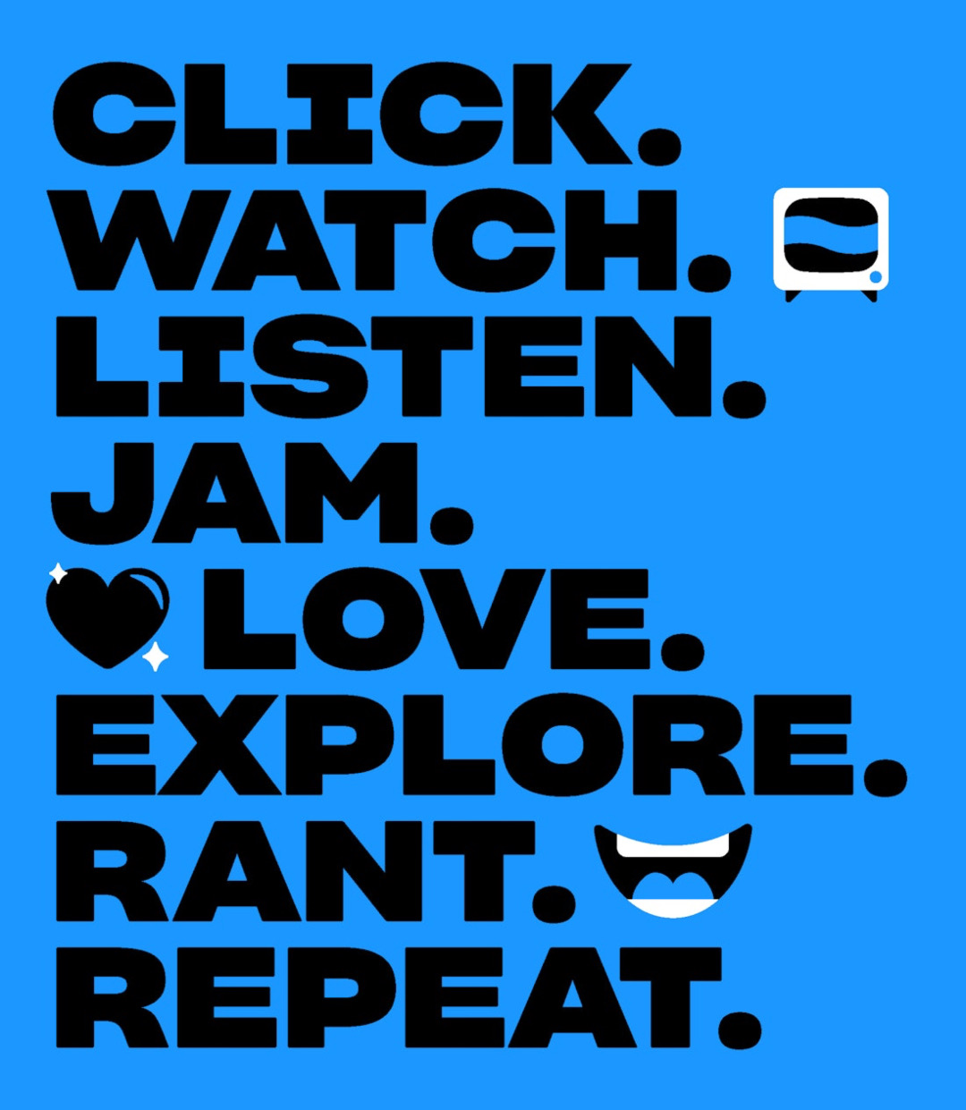
Notably, the typeface is meant to complement Prime Video’s illustrated ‘Iconics’, which comprise motifs representing a gamut of genres from vampire fangs to cowboys and the rings of Middle Earth.
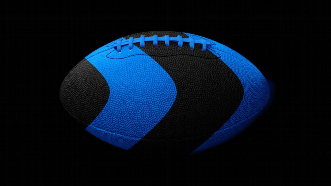
The refresh brings two new animations that serve as idents, with the dimple-arrow magnifying to create a “dimensional portal” into the next scene. One of the animations was helmed by Pentagram, while the other was produced by FutureDeluxe in a “cinematic 3D” style to introduce original shows and movies.
The cheerful Prime Video brand identity will spread beyond ear to ear to motion graphics, social media, television spots, billboards, and everything else.


[via Creative Review and Design Week, videos and images via Pentagram]


