
Nokia Unveils Massive Rebrand To Signal It’s No Longer Just For Mobile Phones
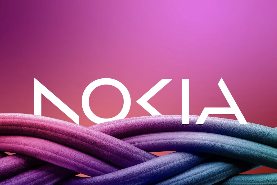
Nokia no longer wants to be viewed as a bygone mobile phone giant. Rather, the company’s new brand identity signals a major refresh to reflect its current identity as “pioneers of digital transformation.”
Doing away with the iconic ‘Yale blue’ logo, the smartphone maker launched a redesigned version of the motif at MWC Barcelona, explaining that the emblem was built on the heritage of its predecessor but with a more modern and digital twist.
According to Reuters, the new logo will not stick with a single hue but will also make use of a range of colors depending on its use.
“We are updating our strategy, and, as a key enabler, we are also refreshing our brand to reflect who we are today: a business-to-business technology innovation leader pioneering the future where networks meet cloud,” CEO Pekka Lundmark said in a blog post.
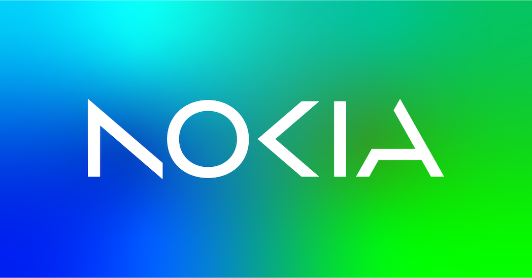
Although news outlets have reported that this is the first time the technology firm is adopting a new brand identity in nearly six decades, Logopedia traces the previous logo change to back in 1978, which was 50 years ago.
Lundmark told Bloomberg that the brand wants the public to recognize it as no longer just a “successful mobile phone brand,” but is focused on its next phase of networks and industrial digitalization, which differ greatly from its iconic phones.
“The company’s new logo is emblematic of an energized, dynamic, and modern Nokia, demonstrating its values and purpose. It has been designed as a symbol of collaboration,” explained the brand in a statement.
Despite moving away from being just a mobile phone manufacturer, it seems Nokia isn’t completely giving up on making them just yet, with the brand recently debuting a do-it-yourself smartphone with its very own repair kit.
This is Nokia, but not as the world has seen us before. Our new brand signals who Nokia is today. We’re unleashing the exponential potential of networks and their power to help reshape the way we all live and work. https://t.co/lbKLfaL2OI #NewNokia pic.twitter.com/VAgVo8p6nG
— Nokia #MWC23 (@nokia) February 26, 2023


