
Nokia’s Stripped-Down Logo Elicits Some Very Cutting Memes
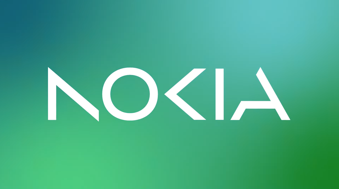
If you haven’t heard already, Nokia is dialing down on its position as a mobile phone manufacturer. To mark its pivot, the company has adopted a dramatic new logo, its first brand identity transformation in decades.
The Finnish tech firm says the fresh wordmark—an abstract emblem with negative space at the front, middle, and tail—represents a more “energized” and “dynamic” Nokia. The overhaul includes an expanded color palette that goes spectrums beyond the singular ‘Yale blue’.
Well, this “dynamic” look has energized the people too, somewhat. Consumers always have something to say when a company introduces a new logo, and Nokia’s revamp is no different.
A stream of jokes on social media insinuates that it’s a good thing Nokia has been around since 1865, because people would have a hard time deciphering its name had it been new.
"Ma, look at that ΛO<Iλ building!" pic.twitter.com/MgCwfxrYh2
— Alvin (@sondesix) February 26, 2023
Idk , captcha doesn't let me in!!! pic.twitter.com/ikVmsTwvsI
— Entro 🔠(@Entroprox) February 26, 2023
Someone is NOt a fan, unfortunately.
When you lack the funds for your design and marketing team. Soon it will be.... pic.twitter.com/xSoJaDdEr8
— RogNuckStrix (@RogNuck) February 26, 2023
Another person teases that Comic Sans would have improved the design.
I redesigned the new Nokia logo. What do you think?
— Michal Malewicz (@michalmalewicz) February 27, 2023
I think it's way better. pic.twitter.com/8aEwRw6lDt
In Nokia’s defense, the branding has its advocates too.
New #NokiaLogo. Do you lov it? pic.twitter.com/REeMMoUvWA
— Marko Heimonen (@markoheimonen) February 27, 2023
But this just in: Elon Musk’s family is growing.
Elon Musk’s son fr
— AppleLeaker (@LeakerApple) February 27, 2023
A point was made… and it stung.
DID YOU KNOW: the new Nokia logo pays tribute to its mobile phone heritage by stylizing the “N” into a trendline graph of Nokia’s market share in phones pic.twitter.com/M2uI3P9iG2
— John Kneeland (@SirKneeland) February 26, 2023
To Kia or Nokia; that is the question.
This has real KIA vibes pic.twitter.com/2I9ryzN0me
— David (@David37494266) February 26, 2023
Last of all, something objective:
The new Nokia logo is mathematically correct. pic.twitter.com/uKu5O0kry8
— Arto Vartiainen (@artovartiainen) February 26, 2023
[via Twitter]


