
‘Sesame Street’ Nonprofit Unveils World’s ‘Longest Street’ In Visual Rebrand
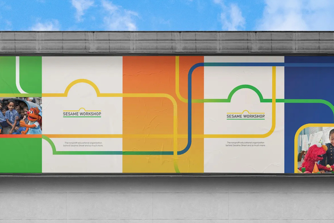
Sesame Workshop, the non-profit company behind the children’s show Sesame Street, recently introduced its new brand system. Designed by Trollbäck+Company, the firm’s visual identity presents itself in a collection of motion graphics that make up “the longest street in the world.”
Despite Sesame Street’s popularity through the decades, not many viewers may know that behind the scenes, Sesame Workshop carries out charity work to benefit the same kids that watch the show through educational programs, social impact projects, and coming up with curricula.
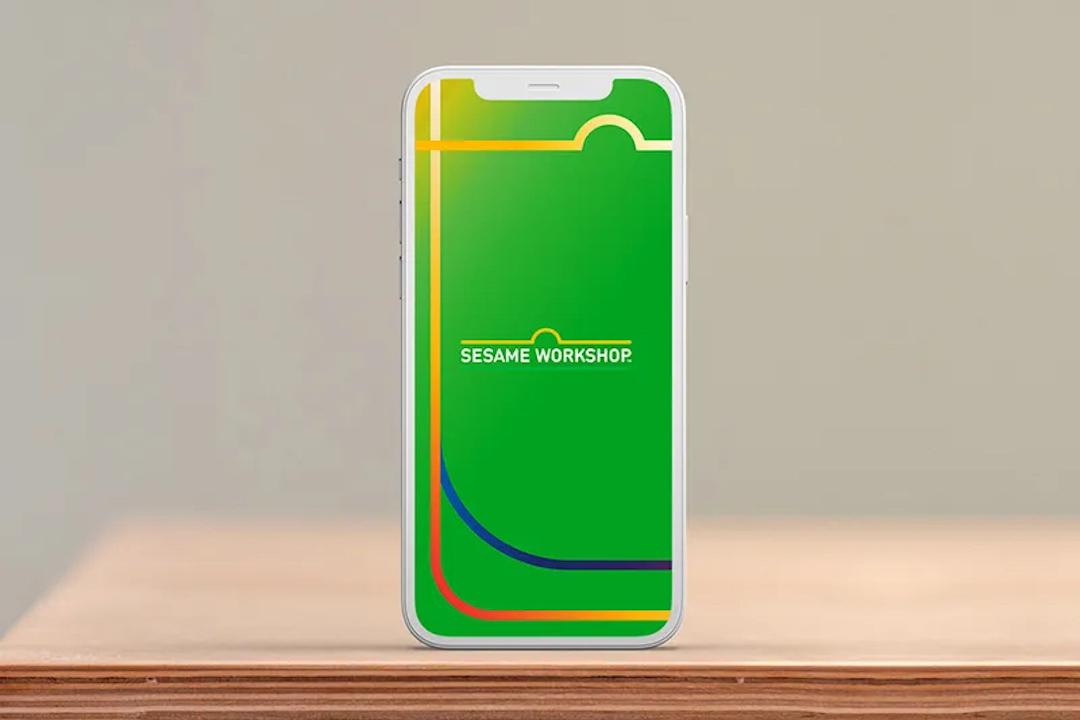
Executive Creative Director Rosie Garschina told Design Week the main idea behind the visual rebrand was to both “unify and differentiate” Sesame Street and Sesame Workshop, the former being more playful while the latter wanted to present as “more optimistic and visionary.”
To link both sides, the studio decided to incorporate visual cues from Sesame Street that would make Sesame Workshop immediately recognizable to fans. This meant including the iconic horizontal containers and bright colors often found in the series’ signs.
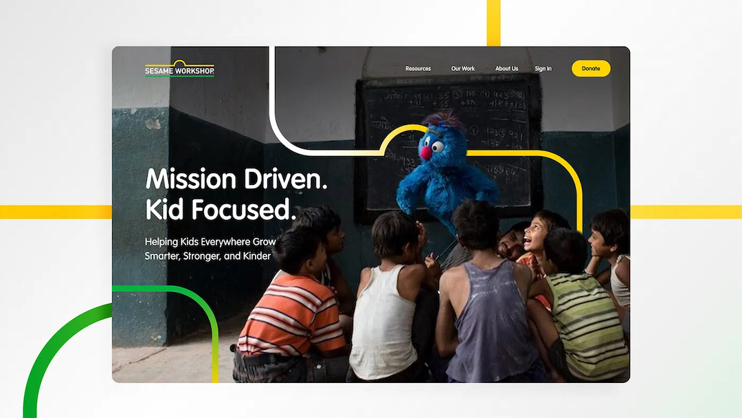
In particular, the designers felt that the logo shone best by showcasing “the longest street in the world” via motion graphics, which repeated the emblem through a unique ecosystem of streets and intersections that pointed to the brand’s far reach.
Furthermore, to complement the organization’s primary colors of grass green, sun yellow, and sky blue, branding experts created “vibrant gradients to motivate the linework” and bring attention to the firm’s visionary approach to education by “literally illuminating new avenues” in its design.
In terms of typeface, the studio decided to retain the original VAG Round, which both brands have used for years, though it took care to style the fonts differently in order to allow each company to stand out on its own.


View this post on Instagram
[via Design Week and Trollbäck+Company, images via Trollbäck+Company]


