
1B Galaxies Are Present in This Image That Took Six Years To Make

The night sky is a wondrous place with infinite secrets to uncover. Yet, from humanity’s tiny corner in this vast universe, the naked eye can only perceive an incredibly small portion of the cosmos. But what if we could look at the bigger picture and witness the grandness of what lies beyond?
A recent collaboration between a group of astronomers gave society a new view of what’s beyond with the largest 2D map of the cosmos called ‘Abell 3518’. And just within this one image rests over a billion galaxies. Yes, that’s right, one billion galaxies have been squashed into this singular picture. That incredible number took six years to achieve and is the work of the Dark Energy Spectroscopic Instrument (DESI) Legacy Imaging Survey. In total, three telescopes were used to capture one petabyte’s worth of data.
These telescopes include the NSF’s NOIRLab’s Kittening Peak National Observatory (KPNO) AND Cerro Tololo Inter-American Observatory (CTIO) in Chile. The image shows 14,000 square degrees of the sky from the northern hemisphere.
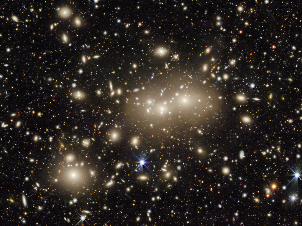
In order to squeeze as much as they could into one map, the researchers had to include data taken from near-infrared wavelengths and the visible light wavelength. This is because distant galaxies often appear redshifted—or on the red end of the spectrum—because of how the universe constantly expands. In addition, the near-infrared wavelength allows them to calculate better the time it took for their light to reach Earth.
So why was the map even made in the first place? Well, it was done to aid research in dark energy and matter. Scientists study these unseen forces by analyzing galaxies and monitoring how they add mass or affect interactions between objects in space.
“Though all galaxies shine brightly, many are cloaked in dust while others are so distant that to observers on Earth, they appear as little more than faint smudges,” says Alfredo Zenteno of NSF’s NOIRLab. Nevertheless, maps such as these should ultimately aid astronomers taking part in different types of research and gives society a window into the cosmos.
[via DIY Photography and Digital Trends, images via DESI Legacy Imaging Survey/KPNO/NOIRLab/NSF/AURA; Image processing: T.A. Rector (University of Alaska Anchorage/NSF’s NOIRLab, Jen Miller, M. Zamani & D. de Martin (NSF’s NOIRLab)]


