
Strongbow Goes Giddy On Color With Boldest Redesign Yet
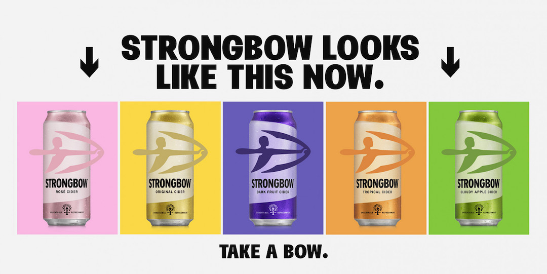
Black-and-gold is apparently getting flat. And, as a prominent maker of sparkling cider, Strongbow doesn’t want flat. The UK beverage brand has announced its “biggest and boldest” design change since its inception in 1960.
To pave the way for a new generation of drinkers, Strongbow is getting intoxicated on vibrancy—no longer limiting itself to the classic black and gold—with color-blocked packaging alluding to its individual flavors. The dramatic visual identity, rolling out this month, comes by way of London design agency Otherway.
The splash of color takes the place of the graphic accents in Strongbow’s old packaging. Meanwhile, the iconic archer logo remains front and center.
Although the makeover coincides with the introduction of the summery Tropical Cider, the new look will take over the brand’s entire variety as a mainstay, creating a buzzy spectrum of pale yellow, light pink, deep lilac, orange, and bright green. As pointed out by Grocery Gazette, the bright overhaul will make it easier for shoppers to spot the cans on the supermarket aisle.
View this post on Instagram
Rachel Holms, cider marketing director at Strongbow’s parent company Heineken UK, explains that the revamp marks “a huge milestone” for Strongbow’s 63 years. Holms adds that the vivid new packaging isn’t just created with the brand’s loyal fanbase in mind, but it also welcomes future Strongbow drinkers to take a sip.
[via It’s Nice That and Grocery Gazette, images via Otherway]


