Don't miss the latest stories
Advertise Newsletter
Network
  • The Creative Finder
  • The Bazaar
  • Deals
  • Status Is Down
Community
  • Sign up / Log in
  • Discussion Forums
  • Calendar of Events
NEW

Follow

Share this

Logo Design
Branding
Creativity
Entertainment
Pop Culture
Trivia
  • Entertainment
  • Pop Culture
  • Trivia
MENU
  • Advertise with us
  • Submit tip/feedback
  • Work with us
  • Subscribe to newsletter
  • Subscribe to RSS
Advertise here
Advertisement

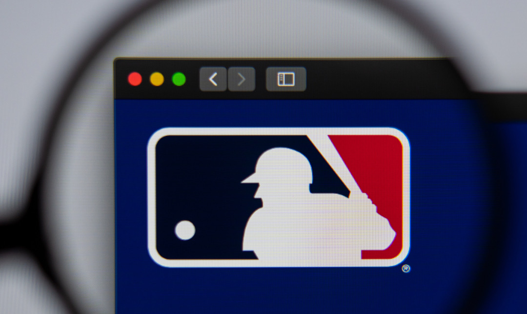
Major League Baseball Logo Has An Optical Illusion That Strikes A Nice Balance
By Mikelle Leow, 12 Mar 2023

Subscribe to newsletter
Like us on Facebook
Photo 145456618 © Anton Garin | Dreamstime.com


A classic American symbol, the Major League Baseball (MLB) logo pretty much hits a home run in the field of design. Not only is it a display of patriotism with its colors, but it also plays with negative space to match the perception of the beholder.


As noted by Mental Floss, the red, blue, and white emblem with a cutout of a batter can be viewed in two different ways.

Image via Wikimedia Commons (public domain)


Some people imagine the player’s back to be facing them, which would make him right-handed. On the other hand (ahem), the figure can also be imagined to be facing the front, which could mean he’s a southpaw, or a left-handed hurler.

Advertisement
Advertisement


Photos 50602921 © Eugene Onischenko, 28115564 © Jerry Coli | Dreamstime.com


As it turns out, designer Jerry Dior purposefully made the character ambiguous when he created the logo in 1969, ensuring audiences couldn’t identify a specific face, handedness, or race.


The designer also shut down speculations that the silhouette was based on right-handed power hitter Harmon Killebrew, whose heyday spanned from the late 1950s to 1971. Dior told ESPN back in 2008 that the character was drawn from reference photos of various baseball players. “It’s not any specific person,” he insisted.


In other words, the logo can be envisioned with any MLB player (fair play), therefore striking a happy medium.


[via Mental Floss and Archysport, images via various sources]

Receive interesting stories like this one in your inbox
Advertise here

More related news

Advertise here
Also check out these recent news
Web Design
Link to news page

When Your Website Goes Down, This Is the Page Customers Meet Instead

2027
Link to news page

2027 Already Has A Color Of The Year And It’s Beginning On ‘Grounded’ Territory

IKEA
Link to news page

IKEA & Xbox Press Play On Furniture & Storage Inspired By The Iconic Controller

Fashion
Link to news page

Vogue Presents ‘United Flags of Fashion’ With Top Designers For All 50 States

Coca-Cola
Link to news page

Coca-Cola Pours Fresh Life Into Its Iconic Branding With Worldwide Redesign