
Designer Of ‘We ♥ NYC’ Logo Promises It’s Not Replacing The Original
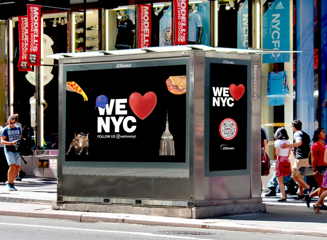
Earlier this week, New York Governor Kathy Hochul and Mayor Eric Adams launched an adapted version of the famed ‘I ♥ NY’ emblem. However, not everyone was keen on the new ‘We ♥ NYC’ logo, with residents taking to social media to air their displeasure.
The overall campaign is meant to “showcase the city’s strengths” as it “overcame the darkest days of the pandemic,” and hopes to spur on a civic engagement initiative that would see New Yorkers take part in bite-sized volunteer projects to uplift communities.
Aside from the change in wording, the redesigned motif moved away from the original typeface, choosing to use a font seen in the city’s subway signs as the New York subway is “the beating heart of the city.”
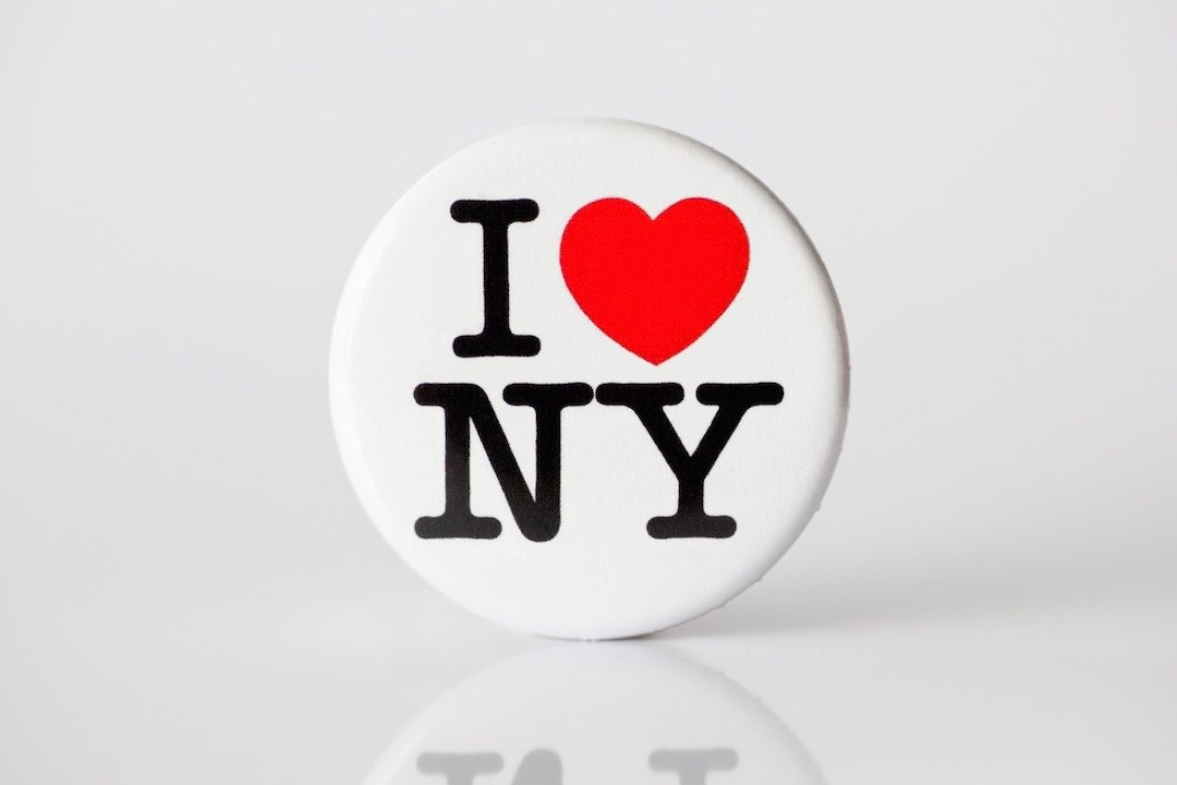
Designer Graham Clifford, the man who oversaw the new logo, told the New York Times he was inspired by how the subway brings everyone in the city together; a space in which “Wall Street types” sit next to homemakers and construction workers.
According to Design Week, he admitted the process of coming up with the emblem was “a delicate balancing act,” as he needed to pay homage to the original while avoiding “confusion between the two marks.”
In response to the backlash, Marketing Executive Maryam Banikarim explained that the new design was not meant to replace the original, but it will co-exist alongside it. She did emphasize the adapted logo’s message of moving towards “a moment for we, not I.”
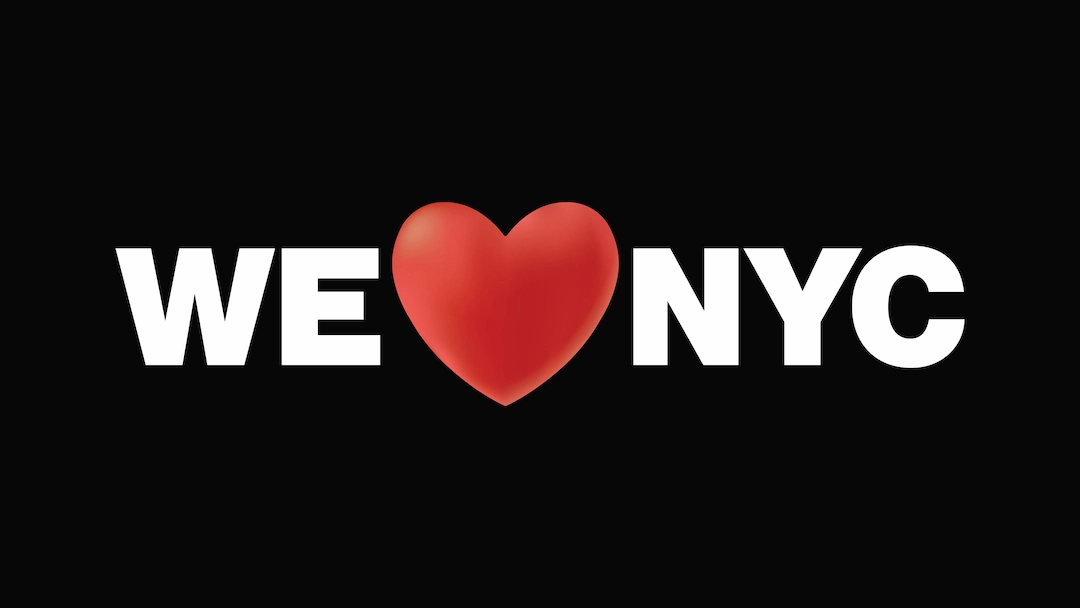
It’s no surprise the original creation by Milton Glaser is such a cherished part of New York’s identity, considering it’s been in use since the 1970s. As per the Smithsonian Magazine, the artist drafted the first copy of the design on the back of scrap paper while riding in a cab.
The graphic designer, who passed on in 2020, once reimagined the logo after the 9/11 attacks as ‘I ♥ New York More Than Ever’, updating the heart with a blackened lower corner in reference to the ashes or flames that shook the city.
While cognizant of the feedback to his design, Clifford ultimately hopes that New Yorkers—whom he admits “are an incredibly passionate bunch,” will use that spark within them to respond positively to the campaign by volunteering or supporting local businesses.
[via Smithsonian Magazine and Design Week, images via various sources]


