
Pentagram Designs Mindful Packaging For Ben From Ben & Jerry’s New Cannabis Line
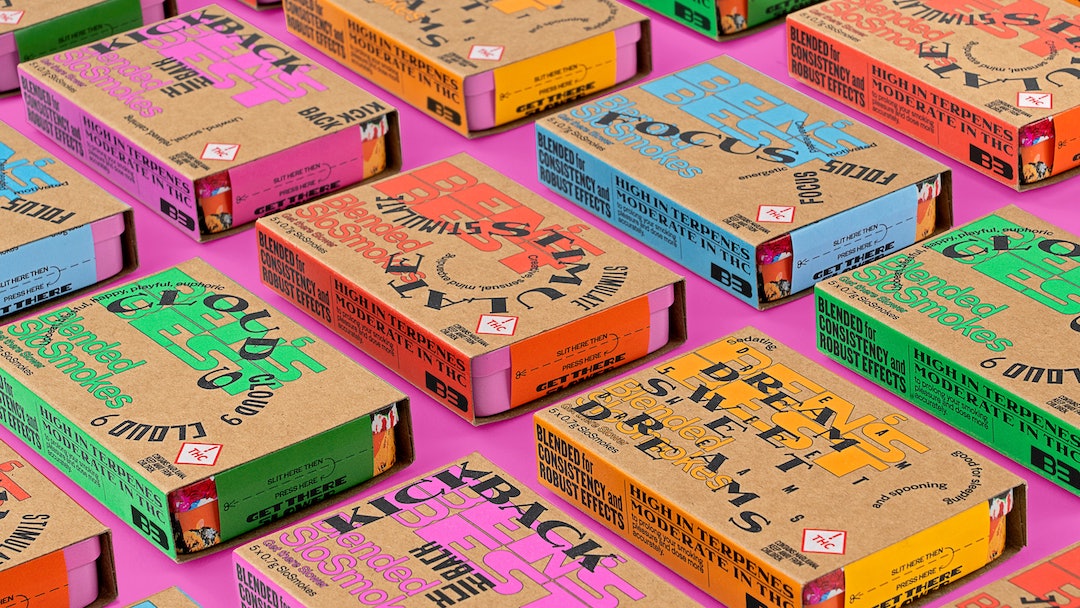
Looking for a way to get baked while munching on a pint of Half Baked ice cream? Add on a dollop of justice-seeking slogans in the form of exciting and colorful print, and you’ll have yourself a sundae swirl of pleasure and equality.
Ben Cohen from Ben & Jerry’s is dishing out a new range of cannabis called Ben’s Best BLNZ (B3). The venture started as a way to sell great pot and then eventually branched into a social movement to alert the masses on communities harmed by the war on drugs.
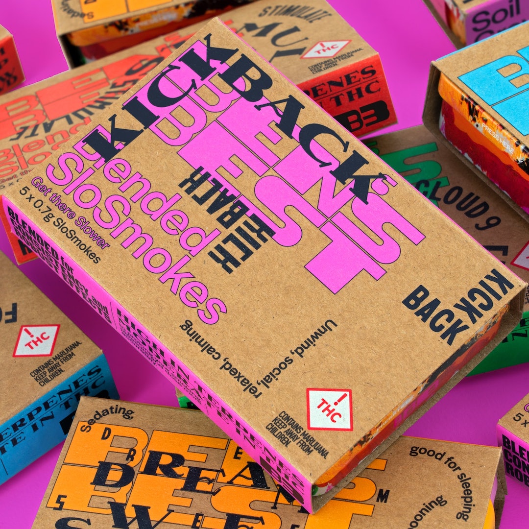
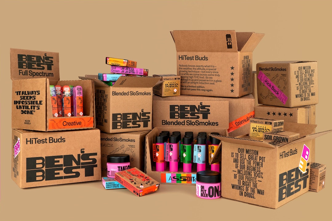
According to Creative Review, he reached out to design firm Pentagram partner Eddie Opara to help develop playful motifs that could spark a more thoughtful outlook on getting high. The packaging spotlights racial inequalities in the cannabis industry with bold colors and fonts.
Opara injected his flair with a visual of a prisoner in an orange jumpsuit made from a collage of flowers. The B3 project also saw Opara working with Black creatives such as Tré Seals from Vocal Type Foundry and Joshua Darden for the typography used and art from Dana Robinson.
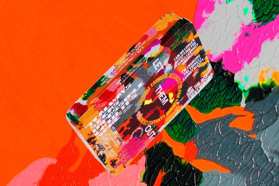
The packaging takes on an almost protest signage quality with fonts inspired by US Civil Rights movements like Martin and Bayard. These were used to emboss out Angela Davis and Nelson Mandela quotes and calls for reform over bright pinks, oranges, blues, and greens tins and vape pens.
Per Dieline, Opara explains that by opting for flowers, quotes, and vibrant colors, the brand diverges from the traditional green and marijuana leaf pattern that has become synonymous in the pot industry. This symbol perpetuates the stereotype that weed is only used for recreational purposes and ignores its medicinal and therapeutic benefits.
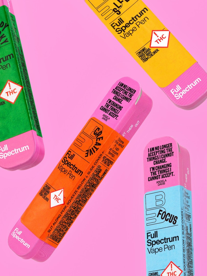
Additionally, B3 uses materials like metal, paper, and glass throughout the line to promote recyclability.
In terms of how the company plans to aid the causes it’s touting, the profits made will be split three ways. 10% will go to the Last Prisoner Project, a nonprofit working to free those incarcerated for weed-related offenses. The following 10% will go to the Vermont Racial Justice Alliance, an organization seeking to end systemic racism in Vermont. The last 80% is being used as grants for Black cannabis businesses through the NuProject.
And just as Ben & Jerry’s first launched in Vermont, so will B3 sometime soon. Until then, you can visit its website to find out more.
[via Dieline and Creative Review, images via Pentagram]


