
‘EA Sports FC’—The New ‘FIFA’—Debuts Brand Inspired By Soccer’s Special Shape
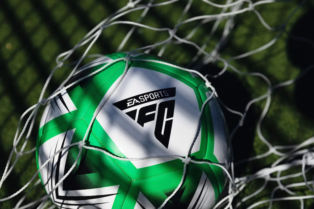
Last year, EA Sports revealed that after three decades, its partnership with global sporting body FIFA on its flagship video game title would be coming to a close. Now, the video game maker has officially unveiled the new logo and branding of the forthcoming replacement, EA Sports FC.
With the split, which occurred when the two couldn’t reach an agreement to continue the licensing deal, the company can no longer use the FIFA name in its game titles. As such, rebranded EA Sports FC comes with an entirely new look and motif.
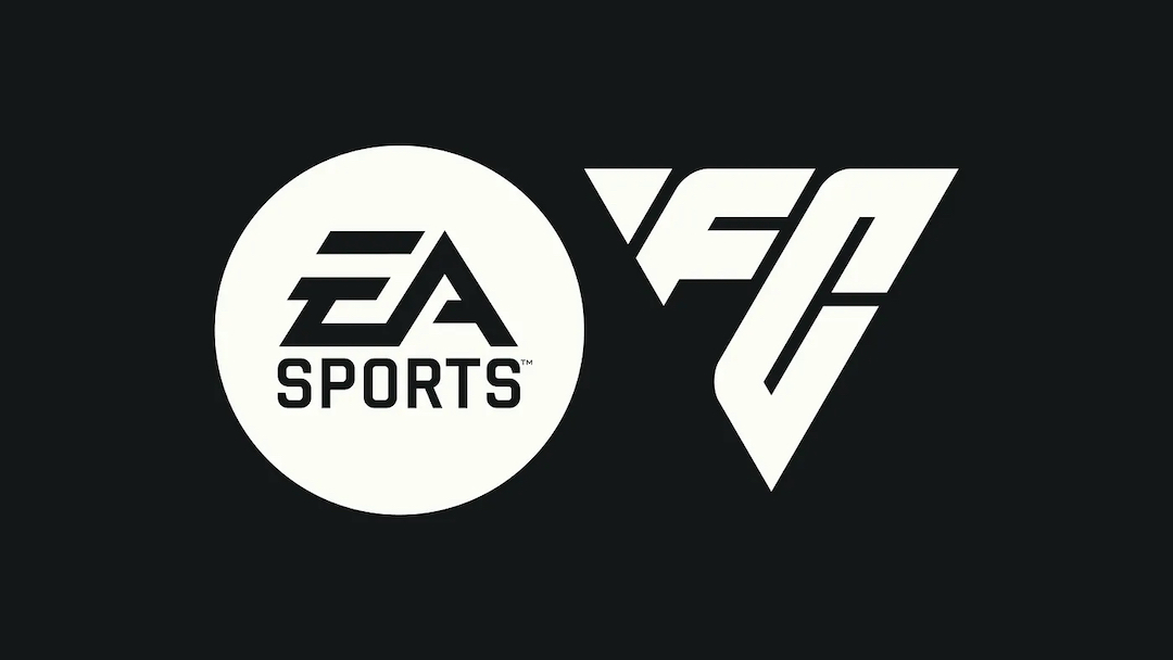
According to Uncommon, the design house that worked on the rebrand, the new brand design was inspired by the beautiful game and the dominant use of triangles in wider soccer culture. For the unfamiliar, the three-sided shape is often referenced in everything from passing techniques to set play arrangements and more.
Furthermore, it pays tribute to the triangular polygons that “make up every pixel” of most video games, the first 8-bit gaming experiences, and the iconic player indicator symbol that appears above each athlete during each match.
Image via EA Sports FC
The new emblem, which is set within a triangular grid system, reflects the shape’s prominence across all three versions of the logo—including a primary motif, two letter product prefix, and an authenticity mark.
This brand identity was then set into motion by creative studio BUCK, drawing from the game’s quick, intense energy, dynamics, and forward momentum and expressing it through 2D animation and design so EA Sports FC comes to life.
Image via EA Sports FC
Even the typefaces don’t skimp on detail, with the two custom fonts inspired by the great Cruyff Turn and the Brazilian footballer, Marta, respectively. These design cues will extend even to the multilingual typeface settings, specially crafted for all scripts from Latin to Arabic.
Color-wise, the title will take on a chiefly monochrome palette using the hues Boot Black and Chalk White, with hints of Pitch Green and Forest Green added in as taken from the field of play itself.
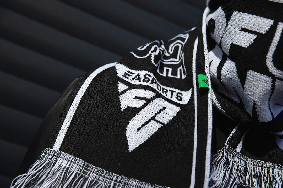
“For the logo we teased out a fundamental icon, rooted in all aspects of the beautiful game. A symbol of power that’s literally in the hands of those who control it,” said Haider Muhdi, Design Director at Uncommon.
“A distinctive form that’s been part of the gameplay (DNA) from the very start, right up to the present day. Hiding in plain sight for almost 30 years, the inverted triangle became our playmaker,” he added.
Image via EA Sports FC
Image via EA Sports FC
[via ESPN and Nintendo Life, images via EA Sports FC]


