
LG Gets A Facelift To Look Younger For Next Generation Of Users
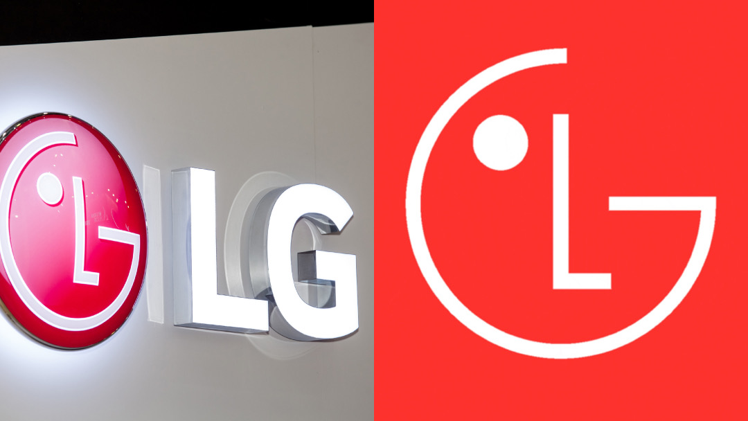
Old logo (left) VS new logo (right). Images via 92143995 © Alexander Tolstykh | Dreamstime.com and LG
The ‘G’ in LG stands for glow-up this time, as the South Korean electronics brand has adopted a simpler, flatter design to include younger consumers.
Most noticeably, the updated global brand identity is splashed in a brighter new red called ‘LG Active Red’. But wait, there’s more from its dip into the fountain of youth. The company intends to energize its look further by animating the ‘LG’ face with eight unique expressions, with the logo winking, smiling, and looking around to engage with its observer.
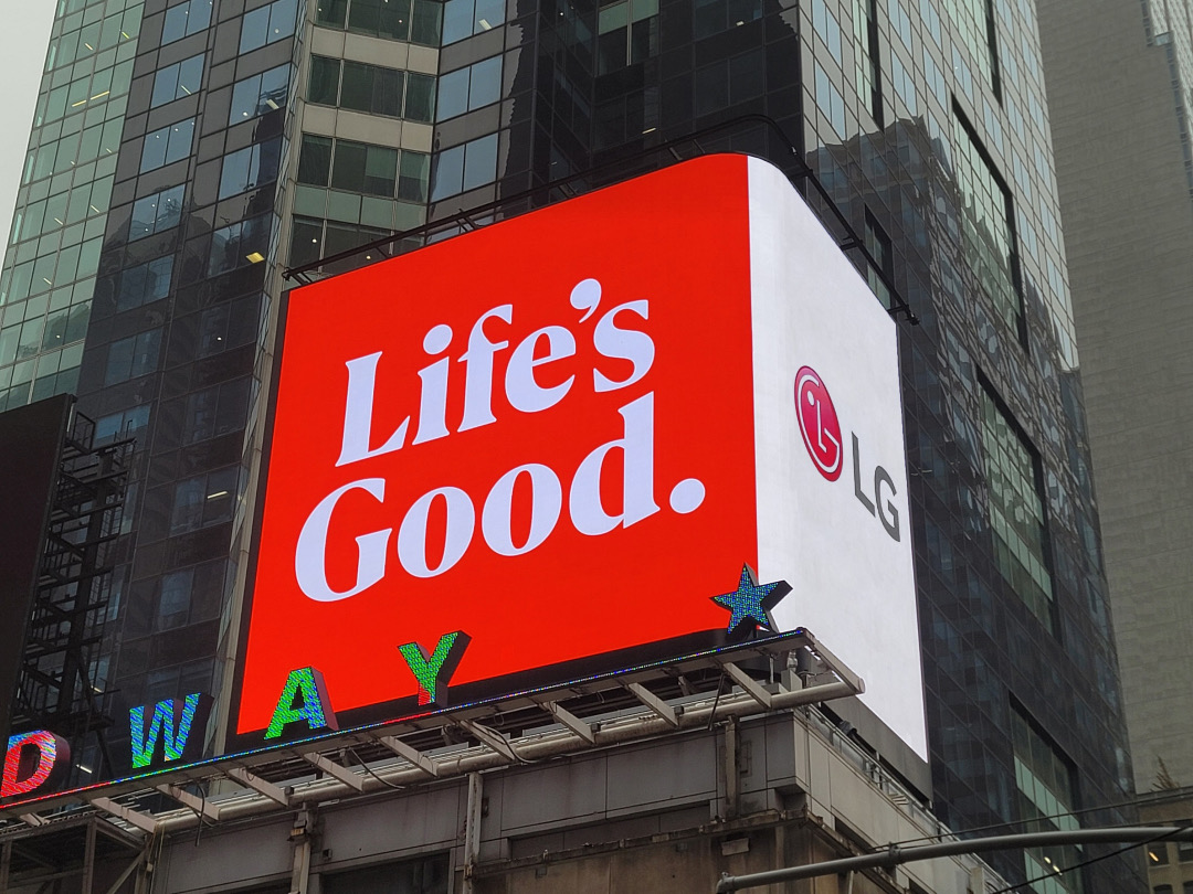
Image via LG
The ‘Life’s Good’ slogan, which sports a fresh typeface, is slated to be more present across LG’s branding and product packaging.
While the logo is now flatter, LG also plans to introduce “gradient elements” to LG Active Red, as well as black and white to its color palette.
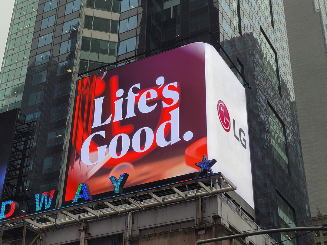
Its hope is that the visual identity will appear more “dynamic and youthful” across geographies and generations—in other words, enhance its relevancy with Gen Z and beyond. Well, it may have succeeded in that regard, as the the emblem and brand colors do resemble the Nintendo Switch logo to some extent.
LG explains that the refresh “signals its willingness and capacity to evolve with generations,” as well as illustrates its “unmatched commitment to innovating customer experiences all around the globe.”
[via GSMArena.com and Campaign Asia-Pacific, images via various sources]


