
Breast Cancer Charity Adopts Boob-Like Typeface To Tackle Public Taboos
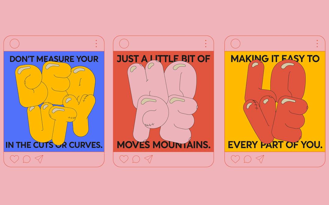
Shell Win, a breast cancer charity based in India, has teamed up with local design studio The House of Two to reimagine its branding, featuring illustrations and a one-of-a-kind typeface that helps tackle taboos surrounding the subject.
The foundation, which offers medical and financial support to young women suffering from the disease, wanted a new brand identity as it plans to shift its focus to research that would look into “the cause” of the illness.
Siddharth Khandelwal, founder of The House of Two, explained that while it is among the most treatable forms of cancer, breast cancer is one of the most common manifestations of it in the country.
Unfortunately, limited awareness, together with lacking support systems and social taboos, have made the journey to recovery “extremely traumatic” for many women and their families.
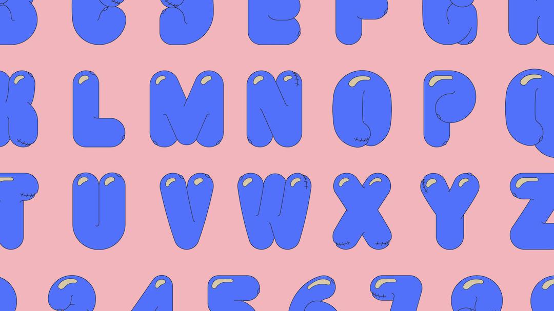
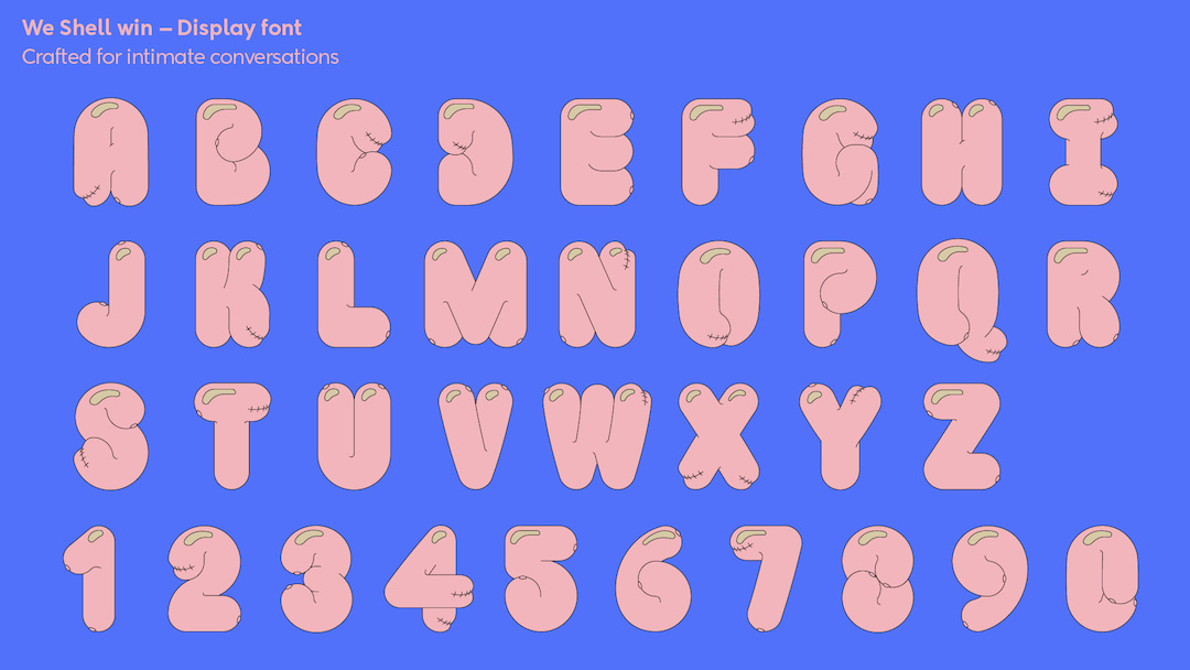
To open up “an honest and intimate” space in which candid conversations can be had about the topic, the studio came up with a bespoke font—‘We Shell Win’—that features subtle, boob-like details that aim to spark discussion.
For example, the rounded forms, rather reminiscent of breasts, feature different forms of scarring that survivors may experience. The letter ‘Y’, for one, depicts one normal breast and one with scar tissue.
The “soft, caring, and accepting” typography empowers women to normalize the difficult changes that come with battling the disease and fights the stigma they face when it comes to dealing with their partners or the wider community.
The charity’s 2D, comic-like illustrations will now see playful and inclusive drawings with two breasts incorporated into each design, in an effort to enforce the idea that breast health should be part of daily conversation.
Khandelwal explained that these drawings, while sensitive to the plight of those suffering from the disease, remained light and lively in order to “remove the shame and taboo” of speaking about the subject in public.
Image via The House of Two
[via Design Week and The House of Two, images via The House of Two]


