
General Mills Unwraps Reenergized Packaging For Fruit Roll-Ups, Gusher’s & More
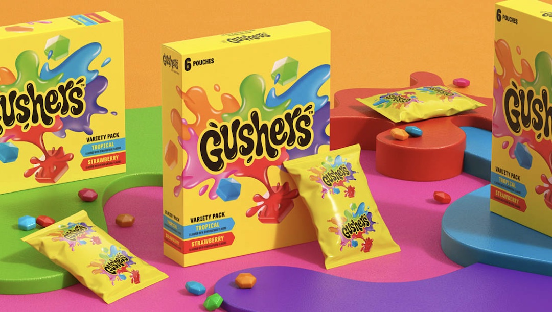
General Mills is setting its sights on providing the new generation with their own revamped and modernized packaging of classic favorites, like Fruit Roll-Ups, Gusher’s, and Fruit by the Foot, for the first time in eight years. The makeover is a new and nostalgic take on the candies and is set to refresh them for modern times.
Design company Pearlfisher brought about the reenergized packaging which saw bolder fonts, brighter colors, and more groovy and wavy patterns gracing the boxes and sweet wrappers.
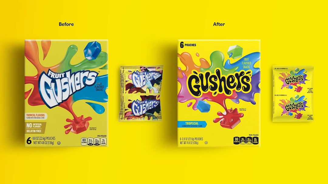
However, the redesign isn’t a significant step away from the classic look of the candies; instead, it’s a touch of refining made to keep the design cues of the sweets while bringing a new flavor for the younger crowd.
The color schemes for the brands have not changed. Gusher’s remains a sunny yellow; however, the backdrop of sour explosions has evolved to incorporate more pinks and purples, while the font takes on a more bubbly effect.
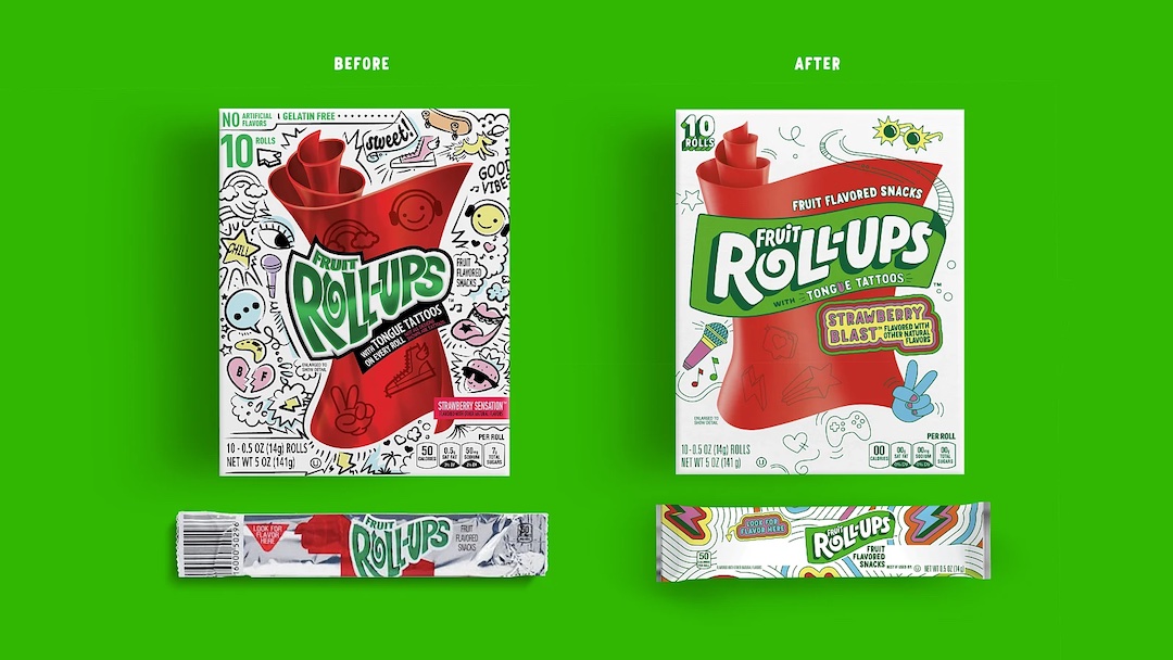
On the other hand, Fruit Roll-Ups remain largely the same, with the iconic white box and bright red roll of candy taking center stage. However, it decluttered its usual doodles and softened the font.
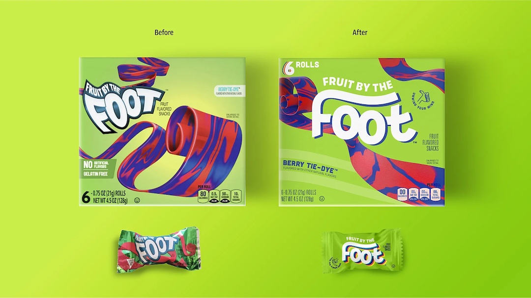
Last, we have Fruit by the Foot with a new, more central logo and an emphasized ‘foot’ tag cast against a swirl of candied rolls against the same green box.
“Creating an expressive and immersive brand experience for each of these brands was really important to us,” notes General Mills Brand Designer Ta’mora Fuhrmann. “Brands today need the ability to connect meaningfully with consumers across a variety of touchpoints. For teens specifically, it’s imperative we fit seamlessly into their lives and deliver benefits that extend beyond the product.”
[via The Dieline and Fanside, images via General Mills]


