
Warner Bros Unveils ‘Streamlined’ Visual Identity For 100th Anniversary Rebrand
Last year, Warner Bros tapped on famed brand design agency Chermayeff & Geismar & Haviv to pay homage to its 100 years of iconic characters in the form of a morphing logomark that featured Batman, Bugs Bunny, Harry Potter, Wonder Woman, and more.
Now, as its centennial approaches, the company has tasked the designers with continuing the redesign of its visual identity. The result? Updated brand elements spotlighting a “streamlined” shield logo and modernized typeface.

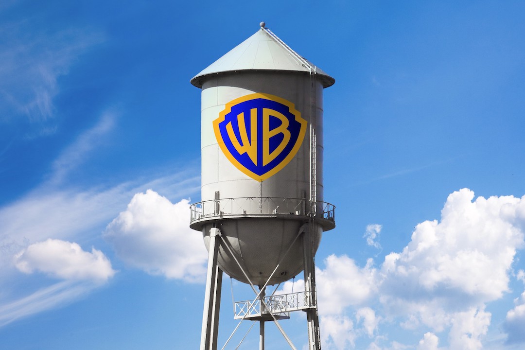
The newly-drawn Warner Bros shield, which was first revealed last year, will take over as the official logo starting this month. According to Design Week, this is the second rebranding campaign the company has undertaken in four years, the last headed by Pentagram in 2019.
Studio partner Sagi Haviv explained the revised emblem was inspired by the 1948 iteration, which is heralded as “synonymous with cinematic creativity.” To refine its look, the designers looked to “reductive geometry, streamlined curves,” and more vibrant colors, while removing the 3D effect.
Image via Chermayeff & Geismar & Haviv
In addition, the redrawing of the logo involved balancing the weight of the ‘W’ and ‘B’ letterforms so that the strokes encase the shield’s shape. As per the agency, this change makes the updated motif a “unified, timeless symbol” that can be used across all media platforms.
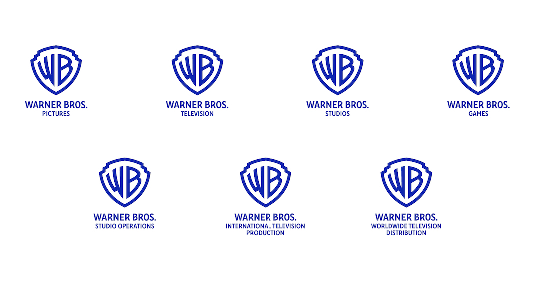
For corporate communication, a solid version of the emblem will be used, while an outline will be chosen to promote the studio’s films, television series, and video games. Both renditions will adapt to the background colors and textures of the content to create “a consistent canvas.”
Image via Chermayeff & Geismar & Haviv
Last but not least, the rebranding efforts were wrapped up with a brand-new, bespoke typeface: Warner Bros Bold Condensed. The font comprises letters drawn similarly to the revised ‘W’ and ‘B’ letters featured in the shield symbol.
Haviv remarked that the typography update, described as a “strong sans serif,” would improve the brand’s legibility, as the typeface focuses on emphasizing the “curvature of the rounded letterforms.”


[via Design Week and Chermayeff & Geismar & Haviv, images via Chermayeff & Geismar & Haviv]


