
Tesco Serves Up Packaging Makeover For Its ‘Premium, But Not Elitist’ Coffee

“Premium, but not elitist. Aspirational, but attainable,” that’s how design studio Coley Porter Bell describes Tesco’s Finest range, a subsegment of the supermarket chain’s larger selection of products that offer customers “a slice of everyday luxury.”
Creative Director Sam Stone said that since Finest’s launch two decades ago, its recognizable silver label has become “predictable and indistinguishable” from other retailers on the block. As such, the studio is tasked with reinvigorating its image, beginning with its series of coffee.
To start, the designers wanted to brew up a fresh identity that would highlight the “fixed and flexible elements” of Finest products, using a tiered, visual hierarchy to spotlight the most important components.
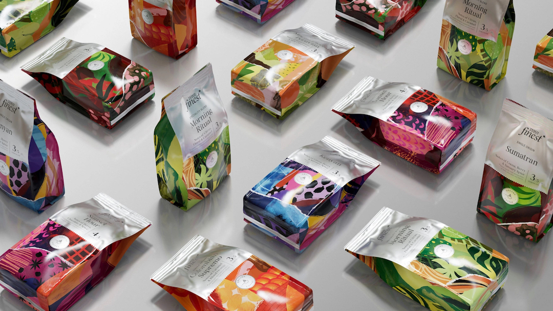
This included the mindset of doing away with “the traditional codes of premium” to devise a packaging design that would appeal to customers as both “uplifting and attainable,” informing the decision to leave behind the less vibrant hues of silver and black paired with scripted fonts.
Now, the brand’s signature “silver thread of equity” is accompanied by a new, interesting style of food photography, with the typeface replaced by a bespoke Tesco-designed and Tesco-owned serif font.
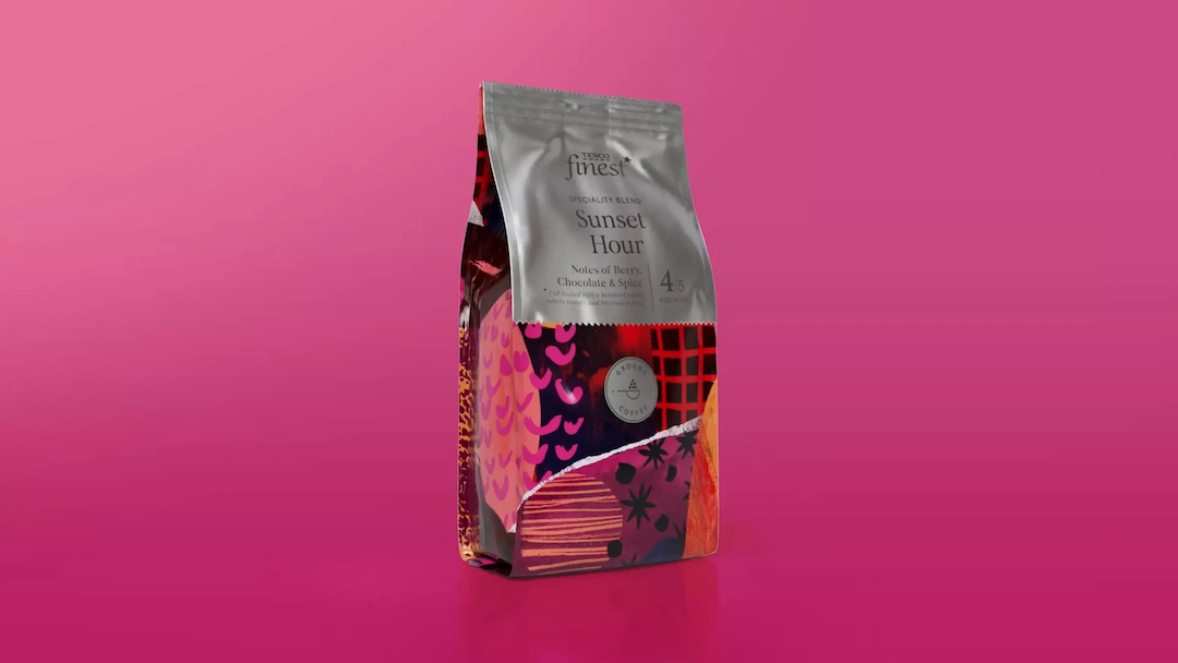
For the range of coffee, in particular, which is dominated by many artisanal brands, the studio wanted to highlight each of the six flavors’ origin and unique taste profiles. This led to the inclusion of illustrator Tom Abbiss Smith, who created “hand-crafted” artwork for the packaging.
Each packet of coffee features Smith’s layered work of “subtle references” to the region from which the grounds were sourced alongside depictions of each blend’s special characteristics and flavor.
Caroline Kelly, Head of Packaging Design at Tesco, told Marketing Communication News that the “beautiful, bespoke designs” are a nod to the provenance of each coffee flavor, all while standing out on shelves so customers will be drawn to the products.
[via Design Week and Marketing Communication News, images via Coley Porter Bell]


