
Pentagram Tweaks ‘Shakespeare In The Park’ Ads For MTA Who Rejected Its Design
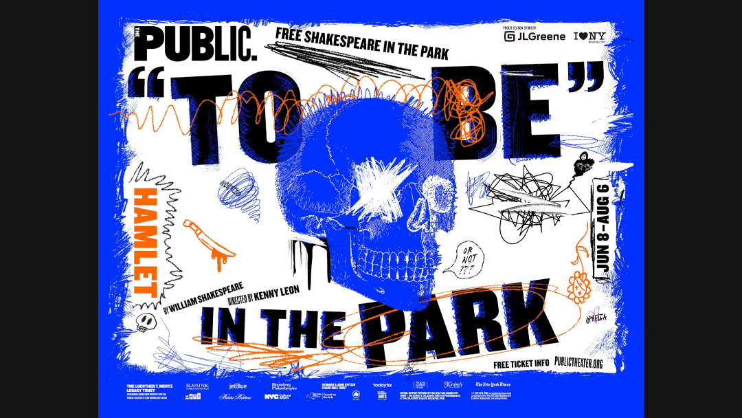
To be dutiful or not to be dutiful? That was the question Pentagram had to ponder when it was instructed by the Metropolitan Transportation Authority (MTA) to update its 2023 Shakespeare in the Park imagery.
This year, Paula Scher and her team at the world-renowned design agency were tasked once again to dream up the campaign for the annual free performances spearheaded by the Public Theater at the Delacorte in Central Park. 2023’s Shakespeare in the Park will introduce a present-day interpretation of Hamlet, hence the grungy skull at the forefront of the visuals, with its eyes crossed out.
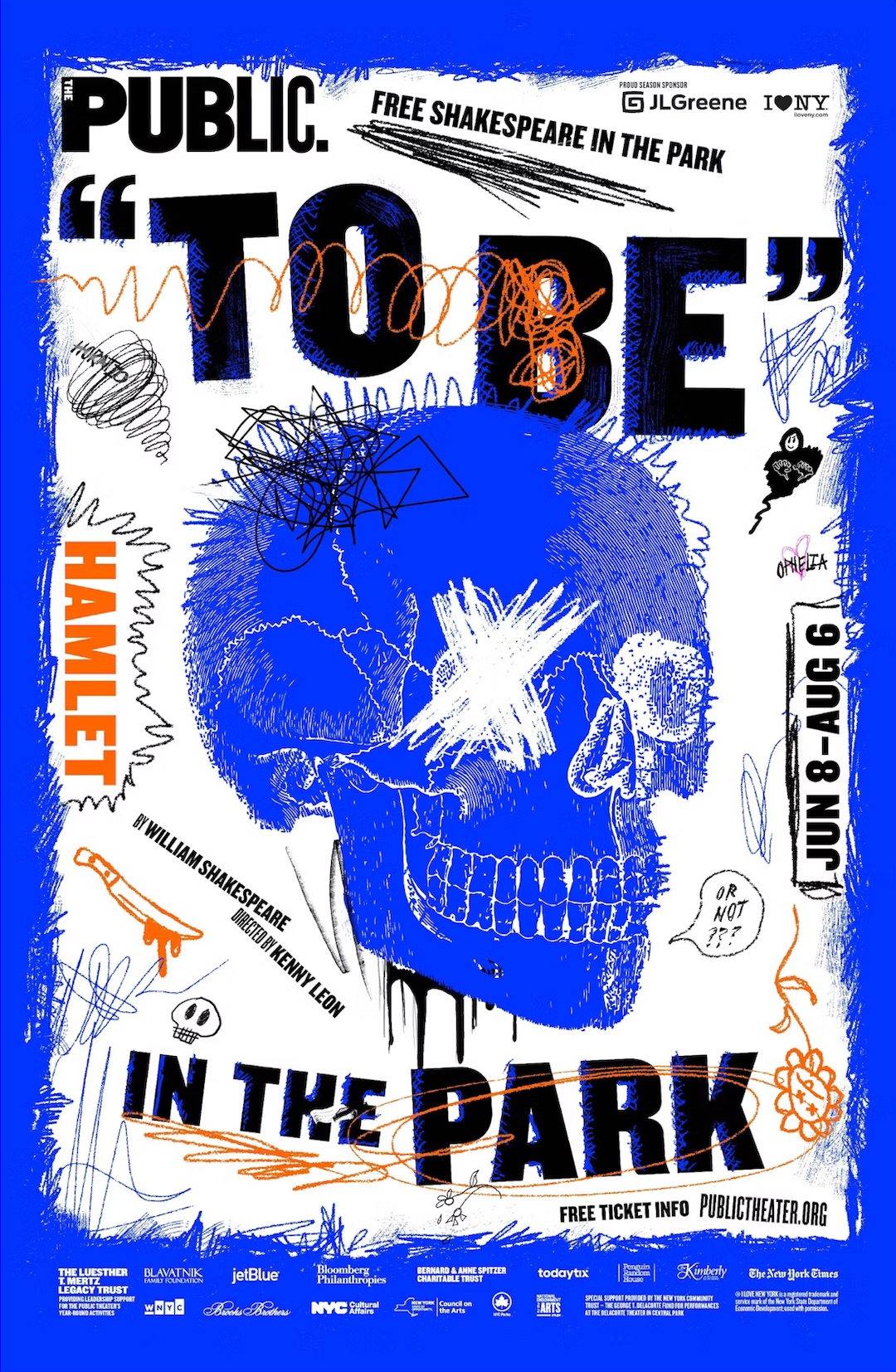
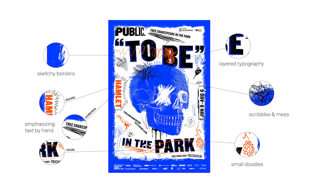
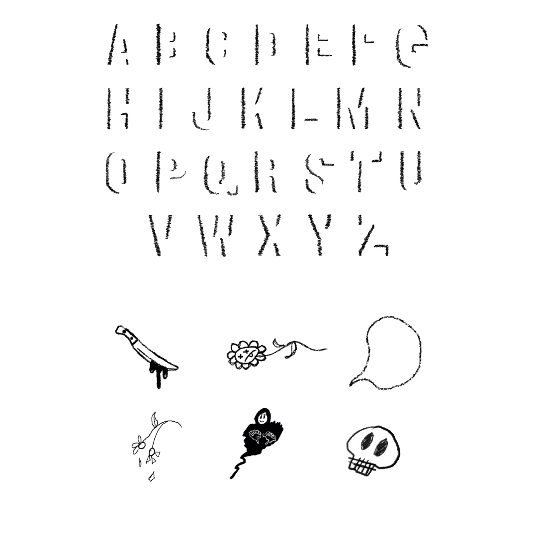
As is customary every year, this iteration sees a unique remix of the theater’s brand typeface, ‘Knockout’, and this time it’s “layered with textured cross-hatching and covered in a mess of hand-drawn scrawls, scribbles, and doodles,” Pentagram explains.
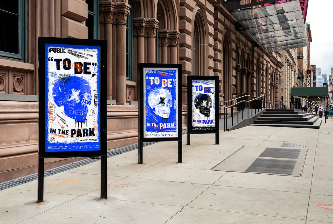
The bold theme makes for a wonderful vehicle for variants of contrasting neons.
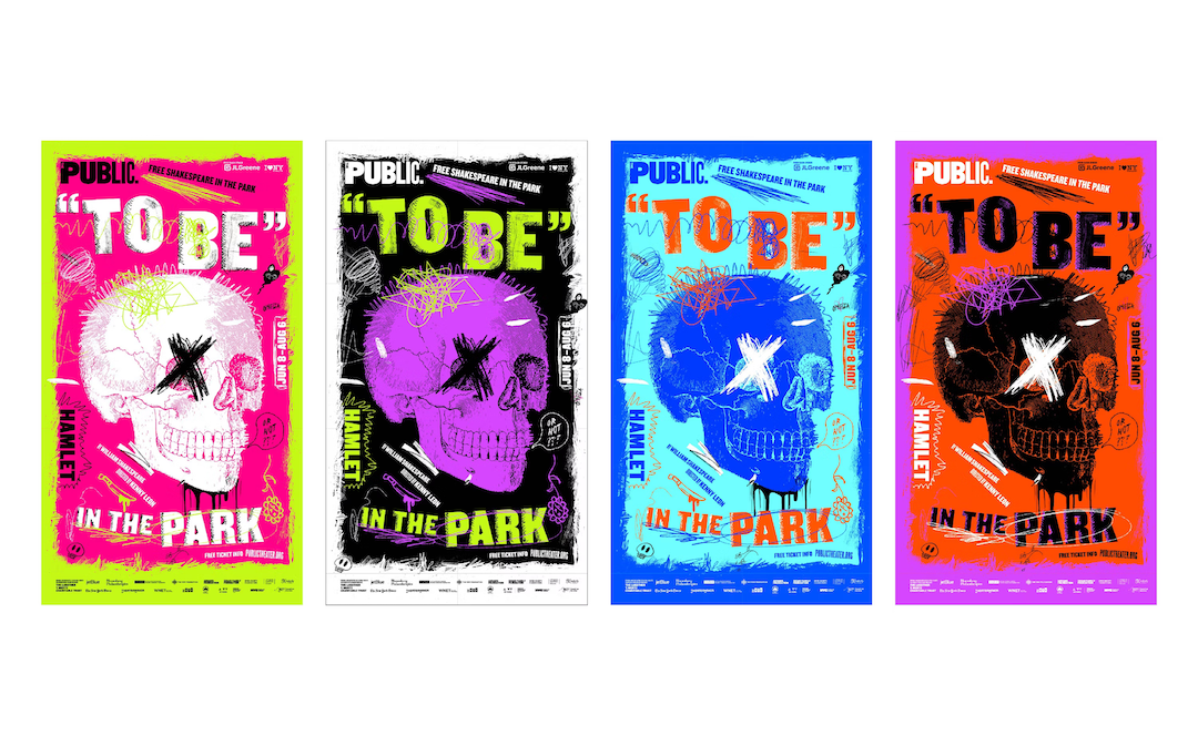
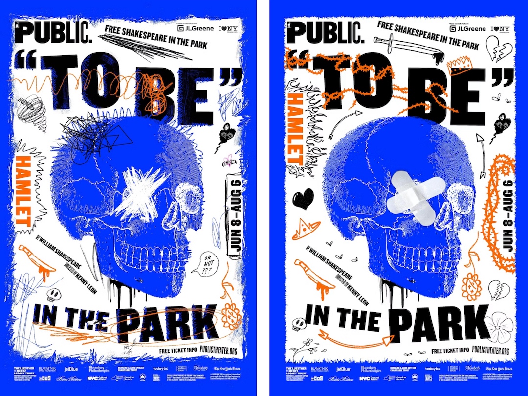
Alas, when Pentagram presented these images to the MTA for review, the authority turned them down. Authorities were worried that the overload of doodles and scribbles would encourage graffiti on the subways.
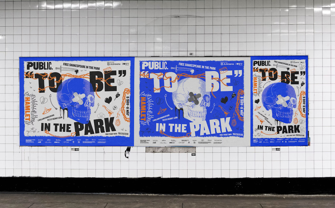
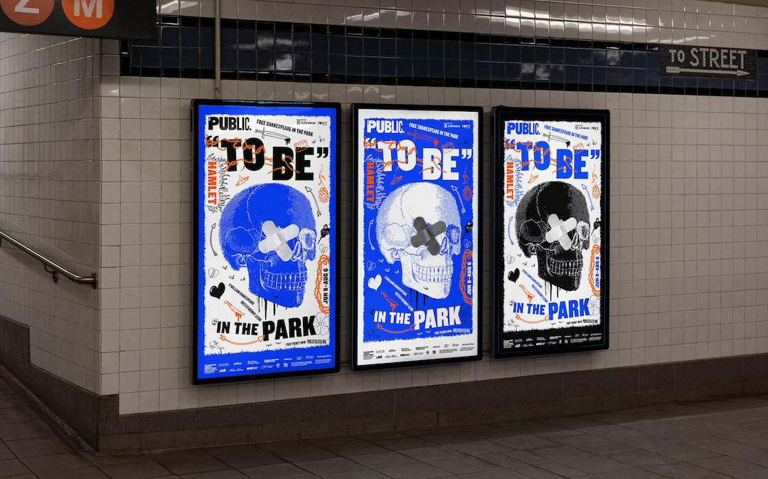
In response, the design team came up with a set of “cleaner” alternative posters just for the MTA, which replaced the hand-drawn ‘X’ over Yorick’s eye with two adhesive bandages.
The MTA-friendly design
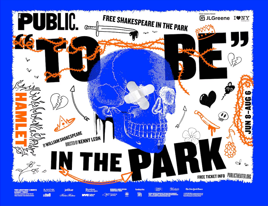
Although it wasn’t the first choice, this variation is, undeniably, fitting of the contemporary Hamlet concept.
Shakespeare in the Park’s Hamlet, directed by Tony Award winner Kenny Leon and starring Ato Blankson-Wood, will be presented for nine weeks from June 8 to August 6. Unlike previous years, this edition will only center on one of the Bard’s plays, to make way for an upcoming overhaul of the Delacorte.
[via Pentagram]


