
WeWork Refreshes Branding With Identity That Ties Its Old & New Looks
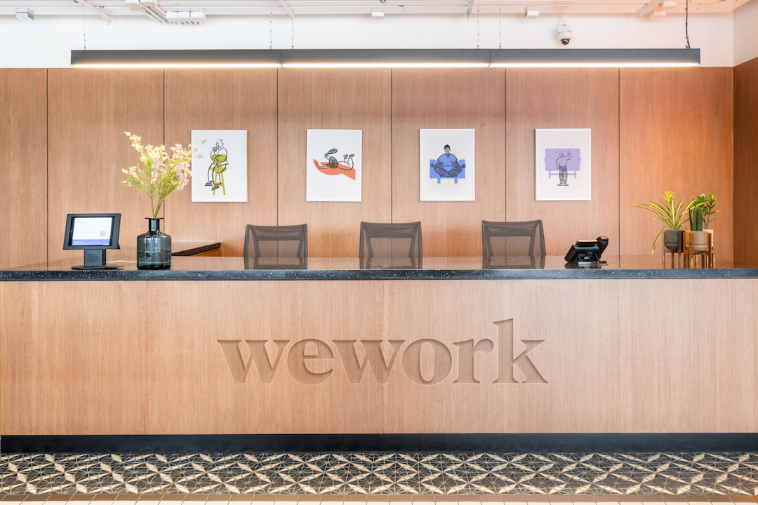
Workspace solutions provider WeWork has teamed up with creative agency Franklyn to refresh its brand identity. Only this time, instead of overhauling the entire look it’s had over the past few years, the duo opted to update it with a series of small changes to blend both the old and new.
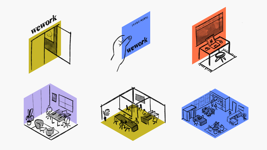
To evolve its brand along with the ever-changing workplace, the company wanted to showcase a more diverse and impactful likeness to the world. To do this, it chose to evolve the firm’s logo, introduce new colors, add hand-drawn illustrations, and even create a custom typeface.
As WeWork put it in a statement, the refreshed identity is “an evolution, not a revolution.” The new creative assets will be displayed across the company’s digital, social, internal, and external communication channels. These additions can be used flexibly according to the audience.
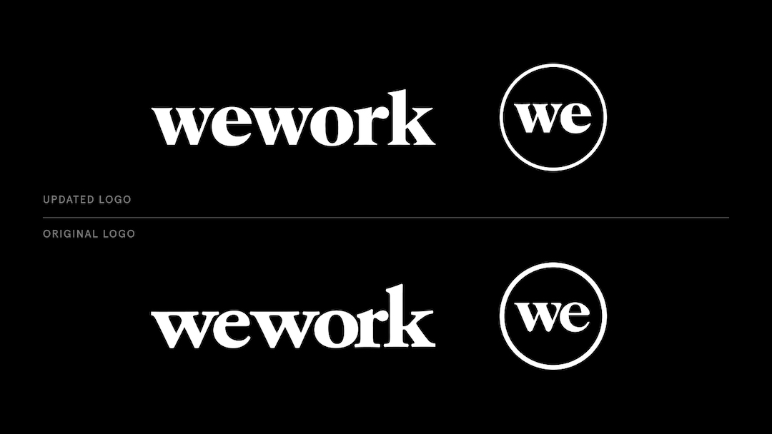
In addition, the updated logo and typeface were intended to be a development from the existing brand so that “old and new designs can live alongside each other” as the firm gradually updates its assets across the globe.
To delve deeper into the redesign, the new emblem retains the overall shape of its predecessor, reimagined with subtle curves and a lowercase version of the original. This allows the motif to remain recognizable to long-time customers and coexist together with the previous version.
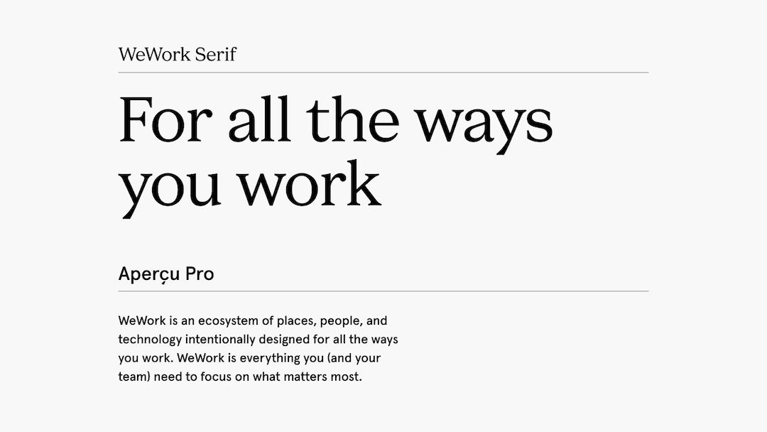
The bespoke typeface, dubbed ‘WeWork Serif’, was created by design studio A+ together with Franklyn. The firm describes the font as creating “continuity” between its logo and the copy for its various brand channels. It will be used in conjunction with a secondary typeface, ‘Apercu Pro’.
That’s not all. The design studio came up with a secondary color palette to better express the company’s entire personality, with each hue meant to represent a different aspect of what the brand stands for.

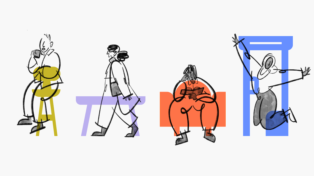
These shades will be used to complement the trademark black and white emblem, together with hand-drawn illustrations that showcase the “human element” of its office offerings through depictions of how its members work and interact within its spaces.
“As the world of work continues to evolve, so have the products we offer to our members every day. Now, we’ve taken steps to develop a more impactful way to showcase WeWork’s diverse and flexible product and unique value proposition to the world,” the firm concluded.
[via It’s Nice That and WeWork, images via WeWork]


