
Intel Designs Free Typeface Aimed To ‘Save Eyes’ From Screen Fatigue
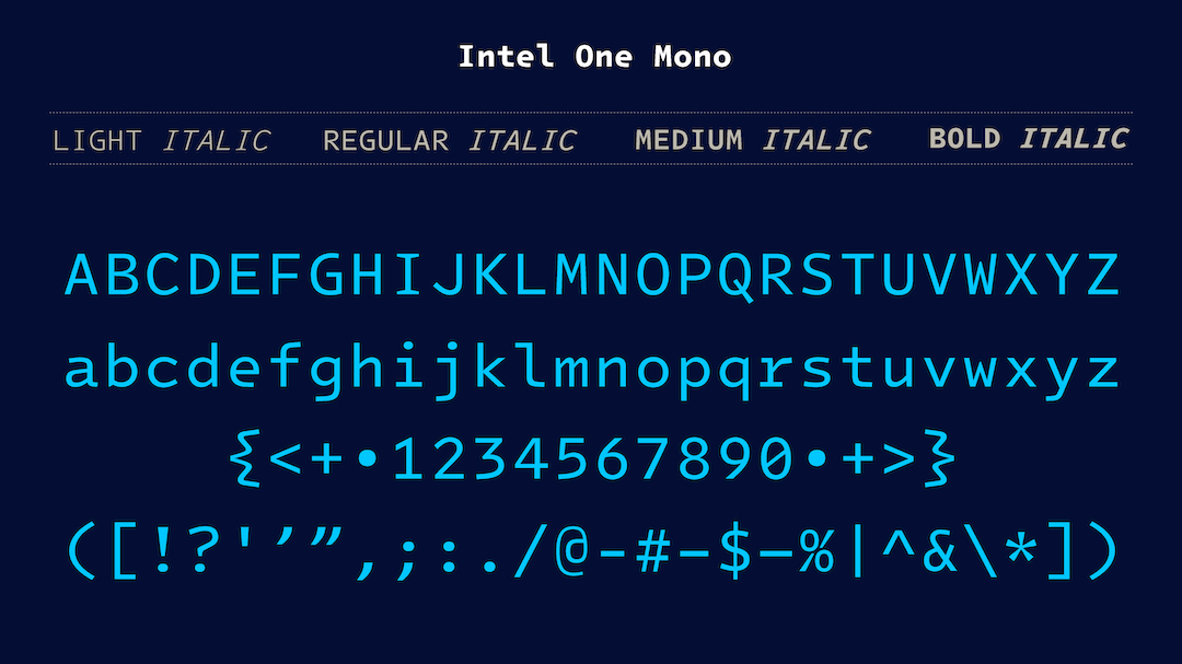
It’s no secret that most of us spend hours on end staring at a computer screen. To help visually-impaired developers, or those who struggle with low vision, technology giant Intel has made available a new open-sourced typeface collection focused on clarity and readability.
Titled the ‘Intel One Mono’, the group of fonts—created in partnership with type design firm Frere-Jones Type and creative agency VMLY&R—is now accessible for free. Overall, the typeface aims to make code more legible, deter eye strain, and hopefully combat developer fatigue.
To ensure the resulting collection would work, the collaborators tapped on a panel of low-vision and legally blind developers to test the typefaces and give feedback throughout the process. The team incorporated several design characteristics into the font to distinguish it from others.
For one, in order to increase legibility, the characters in the typeface were designed to stand out and be less easily confused for one another by making each individual word shape unique as well as increasing the default tracking and leading between the letters.
With these changes, developers will have to spend less time looking back at their work and correcting any mistakes that may occur. Similarly, the heights of the uppercase and lowercase letters have been made as different as possible.
Head here to learn more about installing the fonts. As per Intel, it’s recommended the typefaces be used at 7 points or larger in print and 9 pixels or larger for digital displays.
[via Analytics India Magazine and Phoronix, cover image via Intel / GitHub]


