
KitchenAid Simmers Down On Its Bold Palette With New Neutral Tone
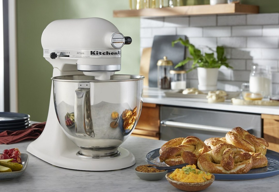
Image via KitchenAid / PR Newswire
Color is a standout part of KitchenAid’s recipe, with the unveiling of a Color of the Year being one of its big rituals. This year’s star is ‘Hibiscus’, and it sees the nearly-neon fuchsia splashed across stand mixers and blenders (it’s also fitting of the coveted Barbiecore trend!).
But loud hues aren’t for every kitchen, as the brand has acknowledged. In recent times, KitchenAid has noticed stiff peaks of interest in natural tones that are “warm, inviting, and raw,” which it alludes to a “heightened clarity of mind and a boom in vulnerability.”
Hence, subverting its usual vibrant choices like red, orange, and green, the company has whipped up a ‘Porcelain White’ option that aims to ring in a “new generation of neutral tones” and blend into any interior style.
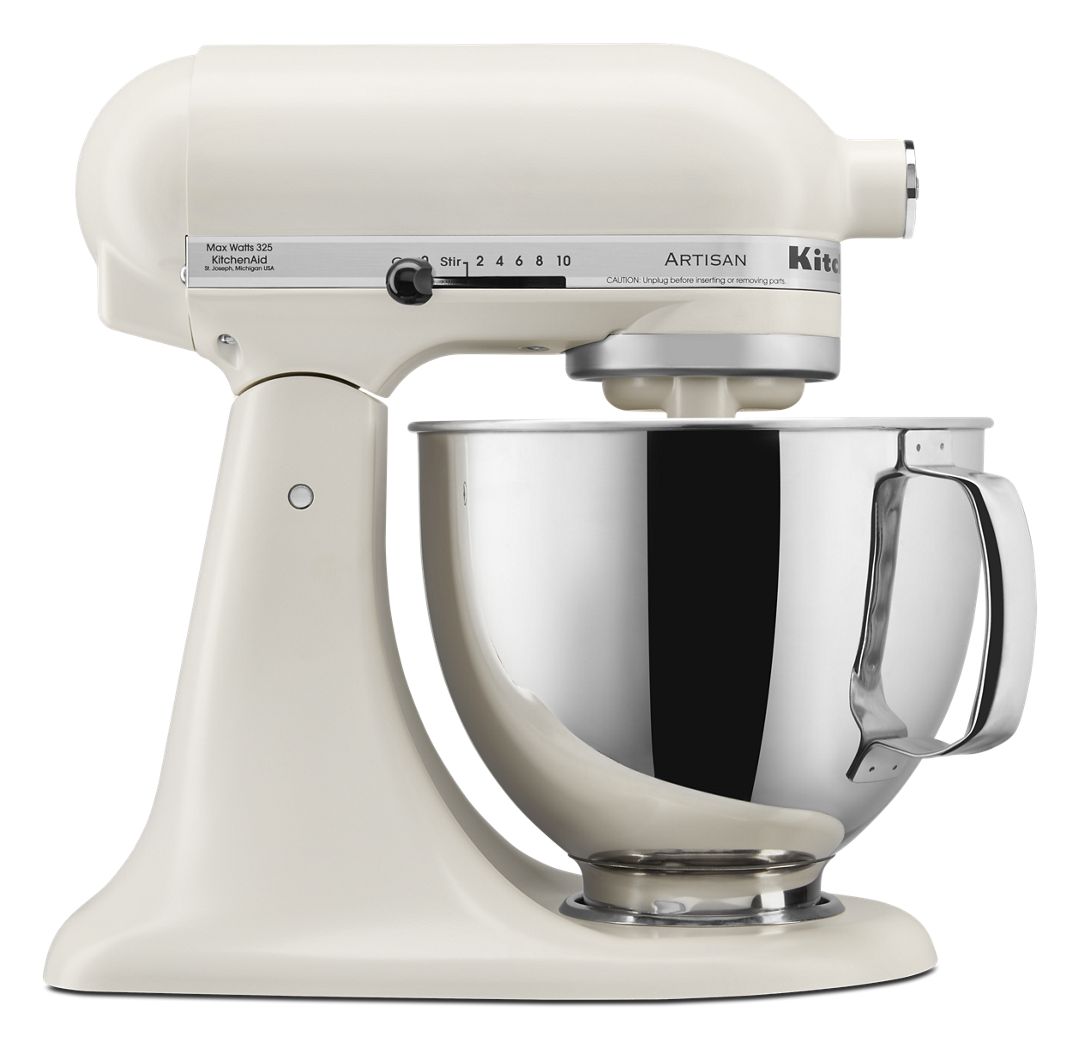
Image via KitchenAid
Porcelain White, a satiny highlight with warm undertones, comes from trend-based research by KitchenAid’s global color and design team that picked up on customers’ growing fondness for softness and coziness (on a separate note, ‘Grannycore’ is another trend that’s been on the rise lately).
The brand offers a few other muted variants, though, like Avocado Cream, Frosted Pearl White, Milkshake, and Matte White. Porcelain White, on the other hand, is a reflection of people’s evolving attitudes toward the highlight over the decades.

Image via KitchenAid
“Consumers’ color cravings evolved from cold and clean in the 2010s to natural and soft in the 2020s,” KitchenAid points out.
The ceramics-inspired hue allows homebodies to “feed softly into tinted neutrals in the home,” the brand notes.
“So whether you gravitate to an all-white aesthetic or a more maximalistic space, Porcelain White can fit seamlessly into any kitchen.”
The homey tone will first appear as an option for the Artisan Series 5 Quart Tilt-Head Stand Mixer, which retails for US$449.99.

Image via KitchenAid
“Porcelain White answers the consumer demand for softer and more approachable white tones in the home, feeding the desire for natural warmth in everyday spaces,” reiterates Brittni Pertijs, who is part of the color, finish, and material design team at KitchenAid parent firm Whirlpool. “We have tracked this evolution since the 1990s, watching as white tones in the home evolve to take on more natural hues from wood tones and stones.”
The hue “is designed for the next generation of kitchens,” adds senior communications manager Chad Parks.
[via The Kitchn and Home Furnishings News, images via KitchenAid]


