
Natural History Museum Gets Revamp For Modern Nature Lovers By Pentagram & Nomad
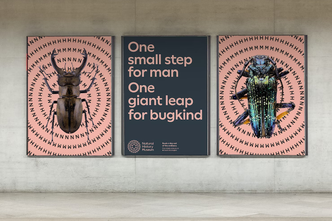
To commemorate its 150th anniversary, the Natural History Museum has unveiled a vibrant new brand identity to the world, envisioning a future where both people and the planet thrive.
The new brand identity, which is backed by a mission to create advocates for the planet, will be rolled out across digital platforms and onsite locations.
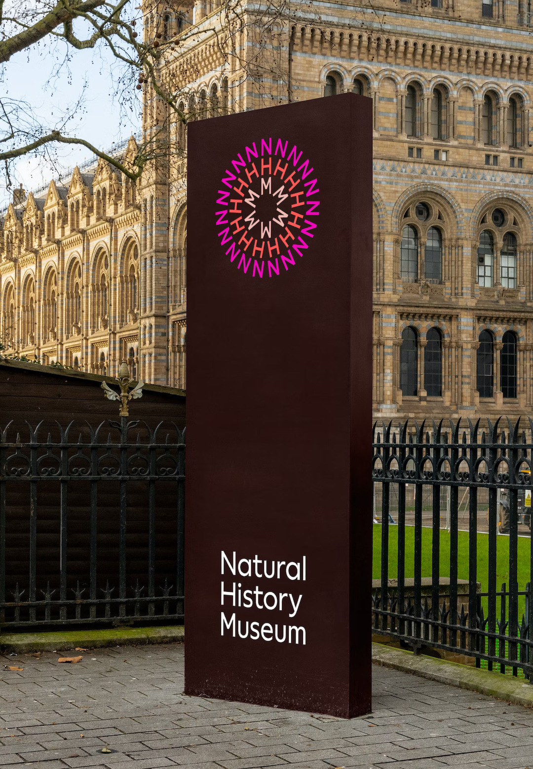
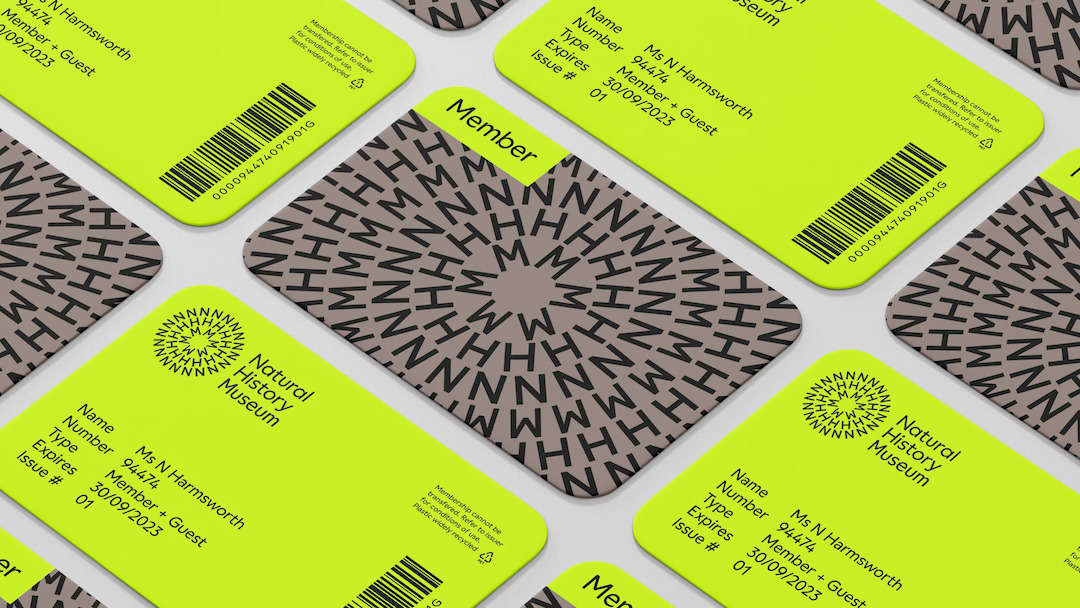
Firstly, its revamped logo features a striking symbol that references the essence of earth and the universal connection between everything in nature.
The symbol, shaped like a circular formation of the letters NHM, exudes energy through a three-color sunburst that pulsates from the center, much like the ripples created in water.
Creative agencies Heavenly, Pentagram Design, and Nomad Studio were behind the rebranding effort, with support from the museum’s internal design, marketing, and digital teams.
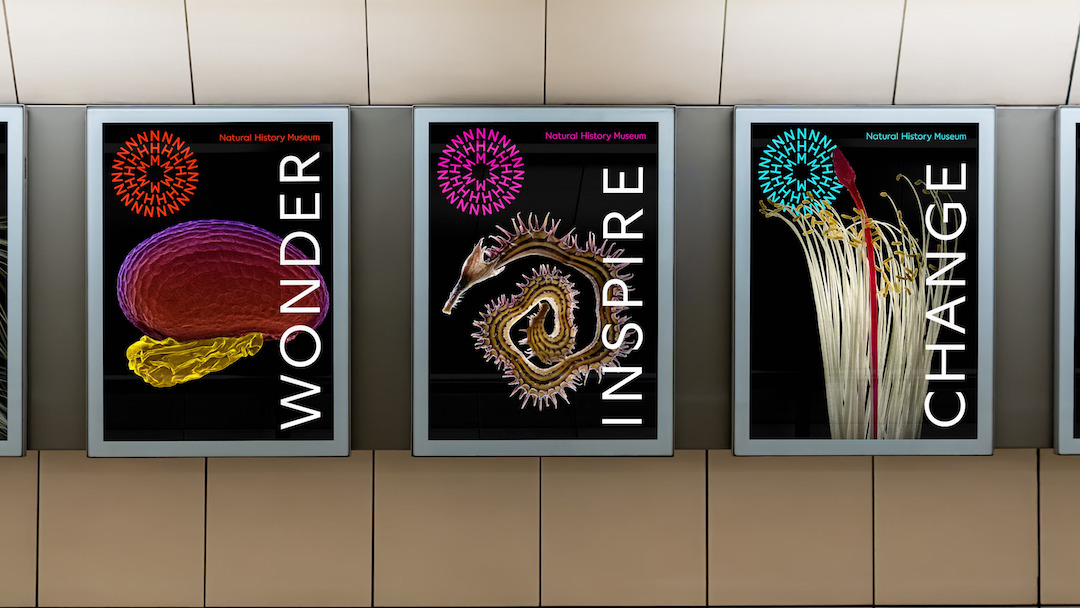
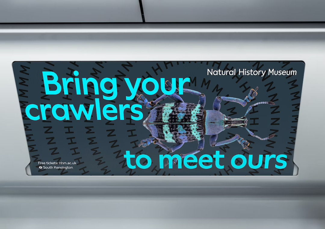
Aiming for inclusivity and diversity, the museum’s newly-adopted brand palette boasts a broad and energetic combination of colors, reflecting the richness found in nature and life.
Through this mix of hues, the space hopes audiences of all backgrounds and origins will feel welcomed and engaged in its activities.
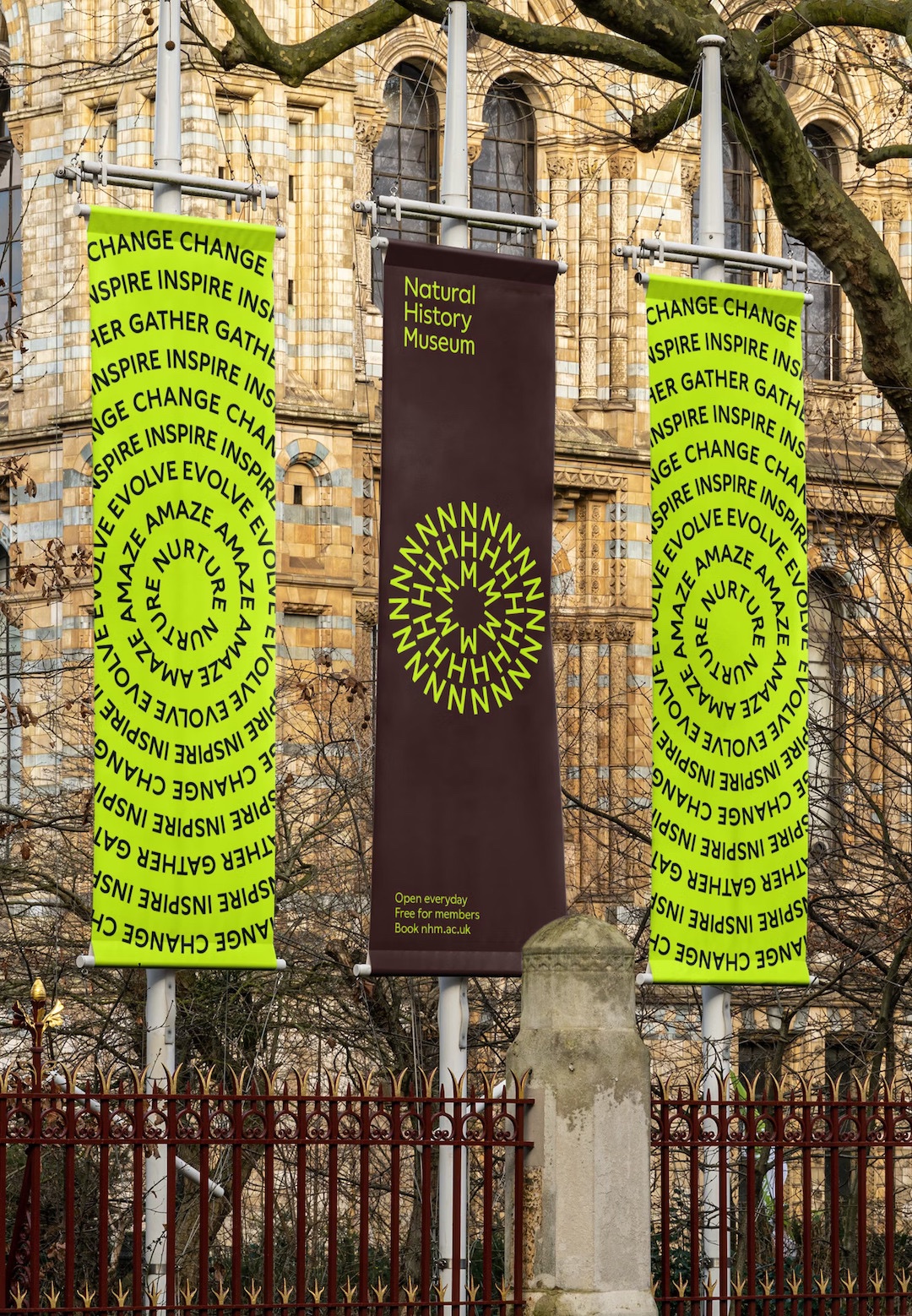
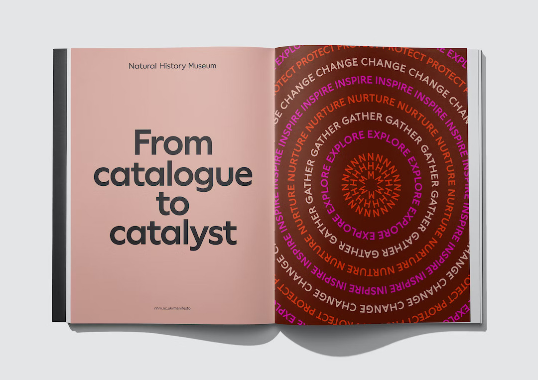
In addition, circular patterns and Word Rings play a pivotal role in the brand identity, serving as catalysts and visually representing movement and energy.
These graphics will take on various forms, ranging from static to animated. To facilitate the easy creation of these elements, the team developed a Generator tool that designers can use to ensure consistency and flexibility across all of the collaterals.
That’s not all. A new typeface, NHM Wallop, was custom-designed to align with the site’s accessible and inclusive nature. The font is meant to exude a friendly, straightforward, and confident vibe as a reflection of the space’s ethos.
Motion is a key aspect of the new brand identity, drawing inspiration from nature to bring this new identity to life. This movement is cleverly applied to the new logo, making it instantly recognizable and memorable.
The motion channels four nature-inspired routes: Ripple, Grow, Pulsate, and Orbit, adding dynamism and momentum to the overall brand.
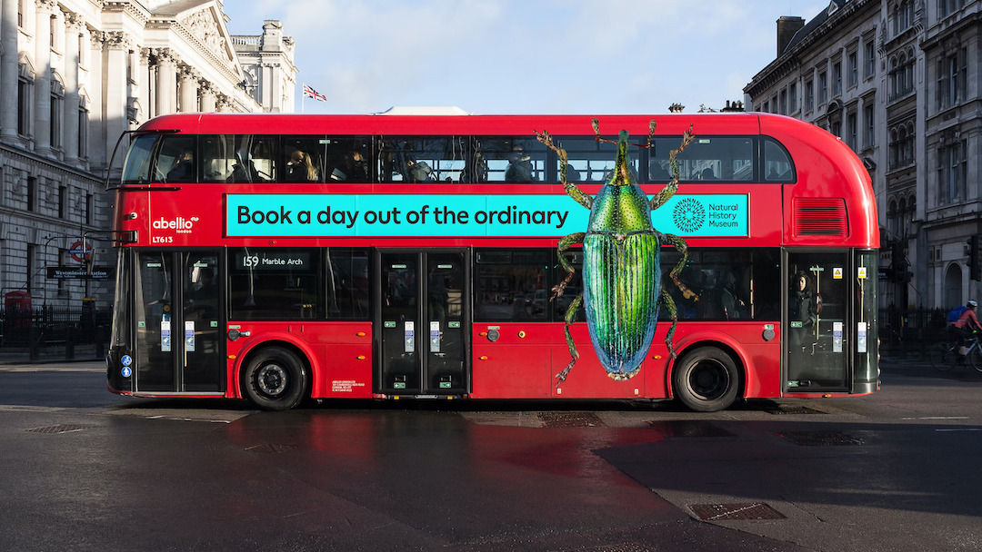
This focus on movement also includes sound-reactive animations, which bring a joyful and expressive element to the experience. These animations celebrate the fascinating creatures that have captured the hearts of millions across the globe.
“Our team created a mindset shift from passive catalogue to active catalyst—creating advocates for the planet. More than museum, more than history, a pioneer in science and advocacy, at a crucial inflection point in time,” said Marina Willier, partner at Pentagram Design.
“With a bolder and more contemporary voice the new brand positioning can better engage both existing and new audiences and help us highlight how the museum is finding solutions to the urgent issues that face our planet,” concurred the museum’s Head of Marketing Richard Orr.
[via It’s Nice That and Natural History Museum, images via Pentagram]
This article was crafted with assistance from an AI engine, and has been reviewed, edited, and fact-checked.


