
World’s Last Gaslit Cinema Illuminates Next Era With Fresh Revamp For Reopening
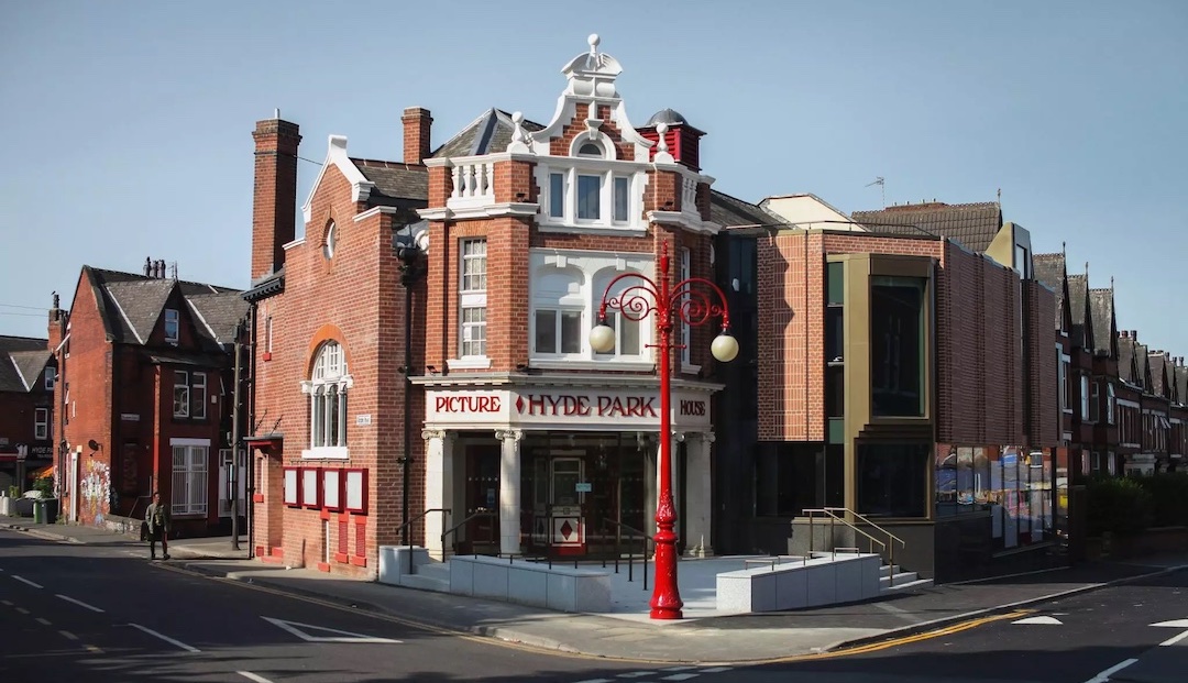
Nestled amid the vibrant streets of Leeds stands the Hyde Park Picture House, the last gaslight movie theater in the world. The structure dates back to 1914, where such cinemas used to illuminate their screens and surroundings with gas lamps. In fact, it still uses two 20th-century Cinemecannica 35 mm projectors to add a little character to its showings.
After closing in 2020 for restoration, this cinematic icon is getting a visual makeover courtesy of Leeds-based design agency Rabbithole.
Video via Rabbithole
At the heart of this makeover is a logo that speaks volumes. Inspired by the circular cue marks, or “cigarette burns,” that signaled film changes to projectionists, it’s a subtle homage to theater’s behind-the-scenes magic. Notably, the graphic doesn’t stand still; its lines multiply and twirl, mirroring the hypnotic spin of a zoetrope.
The color palette is a story in itself. Bathed in the warm glow of yellow, a hue synonymous with cinematic branding, it morphs into the vibrant hues of Technicolor when set in motion.
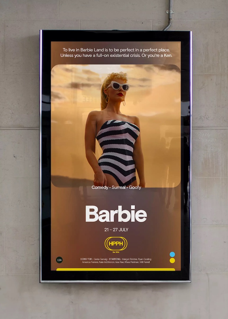
This animated logo serves as an identity for the movie theater, accompanied by music developed in-house.
Each sub-brand of the theater will have a unique font that is handpicked. According to It’s Nice That, the gothic Bradley typeface was used for the Creatures of the Night horror genre, while a Karl Marx typeface was used for the Hyde & Seek collection of family movies.
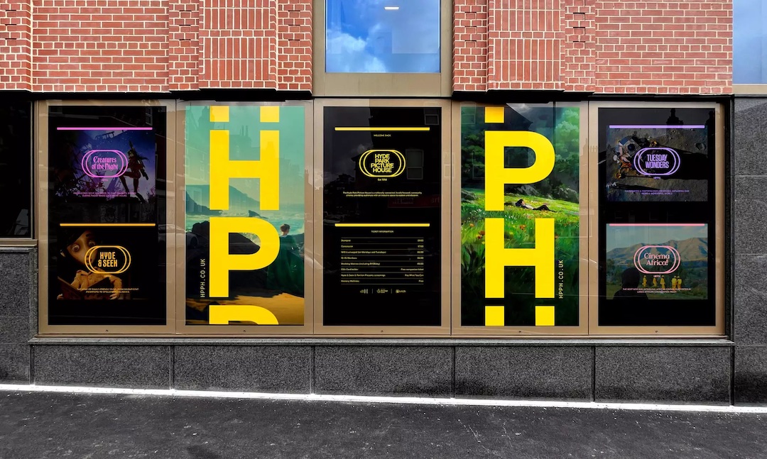
This transformation isn’t confined to the digital realm. It’s making its mark on HPPH’s physical presence too. From the website to posters, signage to lightboxes, programs to idents, this design breathes life into every nook and cranny of the theater.
[via Design Week and It’s Nice That, images via Rabbithole]


