
Facebook Gets New Look With More ‘Electric’ Logo You May Not Notice Is Different

Image via Facebook
Facebook has come a long, long way since the days of poking (remember them?). Nearly two decades on, the social network under the company now known as Meta continues to reinvent itself. On Wednesday, it introduced “the first phase” of a fresh identity system to breathe new life into its brand and elevate its presence among a sea of apps.
A team effort between departments, Facebook’s transformation includes a subtly refreshed logo with a more vibrant blue, along with an updated color palette, typography, and iconography—all aimed at enhancing the user experience across every facet of the platform. All this adds to making exploring, connecting, and sharing even more effortless and personal for the billions of users who engage with Facebook daily.
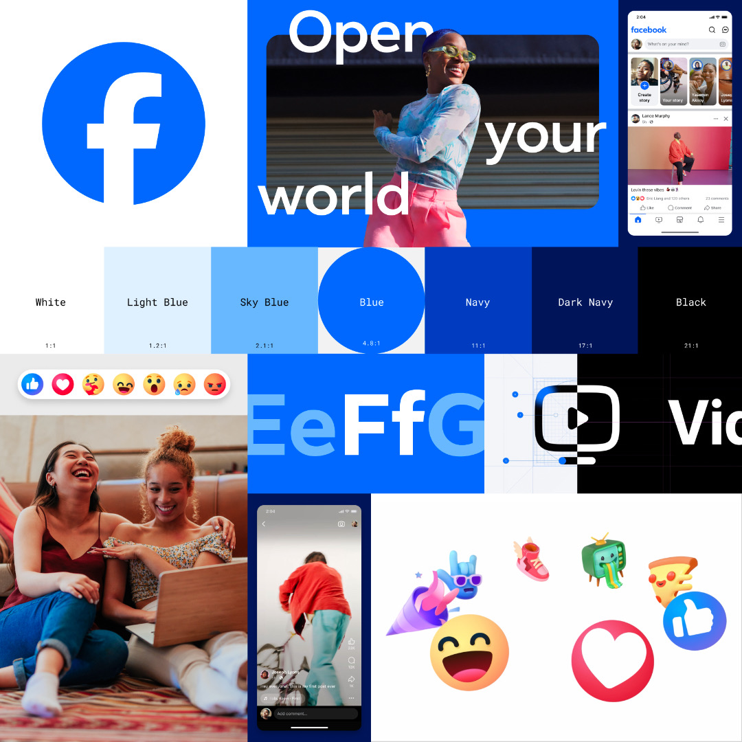
Image via Facebook
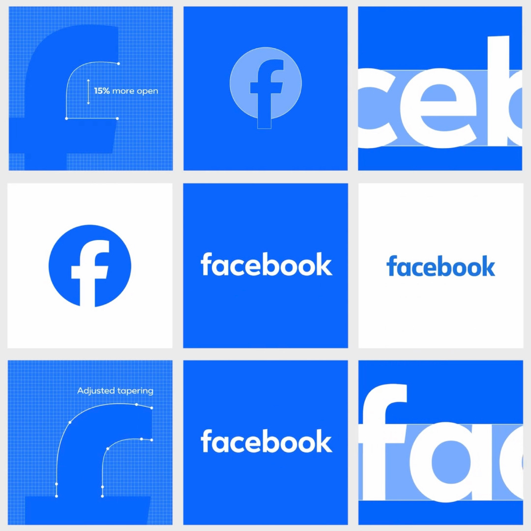
Central to this facelift is a more “electric,” Facebook logo, reworked to stand the test of time. The company’s core blue color has been given a confident makeover for greater visibility, providing a stronger contrast for the iconic ‘f’ icon. Gone are the gradients; what you see is what you get.

Old logo (left) VS new logo (right). Screenshots via Facebook
At the same time, the logo feels “familiar,” sporting changes so minimal most users may not even be aware there is a revival going on.
“The goal of our work was to expand upon our foundation and create the defining mark of our brand that anchors the identity system across Facebook. We wanted to ensure that the refreshed logo felt familiar, yet dynamic, polished and elegant in execution,” explains Facebook’s director of design, Dave Nguyen. “We wanted to ensure that the refreshed logo felt familiar, yet dynamic, polished and elegant in execution.”
The Facebook design team also harnessed the company’s bespoke typeface, Facebook Sans, to create a more consistent treatment of the wordmark and logo, improving overall legibility and creating more cohesion between the wordmark and the rest of the typeface.
Screenshots via Facebook
Adding to the spectrum is a revamped color palette, complete with new hues, tones, and contrast ratios. While blue remains the foundational color, additional shades provide flexibility and help accentuate the brand’s presence in various contexts.

Screenshot via Facebook
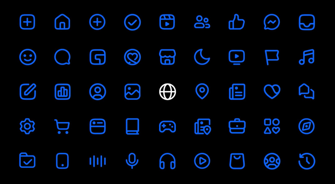
Facebook says its entire iconography system has also been redrawn so that it scales with a wide range of expressions across each moment within the app.
Screenshot via Facebook
Screenshot via Facebook
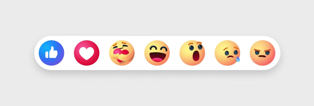
In a similar vein, Reactions are now infused with more dimensionality and emotion. Aided by the extended color palette, they’re now adjusted to meet accessibility guidelines.

Image via Facebook
Overall, Facebook’s changes aren’t here for face value—they strive toward a more user-friendly experience that makes every interaction on the platform a seamless and enjoyable one, the brand justifies.
View this post on Instagram
[via Facebook]
This article was crafted with assistance from an AI engine, and has been manually reviewed & edited.


