
Borussia Dortmund’s Revamped Branding Revolves Around Literal Angle Of Attack
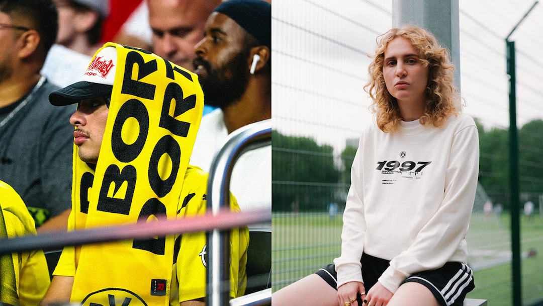
Borussia Dortmund (BVB), one of the most popular soccer clubs in Germany, recently underwent a significant rebranding effort aimed at striking a balance between tradition and international appeal.
With a rich history dating back to its foundation in 1909, BVB has transitioned from local underdogs to formidable contenders, now ranking as runners-up in the country’s top-tier league for 2023.
While the club’s motto, ‘Echte Liebe’ or ‘Real Love’, remains at its core, the sport as a whole has evolved over the years.

The focus doesn’t just remain on tradition and local communities but also involves performance and global recognition.
To acknowledge this shift, DesignStudio embarked on a comprehensive rebranding journey for BVB, bridging the gap between the old and the new.
The central theme of the rebrand positions BVB as “The Black and Yellow Community, together we go all in.”

This belief encapsulates the club’s iconic heritage, emphasizing the united strength and collective spirit of both the team and their unwavering supporters.
The visual identity draws inspiration from one of BVB’s most iconic symbols—the ‘Die Gelbe Wand’ or ‘Yellow Wall’—which is the standing terrace at Signal Iduna Park.
The distinctive 34º angle of this terrace becomes a key element of the new branding, extending across the logo, motion graphics, and other aspects, mirroring the team’s intensity and fighting spirit.

In collaboration with Blaze Type, DesignStudio introduced a custom typeface suite that incorporates this 34º angle of attack. This typeface also forms the basis for the new Borussia Dortmund wordmark.
Unique ‘Intensity Characters’ amp up headlines, complemented by a more functional body type. Even the numbering system takes cues from the graphic device to ensure visual consistency.
While the primary color palette retains the signature black and yellow, an expanded palette introduces neons and grays inspired by the stadium, vintage jerseys, and the city of Dortmund itself.

View this post on Instagram
View this post on Instagram
View this post on Instagram
[via Creative Review and Design Week, images via DesignStudio]
This article was crafted with assistance from an AI engine, and has been manually reviewed & edited.


