
UK’s ‘Areas Of Outstanding Natural Beauty’ Get Fresh, Unified Visual Identity
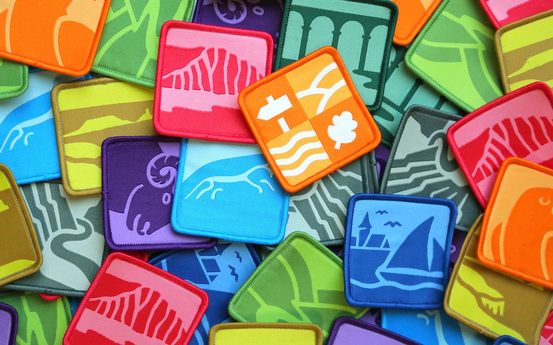
Creative studio Nice and Serious, in collaboration with the National Landscapes Association, has unveiled a rebranding initiative for the UK’s Areas of Outstanding Natural Beauty (AONBs).
This effort aims to raise awareness and foster a deeper connection between the public and these vital landscapes, pivotal in the fight against climate change and biodiversity loss.
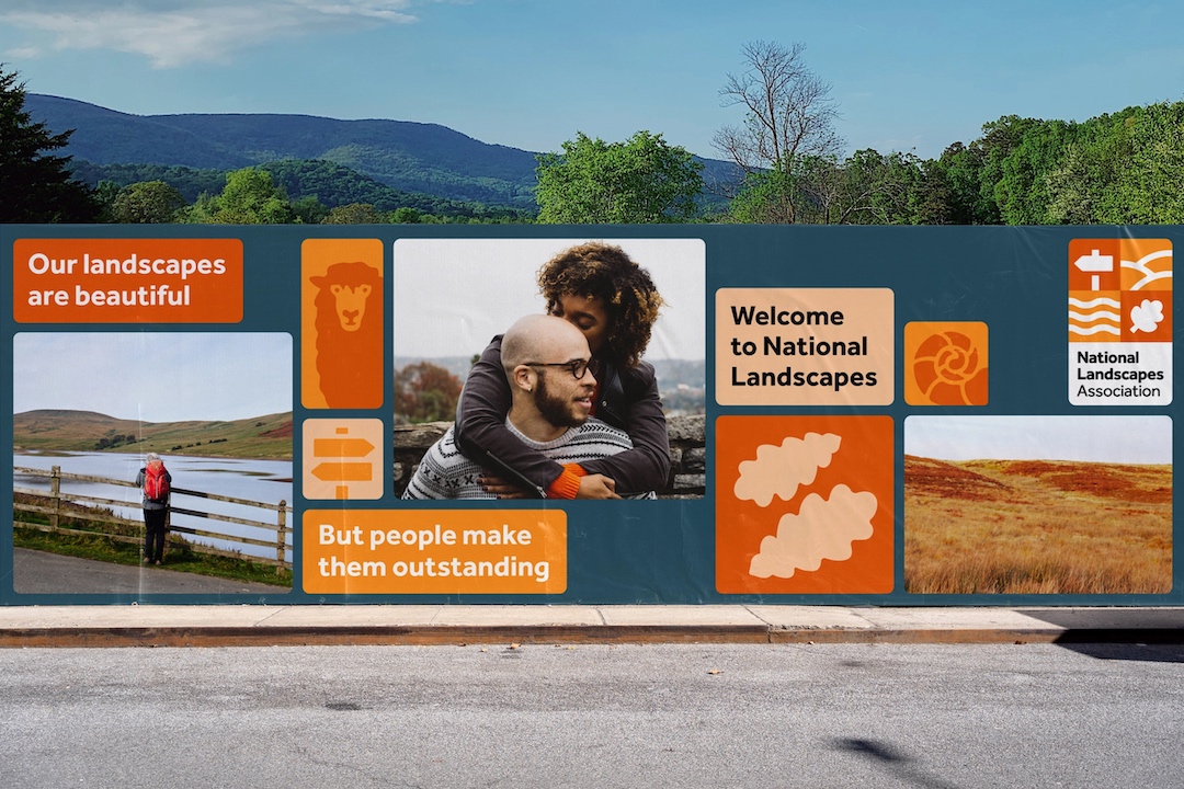
AONBs have struggled with public awareness, with recognition sitting below 50% despite 66% of the UK population living within a 30-minute drive of an AONB.
One of the key challenges of the project was uniting 38 independent organizations under a cohesive brand strategy.

Through extensive research, the common theme identified was the symbiotic relationship between people and landscapes—a concept that landscapes shape people as much as people shape landscapes.
This led to the development of the brand story, “the fabric of us,” portraying National Landscapes as a living patchwork where each part is as essential and unique as individuals.

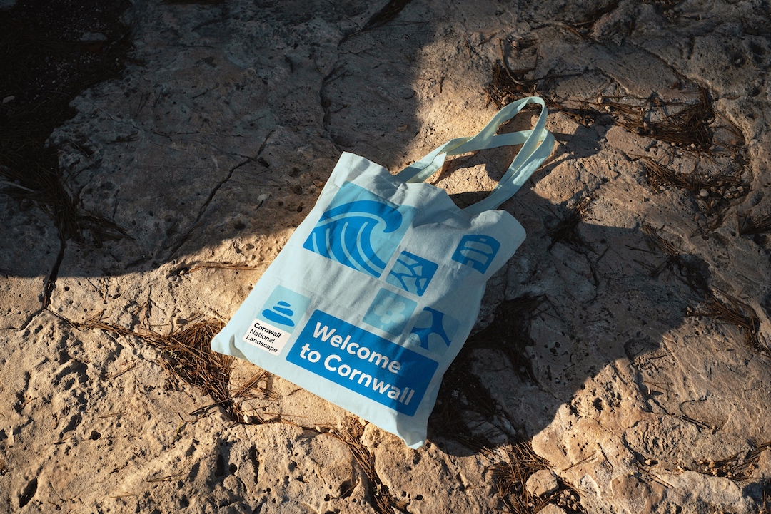
This concept of a patchwork is represented through a unique emblem for each landscape, drawing on their special qualities and creating a wider graphic language when combined.
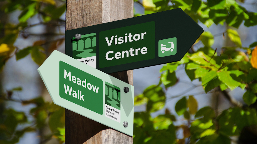
The design system uses an imperfect illustration style, inspired by the natural imperfections found in landscapes. The layout system is based on a flexible, dynamic grid, accommodating various content types and creating endless variations.
The color palette is influenced by the defining colors of the country’s landscapes, ranging from sandy dunes to vibrant moors.
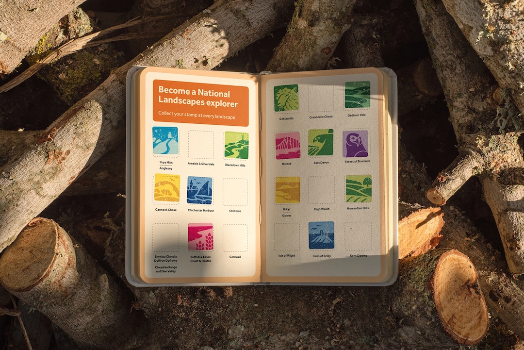
This allows each National Landscape team to choose a color that best represents their local personality.
In addition, special attention was paid to accessibility, with the Effra typeface chosen for its contemporary aesthetic and legibility, particularly beneficial for people with dyslexia.
Overall, the campaign’s tone of voice is built on inclusivity, focused on providing a warm welcome, finding common ground, and acknowledging the diversity of the audience.
This approach, together with the visual rebrand, hopes to make everyone feel seen and heard, thereby inviting more people to interact with and appreciate the National Landscapes.
[via Design Week and Creative Review, images via Nice and Serious]
This article was crafted with assistance from an AI engine, and has been manually reviewed & edited.


