
Reddit Sets Sights On Making Mascot The New ‘Super Mario’ In Eye-Popping Rebrand
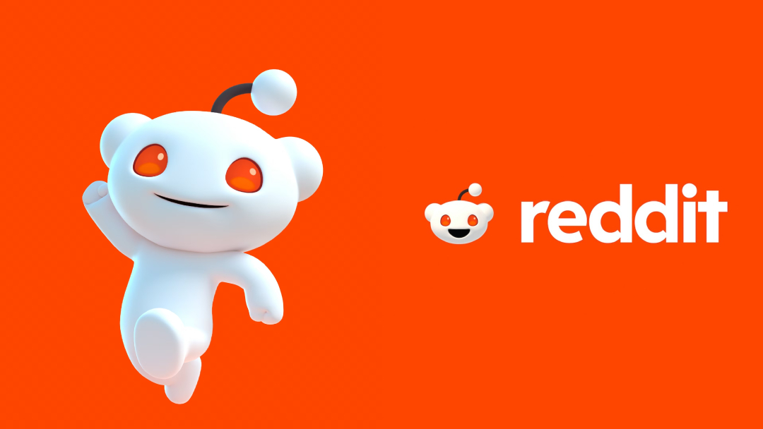
Image via Pentagram
For an upvote-worthy visual identity, Reddit has undergone a comprehensive rebranding that streamlines yet preserves its distinctive character. Orchestrated by the renowned design firm Pentagram, this overhaul is part of the site’s ambition to refine its global presence while maintaining the quirks and joys that define the platform.
Reddit, swarming with visual and verbal elements, realized the necessity of a more harmonized brand strategy. With its mascot ‘Snoo’ having evolved into thousands of variations and the platform’s unique features—like subreddit prefixes and voting mechanisms—adding to the complexity, Reddit sought the studio’s prowess to unify its identity under a global lens.

Image via Pentagram
Pentagram approached the task with a clear objective: to encapsulate Reddit’s essence while refreshing its look. The design team identified four core traits that embody Reddit: “inherently eclectic, positively different, delightfully absurd, and genuinely candid.” Together, these traits establish the platform as “the heart of the internet.”
Image via Pentagram
The team, led by Pentagram partner Natasha Jen, decided to spotlight Reddit’s role in fostering real conversations and community engagement.
Going against the grain of the minimalist trends often coveted in social media design, Reddit’s rebranding injects a playful, cartoon-like personality into its visual identity, capturing its essence of friendliness and joy.

Image via Pentagram
Central to this refresh is the redesign of Snoo, which has been transformed into a more vibrant and dynamic 3D character, “with the kind of nuanced character development that goes into designing Pixar characters,” the design studio explains.
With this project, “Pentagram saw an opportunity to turn Snoo into a character as iconic as Super Mario and cement its role as Reddit’s mascot by formalizing its shape and details,” Pentagram describes. This new Snoo also paves the way for a unified core illustration style, transitioning from disparate spot drawings to cohesive 3D icons.

Image via Pentagram

Image via Pentagram
The reimagined ‘Reddit Sans’ typeface is another significant element of the change, with lowercase letters resembling speech bubbles to reflect the social network’s focus on discussions and conversations.
This design choice is further echoed in the new speech bubble framing device, symbolizing the rich dialogues and interactions that define the Reddit community. The bubble’s motion mirrors how conversations flow on Reddit, and it can stretch to represent different subreddit sizes or longer comments.
Reddit’s colors have been trimmed down from an extensive array of over 100 hues to a more manageable 15, including five primary colors with three shades each.
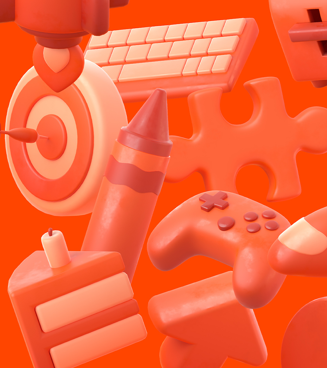
Image via Pentagram
The condensed palette ensures a harmonious transition between the Reddit brand and individual community interactions, with the site’s signature ‘OrangeRed’ now complemented by a carefully curated secondary selection.

Image via Pentagram
This makeover represents a delicate balance between revamping the visual identity and preserving the unique characteristics that make Reddit distinctive as it redefines its position in the digital world. Whether it will mine the kind of karma it’s expecting remains to be seen.
[via Creative Boom, It’s Nice That, Pentagram, images via Pentagram]


